BottomNavigationViewEx
An android lib for enhancing BottomNavigationView.
Features
| Method | Description |
|---|---|
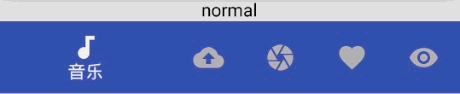
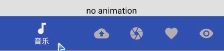
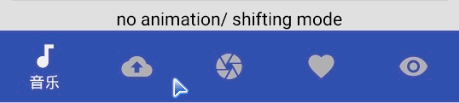
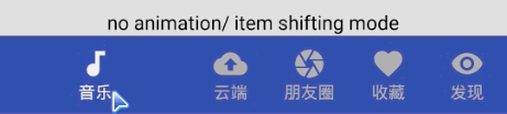
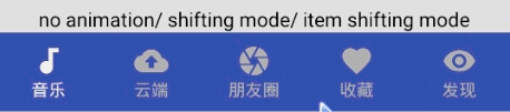
| enableAnimation | Enable or disable click item animation(text scale and icon move animation in no item shifting mode). Default true. |
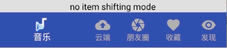
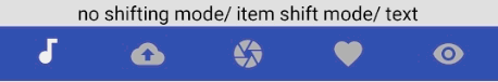
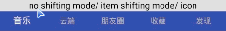
| enableItemShiftingMode | Enable the shifting mode for each item. It will have a shifting animation for item if true. Otherwise the item text is always shown. Default true when item count > 3. |
| enableShiftingMode | Enable the shifting mode for navigation. It will has a shift animation if true. Otherwise all items are the same width. Default true when item count > 3. |
| getBottomNavigationItemView | Get private mButton in mMenuView at position |
| getBottomNavigationItemViews | Get private mButtons in mMenuView |
| getCurrentItem | Get the current checked item position. |
| getIconAt | Get icon at position. |
| getItemCount | Get item count. |
| getItemHeight | Get item height. |
| getLargeLabelAt | Get large label at position. Each item has two labels, one is large, the other is small. |
| getSmallLabelAt | Get small label at position. Each item has two labels, one is large, the other is small. |
| getMenuItemPosition | Get menu item position in menu. Return position if success, -1 otherwise. |
| getOnNavigationItemSelectedListener | Get OnNavigationItemSelectedListener. |
| setCurrentItem | Set the currently checked item. |
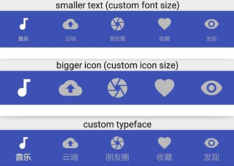
| setIconMarginTop | set margin top for icon. |
| setIconSize | Set all item ImageView size. |
| setIconSizeAt | Set all item ImageView size which is at position. |
| setIconsMarginTop | set margin top for all icons. |
| setIconTintList | Set item icon tint list. |
| setIconVisibility | Change the visibility of an icon. |
| setItemBackground | Set background of item. |
| setItemHeight | Set menu item height. |
| setLargeTextSize | Set all item large TextView size. Each item has two labels, one small and one large. The small one will be shown when item state is normal. The large one will be shown when item is checked. |
| setSmallTextSize | Set all item small TextView size. Each item has two labels, one small and one large. The small one will be shown when item state is normal. The large one will be shown when item is checked. |
| setTextSize | Set all item large and small TextView size. |
| setTextTintList | Set item TextView color. |
| setTextVisibility | Change the visibility of text. |
| setTypeface | set Typeface for all item TextView. |
| setupWithViewPager | This method will link the given ViewPager and this BottomNavigationViewEx together so that changes in one are automatically reflected in the other. This includes scroll state changes and clicks. |
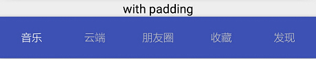
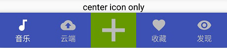
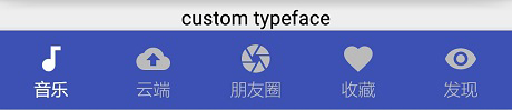
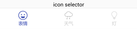
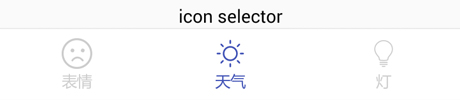
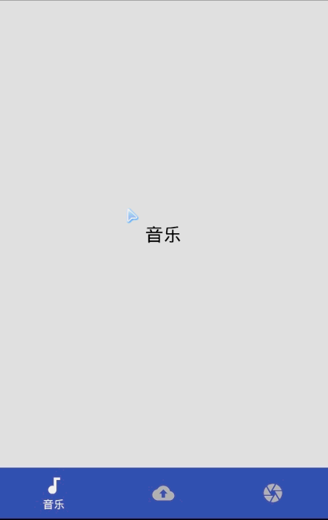
Example


Adding to project
Sdk Version
compileSdkVersion >= 25
Importing to project
Example for Gradle:
Step 1. Add it in your root build.gradle at the end of repositories:
Step 2. Add the dependency
Manual:
Downloading BottomNavigationViewEx.java and copying it to you project.
Getting started
Adding a custom widget in xml :
Binding view in Activity:
Disable all animations
Custom text and icon size
Binding with ViewPager
Add badge view
- Add badge lib
compile 'q.rorbin:badgeview:1.1.0' - Bind bottom view
// add badge
addBadgeAt(2, 1);

private Badge addBadgeAt(int position, int number) {
    // add badge
    return new QBadgeView(this)
            .setBadgeNumber(number)
            .setGravityOffset(12, 2, true)
            .bindTarget(bind.bnve.getBottomNavigationItemView(position))
            .setOnDragStateChangedListener(new Badge.OnDragStateChangedListener() {
                @Override
                public void onDragStateChanged(int dragState, Badge badge, View targetView) {
                    if (Badge.OnDragStateChangedListener.STATE_SUCCEED == dragState)
                        Toast.makeText(BadgeViewActivity.this, R.string.tips_badge_removed, Toast.LENGTH_SHORT).show();
                }
            });
}
Other usage in BottomNavigationViewEx
You can see the demo.
Usage in BottomNavigationView
Other usage is the same as official BottomNavigationView.
You can click here for detail.
ProGuard
If you are using ProGuard you might need to add the following option:
-keep public class android.support.design.widget.BottomNavigationView { *; }
-keep public class android.support.design.internal.BottomNavigationMenuView { *; }
-keep public class android.support.design.internal.BottomNavigationPresenter { *; }
-keep public class android.support.design.internal.BottomNavigationItemView { *; }