SSJetpackComposeSwipeableView
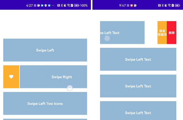
SSJetpackComposeSwipeableView is a small library which provides support for the swipeable views. You can use this in your lazyColumns or can add a simple view which contains swipe to edit/delete functionality.
Features
- Simple and easy to use.
- Customize according to your needs.
- Use wherever you want.
- Get proper swipe callback events.
? Preview
| Swipe Left | Swipe Right | Swipe Left + Right |
|---|---|---|
 |
 |
 |
Installation
-
Add it in your root build.gradle at the end of repositories:
allprojects { repositories { ... maven { url 'https://jitpack.io' } } } -
Add the dependency in your app’s build.gradle file
 dependencies {
        implementation 'com.github.SimformSolutionsPvtLtd:SSJetpackComposeSwipeableView:1.0.1'
 }
How to Use and Customization
- Wherever you want to add swipeable view
    SwipeAbleItemView(
            // Triplet(Icon, TintColor, Id) Pass the icon with the tint color which you want to display in left side view, Id will be used to identify onClick Events.
            leftViewIcons = arrayListOf(Pair(Icons.Filled.Edit, "btnEditLeft"), Pair(Icons.Filled.Delete, "btnDeleteLeft")),
            // Triplet(Icon, TintColor, Id) Pass the icon with the tint color which you want to display in right side view, Id will be used to identify onClick Events.
            rightViewIcons = arrayListOf(Pair(Icons.Filled.Edit, "btnEditRight")),
            // Position of the item normally required only when used with lazyColumns to identify the index of the item.
            position = 0,
            // Swipe direction it can be Left or Right or Both (Left + Right).
            swipeDirection = swipeDirection ?: SwipeDirection.BOTH,
            // Perform any action when swipeable view is clicked. It provides the position(Index of the item) as well as id to identify which item clicked incase of multiple items.
            onClick = { // Pair(Position, Id)
                Toast.makeText(context, "${it.second} clicked. Position :- ${it.first}", Toast.LENGTH_SHORT)
                    .show()
            },
            // Width for the left side of the view which will be shown when swiped.
            leftViewWidth = 70.dp,
            // Width for the right side of the view which will be shown when swiped.
            rightViewWidth = 70.dp,
            // Height for the swipeable view.
            height = 60.dp,
            // Background color for left view.
            leftViewBackgroundColor = Primary,
            // Background color for right view.
            rightViewBackgroundColor = Primary,
            // Corner radius for swipeable view.
            cornerRadius = 4.dp,
            // Space between left swipeable view and your main content view.
            leftSpace = 10.dp,
            // Space between right swipeable view and your main content view.
            rightSpace = 10.dp,
            // fractionalThreshold for the swipe
            fractionalThreshold = 0.3f
        ) {
           // Your main view comes here.
        }
All Attributes
| Attribute | Description | Default |
|---|---|---|
leftViewIcons |
Triplet(Icon, TintColor, Id) Pass the icon with the tint color which you want to display in left side view, Id will be used to identify onClick Events. | None |
rightViewIcons |
Triplet(Icon, TintColor, Id) Pass the icon with the tint color which you want to display in right side view, Id will be used to identify onClick Events. | None |
position |
Position of the item normally required only when used with lazyColumns to identify the index of the item. | 0 |
swipeDirection |
Swipe direction it can be Left or Right or Both (Left + Right). | None |
onClick |
Perform any action when swipeable view is clicked. It provides a Pair(Position, Id) where the position is index of the item and id to identify which item clicked incase of multiple items. |
None |
leftViewWidth |
Width for the left side of the view which will be shown when swiped. | 70.dp |
rightViewWidth |
Width for the right side of the view which will be shown when swiped. | 70.dp |
height |
Height for the swipeable view. | 70.dp |
cornerRadius |
Corner radius to be applied to the button. | 0.dp |
leftSpace |
Space between left swipeable view and your main content view. | 0.dp |
rightSpace |
Space between right swipeable view and your main content view. | 0.dp |
fractionalThreshold |
It is used to resolve the elevation for this button in different. | 0.3f |
content |
Add your actual view here. | none |
Our JetPackCompose Sample
SSComposeCookBook : A Collection of major Jetpack compose UI components which are commonly used.
Our JetPackCompose Libraries
SSJetPackComposeProgressButton : SSJetPackComposeProgressButton is an elegant button with a different loading animations which makes your app attractive.
Find this library useful? ❤️
Support it by joining stargazers for this repository.⭐
How to Contribute?
Whether you’re helping us fix bugs, improve the docs, or a feature request, we’d love to have you! ?
Check out our Contributing Guide for ideas on contributing.
Bugs and Feedback
For bugs, feature requests, and discussion please use GitHub Issues.
LICENSE
This project is licensed under the MIT License – see the LICENSE file for details


