dependencies {
  implementation 'io.github.sridhar-sp:neumorphic:0.0.6'
}
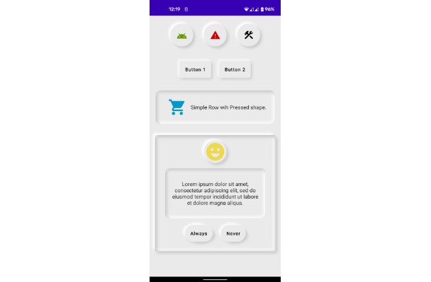
    Button(
        modifier = Modifier
            .defaultMinSize(minHeight = 80.dp)
            .fillMaxWidth()
            .padding(defaultWidgetPadding)
            .neu(
                lightShadowColor = AppColors.lightShadow(),
                darkShadowColor = AppColors.darkShadow(),
                shadowElevation = defaultElevation,
                lightSource = LightSource.LEFT_TOP,
                shape = Flat(defaultCornerShape),
            ),
        colors = ButtonDefaults.buttonColors(
            backgroundColor = MaterialTheme.colors.surface
        )
    ) {
        Text(
            text = "Button", style = AppTextStyle.button()
        )
    }
    Card(
        modifier = Modifier
            .size(128.dp)
            .neu(
                lightShadowColor = AppColors.lightShadow(),
                darkShadowColor = AppColors.darkShadow(),
                shadowElevation = defaultElevation,
                lightSource = LightSource.LEFT_TOP,
                shape = Flat(RoundedCorner(24.dp)),
            ),
        elevation = 0.dp,
        shape = RoundedCornerShape(24.dp),
    ){
    	// Add child components here.
    }
    Button(
        modifier = Modifier
            .fillMaxWidth()
            .padding(defaultWidgetPadding)
            .neu(
                lightShadowColor = AppColors.lightShadow(),
                darkShadowColor = AppColors.darkShadow(),
                shadowElevation = defaultElevation,
                lightSource = LightSource.LEFT_TOP,
                shape = Pressed(defaultCornerShape),
            ),
        colors = ButtonDefaults.buttonColors(
            backgroundColor = MaterialTheme.colors.surface,
        ),
        shape = RoundedCornerShape(12.dp),
        elevation = null

    ) {
        Text(text = "Button", style = AppTextStyle.button())
    }
    Card(
        modifier = Modifier
            .size(128.dp)
            .neu(
                lightShadowColor = AppColors.lightShadow(),
                darkShadowColor = AppColors.darkShadow(),
                shadowElevation = defaultElevation,
                lightSource = LightSource.LEFT_TOP,
                shape = Pressed(RoundedCorner(24.dp)),
            ),
        elevation = 0.dp,
        shape = RoundedCornerShape(24.dp),
    ){
    	// Add child components here.
    }