
Modal Sheet
Modal Sheet library for Jetpack Compose.
Motivation
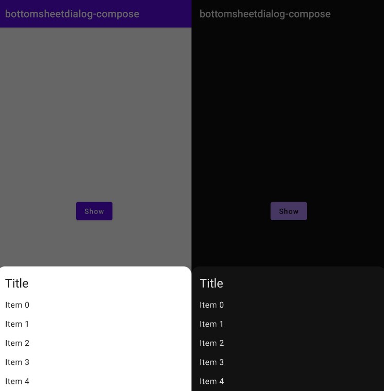
Sometimes we want bottom sheets to behave as real modals, thus overlaying all content on the screen. Official ModalBottomSheetState however, is laid out only in bounds of the parent Composable. This means that to display a bottom sheet above, for example bottom bar navigation, it must be placed “higher” in the hierarchy than usage in one of the tab screen.
The ModalSheet Composable from this library allows creating real modal bottom sheets which could be placed anywhere in the hierarchy.
Solution
The ModalSheet Composable internally uses FullScreenPopup which is basically a window placed above the current window and allows placing Composables inside. Then ModalSheet adds swipe-to-dismiss, scrim and shaping to simulate bottom sheet behavior.
The FullScreenPopup is public, thus can be used to create own “modal” Composables.
Usage
Get a dependency
Step 1. Add the JitPack repository to your build file. Add it in your root build.gradle at the end of repositories:
allprojects {
    repositories {
        ...
        maven { url 'https://jitpack.io' }
    }
}
Step 2. Add the dependency. Check latest version on the releases page.
dependencies {
    implementation 'com.github.oleksandrbalan:modalsheet:$version'
}
Use in Composable
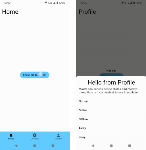
The ModalSheet has 2 mandatory arguments:
- visible – True if modal should be visible.
- onDismiss – Lambda which is called when user touches the scrim or swipes the sheet away.
var visible by remember { mutableStateOf(false) }

Button(onClick = { visible = true }) {
    Text(text = "Show modal sheet")
}

ModalSheet(
    visible = visible,
    onDismiss = { visible = false },
) {

    Box(Modifier.height(200.dp))
}
See Demo application and examples for more usage examples.


TODO list
- Add support for LazyColumn and LazyVerticalGrid inside modal sheet.
- Provide swipe state to
ModalSheetScope