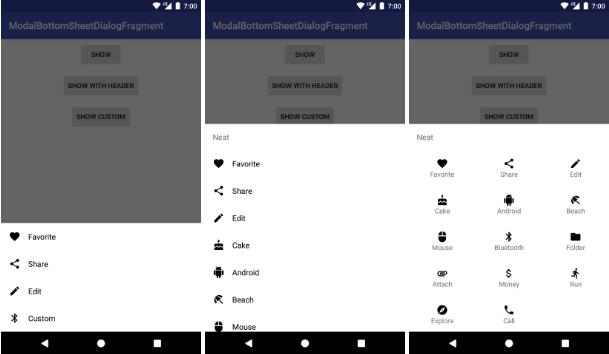
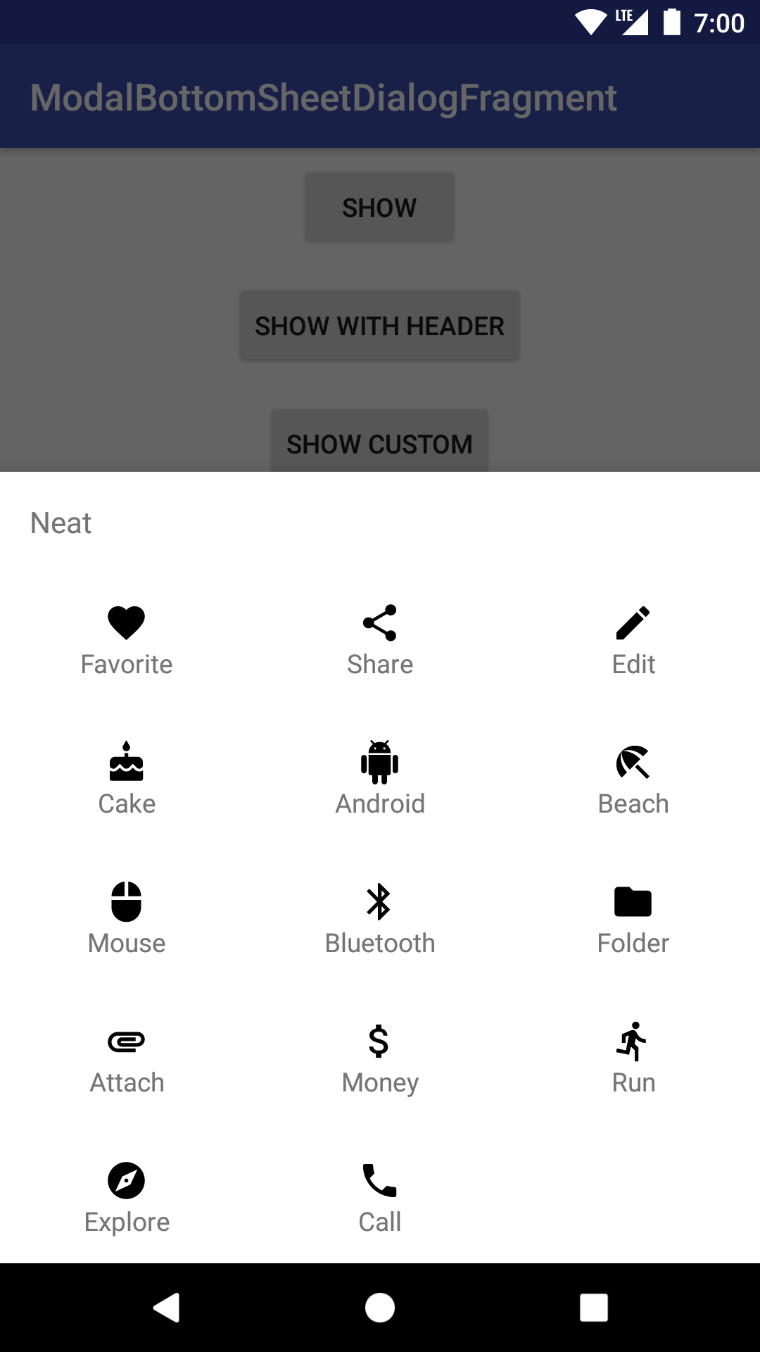
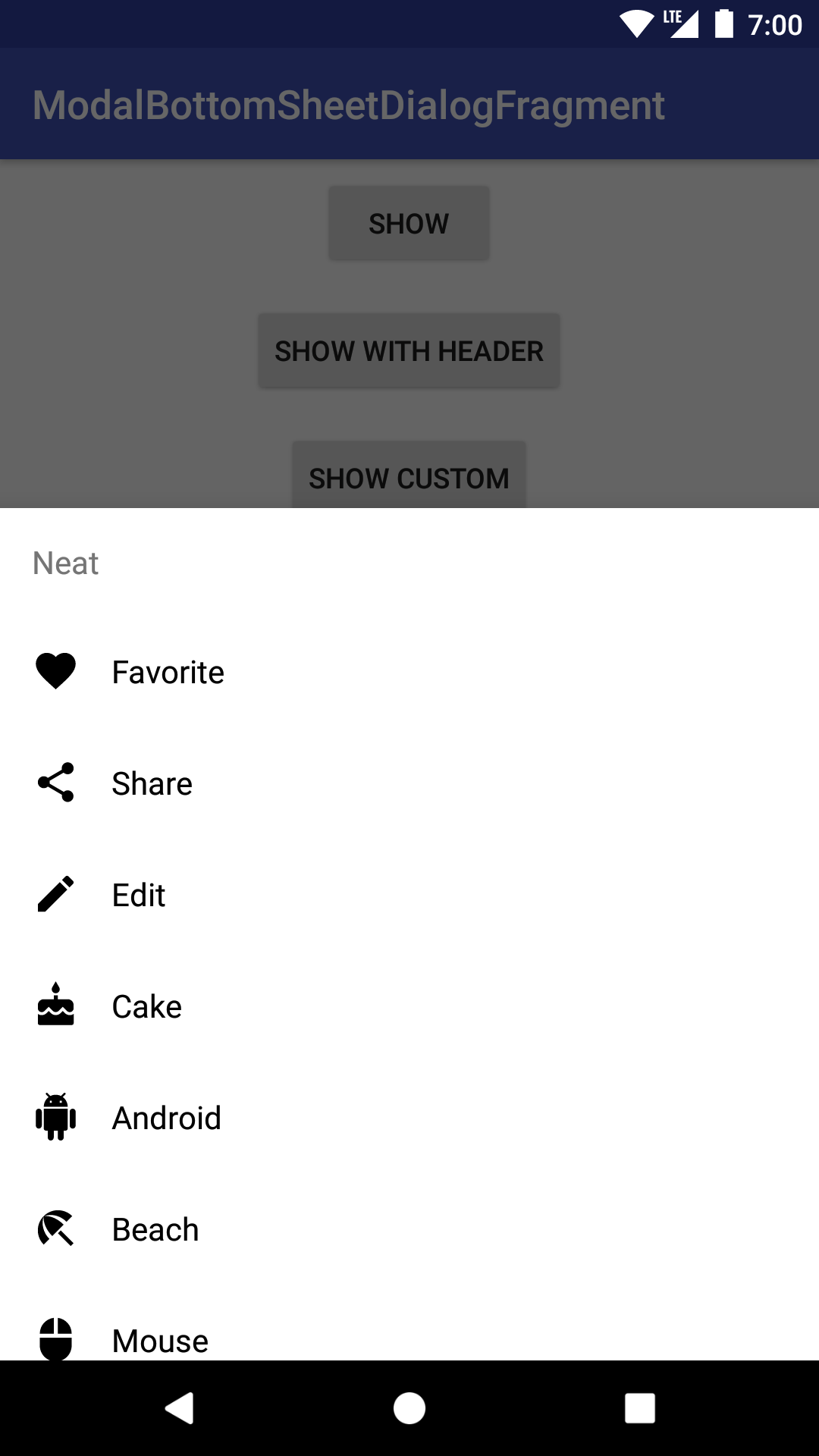
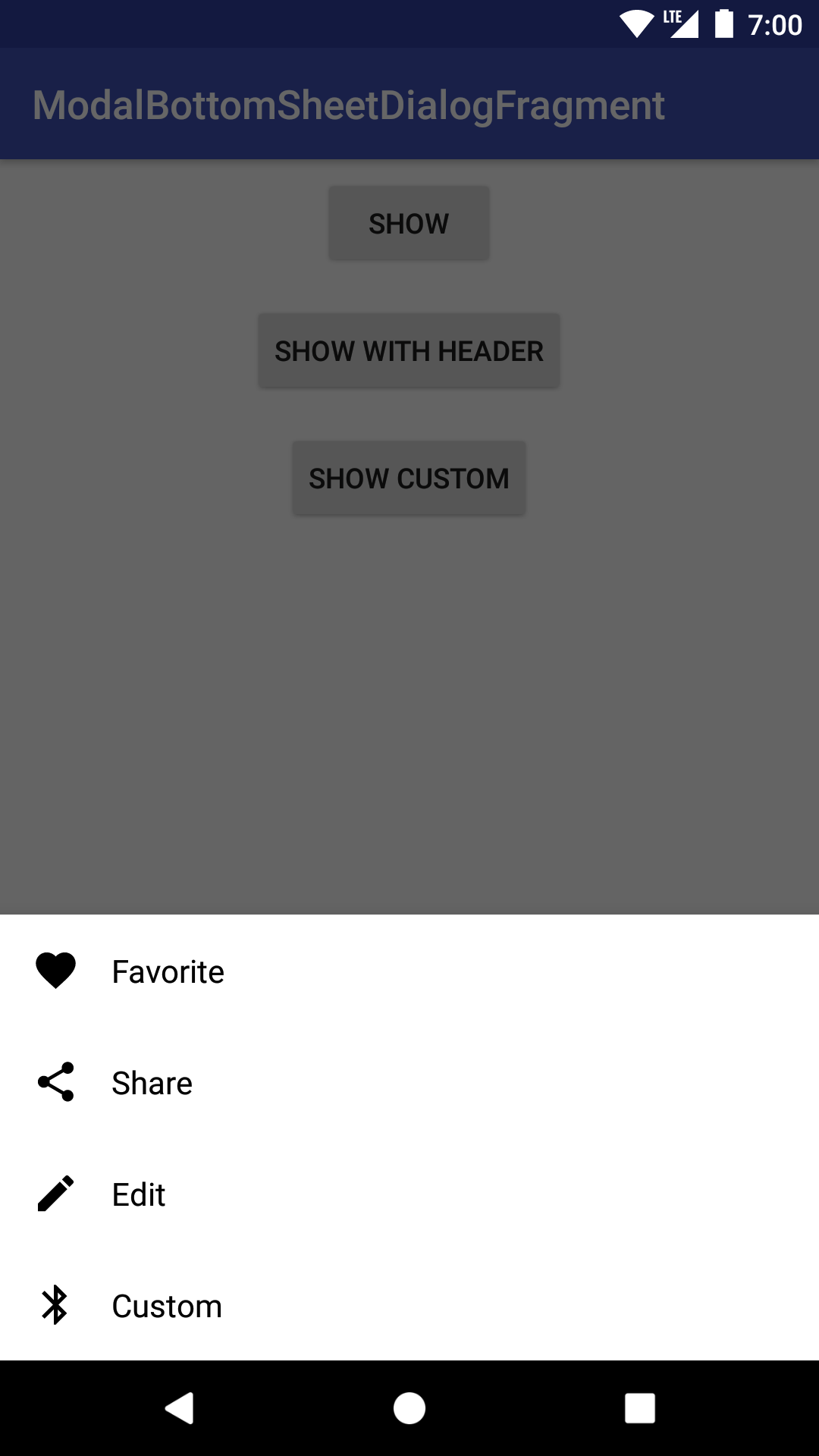
ModalBottomSheetDialogFragment
Modal bottom sheet dialog based on the Material Guidelines.
Usage
ModalBottomSheetDialogFragments are typically inflated via a menu item resource. The menu item resource defines the title, icon, and ID is of each Option. The menu item resource might looks something like this:
Use the builder to create and show the bottom sheet dialog:
Make sure that your activity or fragment implements ModalBottomSheetDialogFragment.Listener. For example:
You can also customize things to your liking:
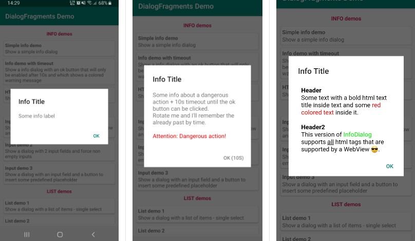
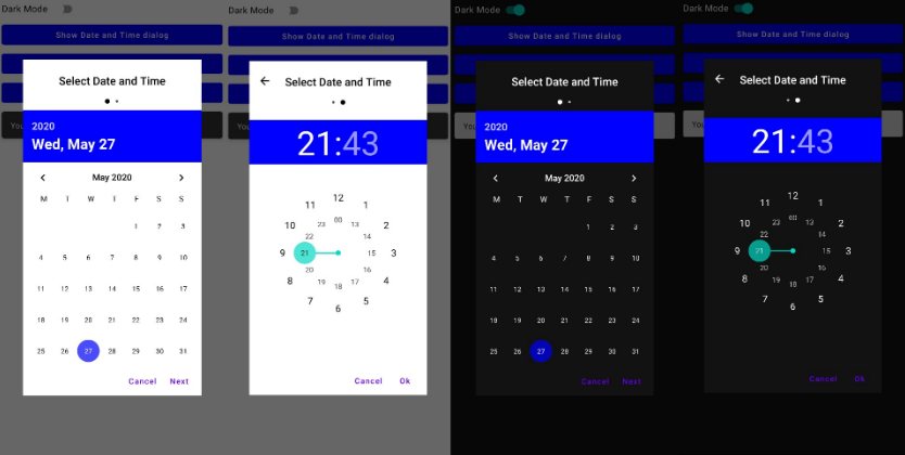
See the sample app for more.