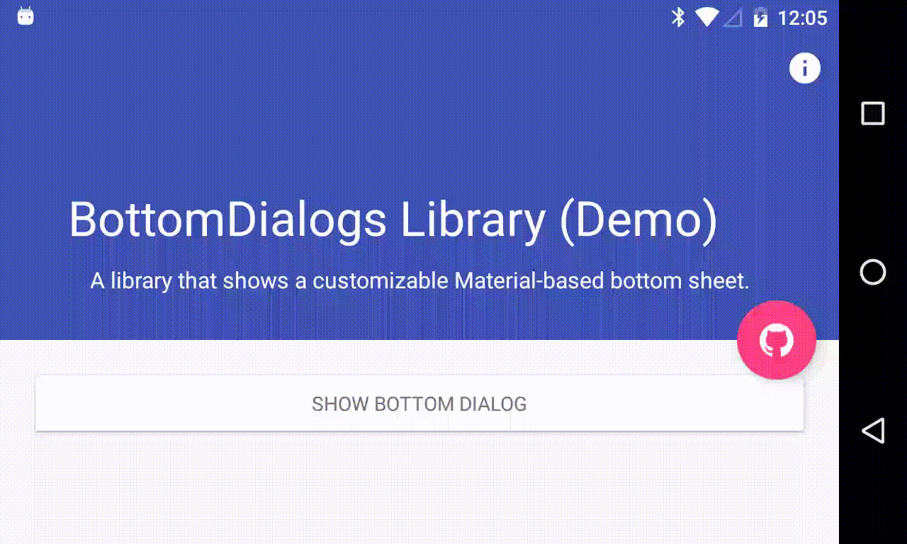
BottomDialogs

An Android library that shows a customizable Material-based bottom sheet. API 11+ required.

How to include

Add the repository to your project build.gradle:

repositories {
    maven {
        url "https://jitpack.io"
    }
}

And add the library to your module build.gradle:

dependencies {
    compile 'com.github.javiersantos:BottomDialogs:1.2.1'
}

Usage

Basic Bottom Dialog

A basic bottom dialog will be shown. You have access to methods such as setTitle(), setContent(), setIcon(), setCancelable(), dismiss(), etc. Customizations are explained below.

new BottomDialog.Builder(this)
	.setTitle("Awesome!")
	.setContent("What can we improve? Your feedback is always welcome.")
	.show();

or

BottomDialog bottomDialog = new BottomDialog.Builder(this)
	.setTitle("Awesome!")
	.setContent("What can we improve? Your feedback is always welcome.")
	.build();
...
bottomDialog.show();

Displaying an icon

The bottom dialog icon will be shown to the left of the title.

new BottomDialog.Builder(this)
	.setTitle("Awesome!")
	.setContent("What can we improve? Your feedback is always welcome.")
	.setIcon(R.drawable.ic_launcher)
	//.setIcon(ContextCompat.getDrawable(this, R.drawable.ic_launcher))
	.show();

Adding buttons and callbacks

Buttons are showed at the end of the bottom dialog. You can add your own text, colors and actions/callbacks.

new BottomDialog.Builder(this)
	.setTitle("Awesome!")
	.setContent("What can we improve? Your feedback is always welcome.")
	.setPositiveText("OK")
	.setPositiveBackgroundColorResource(R.color.colorPrimary)
	//.setPositiveBackgroundColor(ContextCompat.getColor(this, R.color.colorPrimary)
	.setPositiveTextColorResource(android.R.color.white)
	//.setPositiveTextColor(ContextCompat.getColor(this, android.R.color.colorPrimary)
	.onPositive(new BottomDialog.ButtonCallback() {
		@Override
		public void onClick(BottomDialog dialog) {
			Log.d("BottomDialogs", "Do something!");
		}
	}).show();
new BottomDialog.Builder(this)
	.setTitle("Awesome!")
	.setContent("What can we improve? Your feedback is always welcome.")
	.setNegativeText("Exit")
	.setNegativeTextColorResource(R.color.colorAccent)
	//.setNegativeTextColor(ContextCompat.getColor(this, R.color.colorAccent)
	.onNegative(new BottomDialog.ButtonCallback() {
		@Override
		public void onClick(BottomDialog dialog) {
			Log.d("BottomDialogs", "Do something!");
		}
	}).show();

If no onPositive() or onNegative() callbacks are provided, then the bottom dialog will be dismissed when tapping de button.

If autoDismiss() is turned false, then you must manually dismiss the dialog in these callbacks. Auto dismiss is true by default.

Dismissing when touching outside

The setCancelable() method lets you disable dismissing the bottom dialog when you tap outside the dialog window.

new BottomDialog.Builder(this)
	.setTitle("Awesome!")
	.setContent("What can we improve? Your feedback is always welcome.")
	.setCancelable(false)
	.show();

Adding a custom view

You can add custom view to your bottom dialog just by adding the layout to the setCustomView() method.

new BottomDialog.Builder(this)
	.setTitle("Awesome!")
	.setContent("What can we improve? Your feedback is always welcome.")
	.setCustomView(R.layout.my_custom_view)
	.show();

A detailed description is available at: https://github.com/javiersantos/BottomDialogs/wiki/Adding-a-custom-view

Adding a custom color and font

You can add custom colors and fonts to bottom dialog by using the view objects: getIconImageView(), getTitleTextView(), getContentTextView(), getNegativeButton() and getPositiveButton(). For example:

BottomDialog bottomDialog = BottomDialog.Builder(this)
	...
	.build();

bottomDialog.getTitleTextView().setTextColor(Color.parseColor("#8f000000"));
bottomDialog.getTitleTextView().setTypeface(BaseActivity.getFont(Fonts.SEMI_BOLD));
bottomDialog.show();

Third Party Bindings

React Native

You may now use this library with React Native via the module here

GitHub