CustomizableDialog
Lightweight library that allows you to use a Customizable Dialog instead of the boring and predefined AlertDialogs
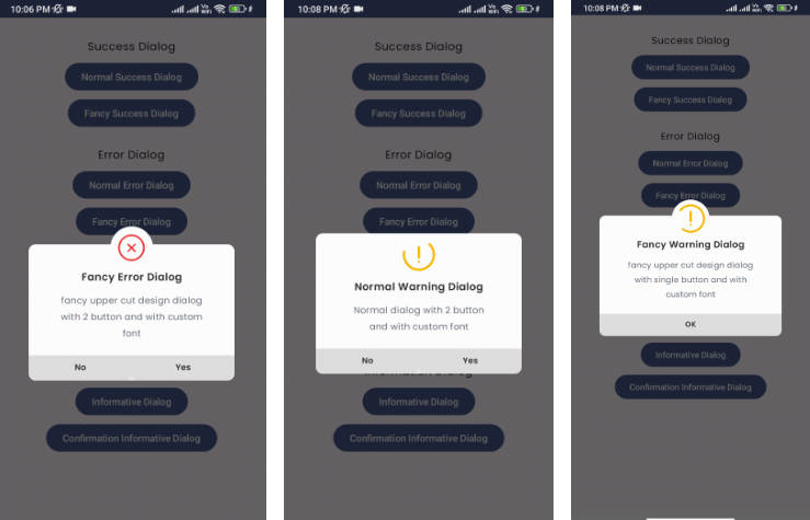
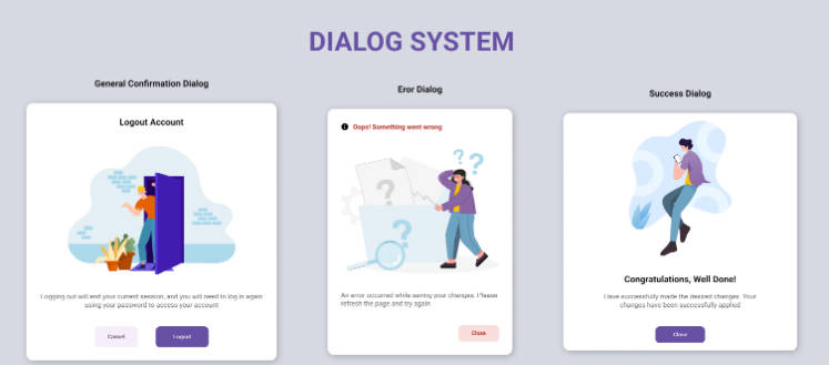
Example Designs


Add to the project
Step 1. Add it in your settings.gradle at the end of repositories:
maven { url ‘https://jitpack.io‘ }

Step 2. Add the dependency
implementation 'com.github.cnovaezDev:CustomizableDialog:1.0.1'

Example of use
 showGenericDialog(CustomizableDialogItem(
                    title = "App finished loading", //Title of the dialog
                    content = "All the data is ready to be used!", //Content of the dialog
                    cancelBtnLabel = "Nop", // Label of the cancel button
                    acceptBtnLabel = "Understood", //Label of the accept button
                    selectedMode = GenericModeType.info_type, //Predefined mode to use with design defined by default, optional and customizable.
                    twoButtons = true //Quantity of buttons to display, depending of the type of message that you want to display, is true by default.
                ),
                object : OnInteractionSelectedListener {
                    override fun onAccept(result: Any?) {
                        Toast.makeText(this@MainActivity, "Accept Button", Toast.LENGTH_LONG).show()
                        //Action to perform in case of the user pressing accept button
                    }

                    override fun onCancel(result: Any?) {
                        Toast.makeText(this@MainActivity, "Cancel Button", Toast.LENGTH_LONG).show()
                        //Action to perform in case of the user pressing the cancel button

                    }
                })
All the properties
CustomizableDialogItem(
                    title = "App finished loading", //Title of the dialog
                    content = "All the data is ready to be used!", //Content of the dialog
                    cancelBtnLabel = "Nop", // Label of the cancel button
                    acceptBtnLabel = "Understood", //Label of the accept button
                    selectedMode = GenericModeType.info_type, //Predefined mode to use with design defined by default, optional and customizable.
                    twoButtons = true, //Quantity of buttons to display, depending of the type of message that you want to display, is true by default.
                     acceptBtnCustomColor = R.color.blue, // Accept button color
                    cancelBtnCustomColor = R.color.red, // Cancel button color
                    titleTextColor = R.color.white, //Title text color
                    contentTextColor = R.color.black, //Content text color
                    customCardHeaderBackgroundColor = R.color.green, //Card header background color
                    image = GenericImageType.question_pic, // Predefine pics to choose from
                    customImage = R.drawable.info_pic, // A custom pic to be used, if especified the previous image property is ignored.
                )
Requirements
- kotlin version 1.6
- min sdk 23