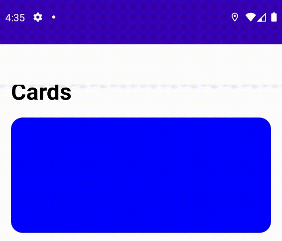
FadingToolbar
FadingToolbar is an animation library which fades out your footer view in a ScrollView/RecyclerView and fades in a toolbar title (analogue of the LargeTitle animation in iOS). Main points:
- Supports both XML and Compose.
- Easy to use – just pass your UI components and they will be animated right away
- Kotlin-based and lightweight.
Download
Add it in your root build.gradle at the end of repositories:
allprojects {
    repositories {
        ...
        maven { url 'https://jitpack.io' }
    }
}
Add the dependency (you can put one of them or include both)
dependencies {
    implementation 'com.github.PineapplePie.FadingToolbar:fadingtoolbar:1.0.1' // XML version
    implementation 'com.github.PineapplePie.FadingToolbar:fadingtoolbar-compose:1.0.1' // Compose version
}
Usage
For a full example take a look at the sample module.
Compose version
Compose version of the library consists of a custom LazyColumn container and simple configs for your texts. It supports all Text and LazyColumn parameters and settings.
// Toolbar title text customization

val topBarTextConfig = TextConfig.Builder()
    .textFontSize(20.sp)
    .textFontWeight(FontWeight.SemiBold)
    .textModifier(
        Modifier.padding(horizontal = 16.dp, vertical = 8.dp)
    )
    .build()

// Footer text customization

val footerTextConfig = TextConfig.Builder()
    .textFontSize(32.sp)
    .textFontWeight(FontWeight.Bold)
    .textModifier(
        Modifier.padding(horizontal = 16.dp, vertical = 8.dp)
    )
    .build()

FadingTopBarLazyColumn(
    listContent = {
        // your item or items here
        item {}
        item {}
        item {}
    },
    topBarText = "Your text here!", // your text here
    footerText = "Your second text here!", // your text here, but you can skip it if both texts are the same
    topBarTextConfig = topBarTextConfig,
    topBarBackgroundColor = Color.White, // your color here
    footerTextConfig = footerTextConfig,
 )
XML version
XML version of the library is implemented as a separate animator helper class. It supports ScrollView and RecyclerView set ups, but doesn’t provide basic containers compared to the Compose version.
RecyclerView
private val animator by lazy { FadingToolbarAnimator() }

private fun setupAnimator() = with(binding) {
    animator.bind(toolbar, recyclerView) // your Toolbar and RecyclerView here
}
ScrollView
private val animator by lazy { FadingToolbarAnimator() }

private fun setupAnimator() = with(binding) {
    animator.bind(toolbar, footerView, scrollView) // your Toolbar, footer View and RecyclerView here
}
License
FadingToolbar is licensed under the Apache License 2.0.


