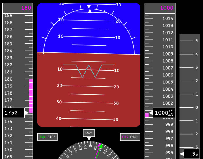
Primary Flight Display Library for Compose for Desktop

This library provides a customizable Primary Flight Display (PFD) built using Compose for Desktop. It features the following instruments:
- Altitude Indicator
- Bank Indicator
- Compass
- Artificial Horizon
- Speed Indicator
- Vertical Speed Indicator
Usage
@Composable
fun YourFlightScreen() {
    PrimaryFlightDisplay(
        roll = // roll angle in degrees,
        pitch = // roll angle in degrees
        heading = // heading in degrees
        track = // track in degrees
        course = // course over ground in degree
        altitude = // altitude (unitless)
        targetAltitude = // autopilot target altitude (unitless)
        speed = // speed (unitless)
        targetSpeed = // autopilot target speed (unitless)
        verticalSpeed = // vertical speed (unitless)
    )
}
Customization and Theming
Custom Indicators
You can customize the appearance and behavior of the PFD by passing in custom composables for each indicator:
PrimaryFlightDisplay(
    // ...other parameters,
    attitudeIndicator = { roll, pitch -> /* your custom composable */ },
    compass = { heading, track, course -> /* your custom composable */ },
    altitudeIndicator = { altitude, targetAltitude -> /* your custom composable */ },
    speedIndicator = { speed, targetSpeed -> /* your custom composable */ },
    verticalSpeedIndicator = { verticalSpeed -> /* your custom composable */ }
)
Theming
The PFD uses a custom theme that can be adjusted to fit your needs. The theme is divided into three main parts:
Colors
You can define a custom color scheme using the PfdColors data class:
data class PfdColors(
    val groundColor: Color,
    val skyColor: Color,
    val indicatorColor: Color,
    val bgColor: Color,
    val courseColor: Color,
    val trackColor: Color
)
PrimaryFlightDisplay(
    // ...other parameters,
    colors = defaultPfdColorScheme(groundColor = Color(0xA52A2A))
)
Dimensions
Customize the dimensions of various elements using the PfdDimensions data class:
data class PfdDimensions(
    val indicatorStrokeWidth: Dp,
    val indicatorSizeLong: Dp,
    val indicatorSizeShort: Dp,
    val spacingRegular: Dp,
    val spacingLarge: Dp
)
PrimaryFlightDisplay(
    // ...other parameters,
    dimensions = defaultPfdDimensions(indicatorStrokeWidth = 1.dp)
)
Typography
Text styles can be customized using the PfdTypography data class:
data class PfdTypography(
    val small: TextStyle,
    val regular: TextStyle,
    val large: TextStyle
)
PrimaryFlightDisplay(
    // ...other parameters,
    typography = defaultPfdTypography(
        regular = TextStyle(
            color = Color.White,
            fontFamily = FontFamily(Font(resource = "fonts/b612_mono_regular.ttf")),
            fontSize = TextUnit(12f, TextUnitType.Sp)
        )
    )
)