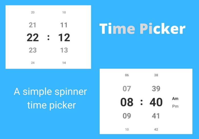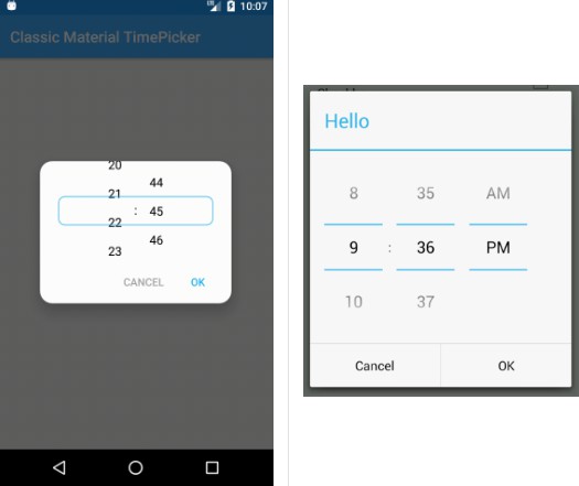
Classic Material TimePicker
Simple, customisable TimePicker created in the "old" Android API 16 style.
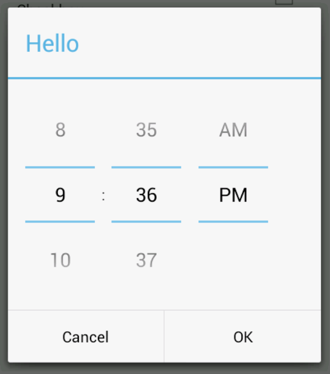
Restyled with Material 2.0 guidelines and powered by RecyclerView.
| Classic Material TimePicker | "Old" Android Api 16 TimePicker |
|---|---|
 |
 |
High Resolution Demo:
https://giant.gfycat.com/LastingImpassionedGelada.webm
Setup
This library is being distributed via JitPack
AndroidX libraries are required.
Step 1:
Add Jitpack repository in root build.gradle at the end of repositories:
Step 2:
Add dependency in app project:
Usage
See Sample App for full example.
Create and show time picker's CmtpDialogFragment:
Set initial time with setInitialTime12() or setInitialTime24() method:
Selected time can be retrieved with one of the listeners:
CmtpDialogFragment is being used as a host for CmtpTimePickerView view.
You can use this view by itself or host it in a different Android component (like Bottom Sheet)
Customization
Each element of the time picker can be customized:
Dialog background
Override following style in your app with your own background drawable:
Dialog positive/negative button text
Provide custom texts while creating DialogFragment's instance:
Dialog positive button style
Override following style in your app with your own text style:
Dialog negative button style
Override following style in your app with your own text style:
Custom text frame drawable, text color and size
Override following style in your app with your own text style: