Navigation Toolbar for Android
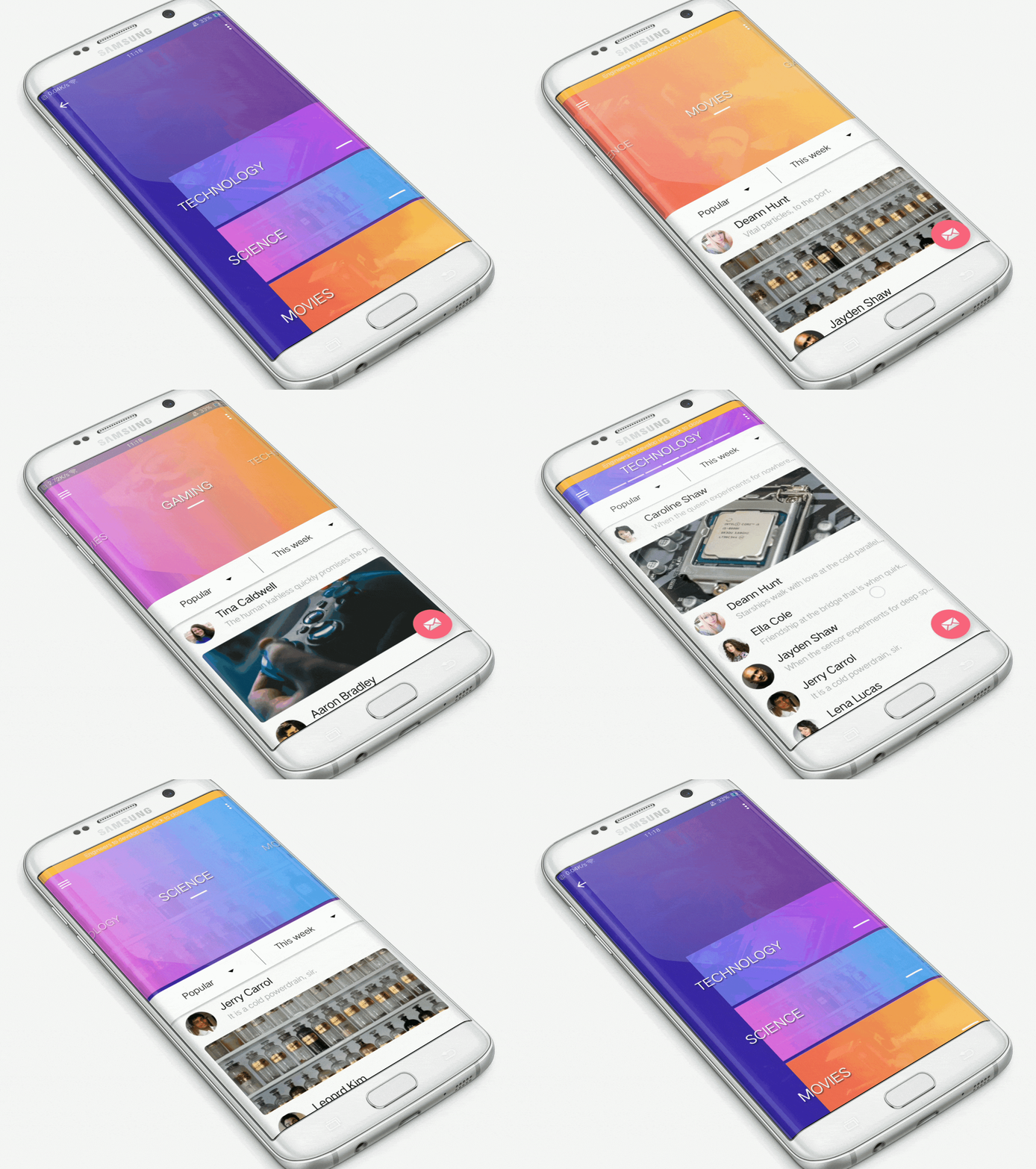
Navigation toolbar is a slide-modeled UI navigation controller made by @Ramotion
Looking for developers for your project?
This project is maintained by Ramotion, Inc. We specialize in the designing and coding of custom UI for Mobile Apps and Websites.

Requirements
- Android 5.0 Lollipop (API lvl 21) or greater
- Your favorite IDE
Installation
Just download the package from here and add it to your project classpath, or just use the maven repo:
Gradle:
SBT:
Maven:
Basic usage
NavigationToolBarLayout is the successor to CoordinatorLayout. Therefore, NavigationToolBarLayout
must be the root element of your layout. Displayed content must be inside
NavigationToolBarLayout, as shown below:
Next, you must specify an adapter for NavigationToolBarLayout, from which
NavigationToolBarLayout will receive the displayed View.
NavigationToolBarLayout contains android.support.v7.widget.Toolbar and
android.support.design.widget.AppBarLayout, access to which can be obtained through
the appropriate identifiers:
or through the appropriate properties of the NavigationToolBarLayout class:
Here are the attributes you can specify through XML or related setters:
headerOnScreenItemCount- The maximum number of simultaneously displayed cards (items) in vertical orientation.headerCollapsingBySelectDuration- Collapsing animation duration of header (HeaderLayout), when you click on the card in vertical orientation.headerTopBorderAtSystemBar- Align the top card on the systembar or not.headerVerticalItemWidth- Specifies the width of the vertical card. It can be equal tomatch_parent, then the width of the card will be equal to the width of NavigationToolBarLayout.headerVerticalGravity- Specifies the alignment of the vertical card. Can take the values: left, center, or right.


