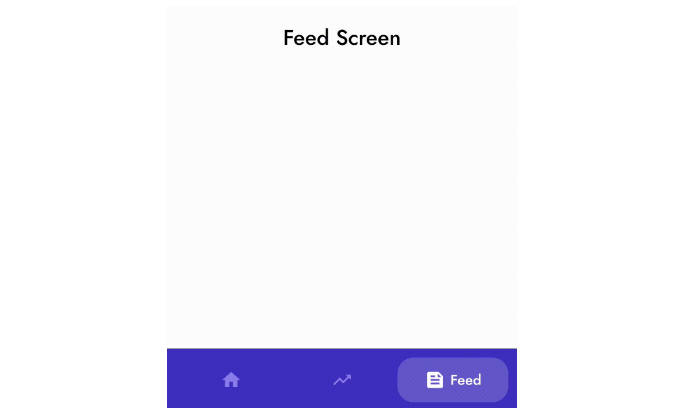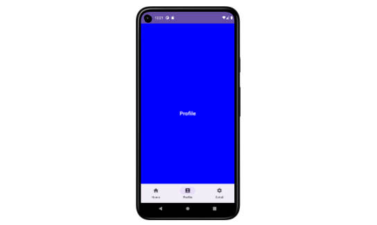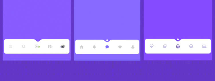

Animated Navigation Bar
AnimatedNavigationBar is a navigation bar with a number of preset animations written in Jetpack Compose
Usage
- Remember Int to store the current selection
var selectedIndex by remember { mutableStateOf(0) }
- Pass your buttons to the AnimatedNavigationBar
AnimatedNavigationBar(selectedIndex = selectedIndex) {
   Button1()
   Button2()
   Button3()
}
Required parameters
selectedIndex – binding to the current index
content – buttons to display in the tabbar
Additional parameters
barColor – Color of the navigation bar itself
ballColor – Ball indicator color
cornerRadius – The corner radius to all corners applied to the navigation bar
ballAnimation – Ball animation with the animation curve, default value Parabolic(tween(300))
Parabolic– Jump to the selected button following a parabolic arcTeleport– Disappear and quickly re-appear above selected tabStraight– Slide to the selected tab You can build your own animation, just implement theBallAnimationinterface.
indentAnimation – Indent animation with the animation curve, default value is Height(tween(300))
Height– Disappear by decreasing in height and quickly re-appear by increasing in height above the selected tabStraightIndent– Slide to the selected tab You can also build your own animation, just implement theIndentAnimationinterface.
Built-in animatable tab buttons
This library has two built-in button types you can use out-of-the-box:
DropletButton and WiggleButton, and a super custom ColorButton type in the Example project. Please feel free to use them in your projects or build your own buttons.
Download
Add the dependency in build.gradle file:
dependencies {
    implementation("com.exyte:animated-navigation-bar:1.0.0")
}
Acknowledgements
Many thanks to Yeasin Arafat for their beautiful original work that we recreated with JetpackCompose.