MaterialStyledDialogs
Android Library that shows a beautiful and customizable Material designed dialog with header. Based on material-dialogs and inspired by this dribbble.
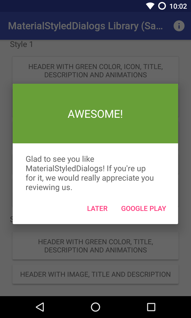
Sample Project
You can download the latest sample APK from Google Play:
How to include
Add the repository to your project build.gradle:
And add the library to your module build.gradle:
Usage
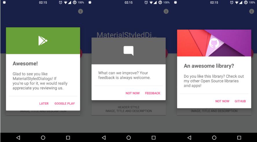
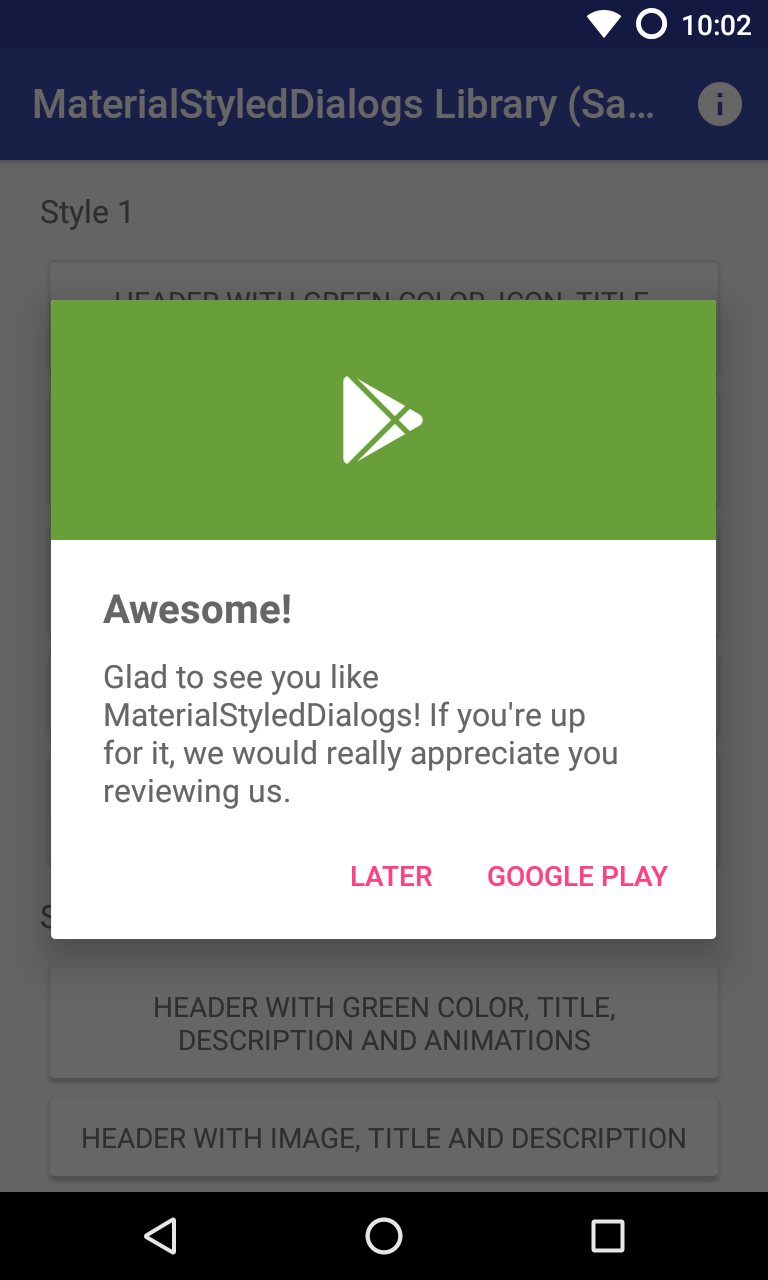
Basic Dialog
A basic dialog will show the provided title (optional) and description, using your primary color as the header background. You have access to methods such as setTitle(), setContent(), setIcon(), setCancelable(), dismiss(), etc. Customizations are explained below.
or using the builder...
Customizations (Wiki)
Setting a style
|
|
|---|---|
| Header with Icon (default): .setStyle(Style.HEADER_WITH_ICON) | Header with Title: .setStyle(Style.HEADER_WITH_TITLE) |
Displaying an icon
The dialog icon is displayed in the center of the dialog (as seen it the screenshots).
Using a custom header color
By default, your primary color will be used for the header background. However you can customize this by adding:
Using an image as the header background
Customize your dialog by adding a drawable instead of a color.
Adding a darker/grey overlay to the header background
Some icons or drawables may fit better when using a darker/grey overlay. Using the .withDarkerOverlay() method the library will apply a color filter to the header background. false by default.
Adding icon and dialog animations
An animation to the icon will be displayed when the dialog is opened. true by default.
The dialog will be displayed with an animation when it is opened and closed. false by default.
Adding buttons and callbacks
Buttons are showed at the end of the bottom dialog. You can add your own text and actions/callbacks.
If no onPositive(...), onNegative(...) or onNeutral(...) callbacks are provided, then the bottom dialog will be dismissed when tapping de button.
If autoDismiss() is turned false, then you must manually dismiss the dialog in these callbacks. Auto dismiss is true by default.
A divider before the buttons can be added using the .withDivider(true) method (false by default).
Dismissing when touching outside
The setCancelable() method lets you disable dismissing the bottom dialog when you tap outside the dialog window. true by default.
Adding a custom view
You can add custom view to your bottom dialog just by adding the layout to the setCustomView() method.
A detailed description is available at: https://github.com/javiersantos/MaterialStyledDialogs/wiki/Adding-a-custom-view
Making the content scrollable
If your dialog content is too long you may prefer to make it scrollable. By using the next method you can specify the minimum number of lines to show the scroll bar (5 lines by default).