ooltipPopupWord

ToolTipopupWordTV is an Open Source Android library, that allows you to easily open a popup like tooltip, fully customizable, with details about selected word from your text.

default-layout

custom_layout

Including in your project

Gradle

Add below codes to your root build.gradle file.

allprojects {
		repositories {
			...
			maven { url 'https://jitpack.io' }
		}
	}

And add a dependency code to your module's build.gradle file.

dependencies {
	        implementation 'com.github.EusebiuCandrea:ToolTipPopupWordTV:1.0.1'
	}

Features

  • Selectable word from text;
  • Show PopupWindow based on selected word;
  • Customizable textsize, typeface, color, backround and alignment;
  • Customizable ToolPopupWindows and Arrow
  • Customized layout.

Custom attributes for SelectableWordTextView

attribute name attribute description
highlightBackgroundColor The backround color of selected word.
highlightTextColor The text color of selected word.
setUnderline You can set a underline for selected word (true/false)

Usage

Basic Example (Kotlin)

Firstly, you need to add this custom text view to the layout of the class, with custom attributes

<com.ecandrea.library.tooltipopwordtv.wordTextView.SelectableWordTextView
        android:id="@+id/word"
        android:layout_width="match_parent"
        android:layout_height="wrap_content"
        android:layout_gravity="center"
        android:layout_margin="@dimen/space_30dp"
        android:textColor="@color/colorPrimaryDark"
        app:highlightBackgroundColor="@color/blue"
        app:highlightTextColor="@color/white"
        app:layout_constraintBottom_toBottomOf="parent"
        app:layout_constraintLeft_toLeftOf="parent"
        app:layout_constraintRight_toRightOf="parent"
        app:layout_constraintTop_toTopOf="parent"
        app:setUnderline="true" />

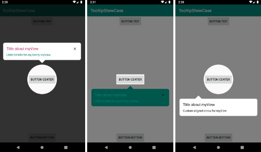
Here is a basic example of implementing ToolPopupWindows with a default layout using ToolPopupWindows.ToolTipBuilder class.

 word.apply {
        text = "Select a word from this example."
        setToolTipListener(object : SelectableWordListeners {
            override fun onWordSelected(anchorView: TextView, wordSelected: String, lineNumber: Int, width: Int) {
                val toolPopupWindows = ToolPopupWindows.ToolTipBuilder(this@MainActivity)
                    .setToolTipListener { Toast.makeText(applicationContext, "dismissed", Toast.LENGTH_SHORT).show() }
                    .setTitleTextColor(ContextCompat.getColor(this@MainActivity, R.color.colorAccent))
                    .setTitleTextSize(20f)
                    .setBackgroundColor(ContextCompat.getColor(this@MainActivity, R.color.colorPrimary))
                    .setIsOutsideTouchable(false)
                    .setArrowCustomizer(...)
                    .build()

                word.showToolTipWindow(anchorView, wordSelected, lineNumber, width, toolPopupWindows)
            }
        })
        }
        word.setBackgroundWordColor(ContextCompat.getColor(this, R.color.colorAccent))

Also, the arrow can be customized using an ArrowCustomizer.Builder class
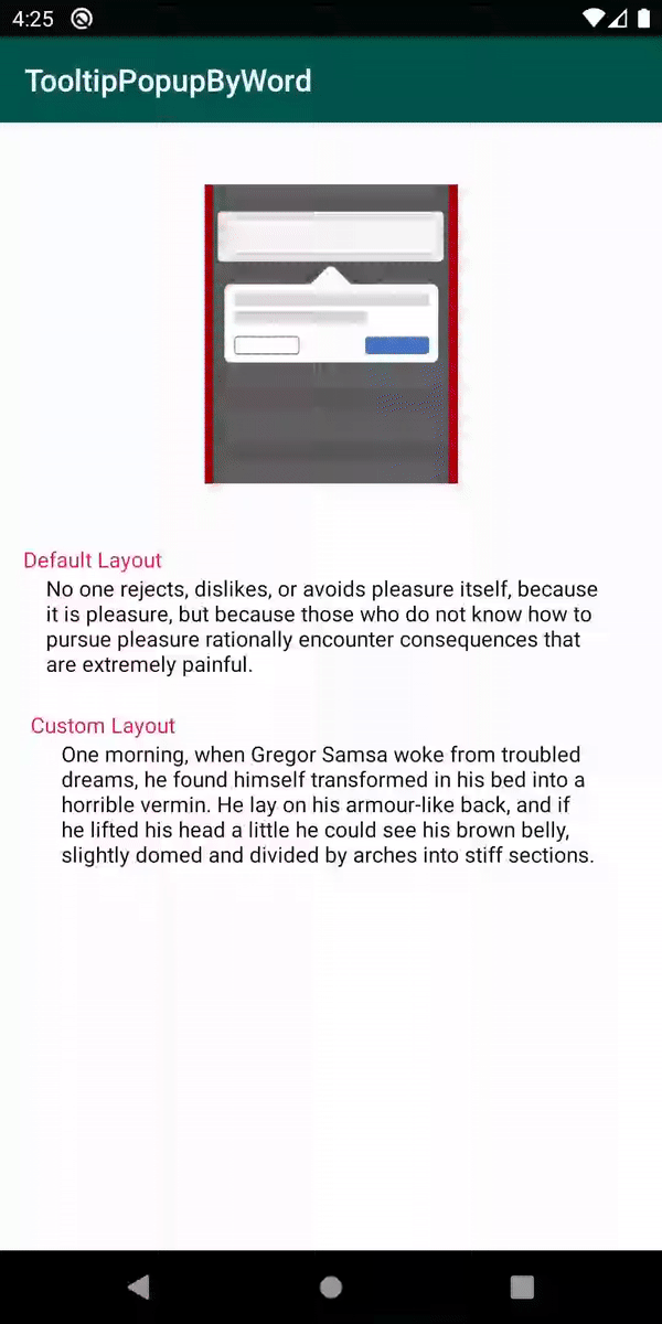
 ArrowCustomizer.Builder(this@MainActivity)
    .setArrowColor(ContextCompat.getColor(this@MainActivity, R.color.colorAccent))
    .setArrowSize(20)
    .build()

Customized layout

We can fully customize the ToolPopupWindows layout using below method.

 .setCustomLayout(R.layout.custom_layout)

This is an example of implementing custom ToolPopupWindows.

Firstly create an xml layout file like custom_layout.

   val toolPopupWindows = ToolPopupWindows.ToolTipBuilder(this@MainActivity)
        .setToolTipListener { Toast.makeText(applicationContext, "dismissed", Toast.LENGTH_SHORT).show() }
        .setCustomLayout(R.layout.custom_layout)
        .setAutoDismissDuration(1500)
        .setIsOutsideTouchable(false)
        .setArrowCustomizer(ArrowCustomizer.Builder(this@MainActivity)
                .setArrowColor(ContextCompat.getColor(this@MainActivity, R.color.colorAccent))
                .setArrowSize(20)
                .build())
        .build()

And next we can get the inflated custom layout using getCustomInflatedView method.

 val inflatedView = toolPopupWindows.getCustomInflatedView()
        inflatedView?.let {
            it.newText.text = wordSelected
            it.newDescription.text = "Press remove button to delete this word!"
            it.testButton.setOnClickListener {
                removedWord(anchorView, wordSelected, wordTwo)
                toolPopupWindows.dismissTooltip()
            }
        }

:warning: If you didn't added your custom layout this method can return null

ToolPopupWindows.ToolTipBuilder methods:

.setWidthPercentsFromScreen(value: Double)
.setBackgroundColor(value: Int)
.setBackgroundDrawable(@DrawableRes value: Int)
setTextTitle(value: String)
.setToolTipDescription(value: String)
.setTitleTextColor(@ColorInt value: Int)
.setTitleTextColorResource(@ColorRes value: Int)
.setTitleTextTypeface(value: Int)
.setTitleTextSize(@Sp value: Float)
.setDescriptionTextColor(@ColorInt value: Int)
// same for description
.setCustomLayout(value: Int)
.setAutoDismissDuration(value: Long)
.setIsOutsideTouchable(value: Boolean)
.setToolTipListener(listener: ToolTipListeners)
.setArrowCustomizer(value: ArrowCustomizer)
.setToolTipListener(unit: () -> Unit)
.build()

ArrowCustomizer.Builder methods:

.setArrowDrawable(value: Drawable?)
.setArrowDrawableResource(@DrawableRes value: Int)
.setArrowSize(@Px value: Int)
.setArrowColor(@ColorInt value: Int)
.setArrowColorResource(@ColorInt value: Int)
.setArrowVisibility(isVisible: Boolean)
.build()

Find this library useful?

Be free to use it and enjoy.

GitHub