Including in your project

Maven Central
Balloon

Gradle

Add below codes to your root build.gradle file (not your module build.gradle file).

allprojects {
    repositories {
        mavenCentral()
    }
}

And add a dependency code to your module's build.gradle file.

dependencies {
    implementation "com.github.skydoves:balloon:1.3.6"
}

SNAPSHOT

Balloon

Snapshots of the current development version of Balloon are available, which track the latest versions.

repositories {
   maven { url 'https://oss.sonatype.org/content/repositories/snapshots/' }
}

Usage

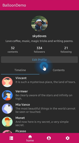
Basic Example for Java

Here is a basic example of implementing balloon popup with icon and text using Balloon.Builder class.

Balloon balloon = new Balloon.Builder(context)
    .setArrowSize(10)
    .setArrowOrientation(ArrowOrientation.TOP)
    .setArrowPositionRules(ArrowPositionRules.ALIGN_ANCHOR)
    .setArrowPosition(0.5f)
    .setWidth(BalloonSizeSpec.WRAP)
    .setHeight(65)
    .setTextSize(15f)
    .setCornerRadius(4f)
    .setAlpha(0.9f)
    .setText("You can access your profile from now on.")
    .setTextColor(ContextCompat.getColor(context, R.color.white_93))
    .setTextIsHtml(true)
    .setIconDrawable(ContextCompat.getDrawable(context, R.drawable.ic_profile))
    .setBackgroundColor(ContextCompat.getColor(context, R.color.colorPrimary))
    .setOnBalloonClickListener(onBalloonClickListener)
    .setBalloonAnimation(BalloonAnimation.FADE)
    .setLifecycleOwner(lifecycleOwner)
    .build();

Create using kotlin dsl

This is how to create Balloon instance using kotlin dsl.

val balloon = createBalloon(context) {
  setArrowSize(10)
  setWidth(BalloonSizeSpec.WRAP)
  setHeight(65)
  setArrowPosition(0.7f)
  setCornerRadius(4f)
  setAlpha(0.9f)
  setText("You can access your profile from now on.")
  setTextColorResource(R.color.white_93)
  setTextIsHtml(true)
  setIconDrawable(ContextCompat.getDrawable(context, R.drawable.ic_profile))
  setBackgroundColorResource(R.color.colorPrimary)
  setOnBalloonClickListener(onBalloonClickListener)
  setBalloonAnimation(BalloonAnimation.FADE)
  setLifecycleOwner(lifecycleOwner)
}

Width and height

We can handle sizes of the popup width and height using the below ways.

If we would not set any specific sizes of the width/height of the balloon, the size of the popup will be decided by the content.

Padding

Balloon wraps a content. We can control the content size of the balloon using padding of the content.

balloon.setPadding(6) // sets 6dp padding to all directions (left-top-right-bottom)
balloon.setPaddingLeft(8) // sets 8dp padding to content's left.
balloon.setPaddingTop(12) // sets 12dp padding to content's top.

Specific size

We can set the specific size of the balloon regardless size of the contents.

balloon.setWidth(220) // sets 220dp width size.
balloon.setHeight(160) // sets 160dp height size.
balloon.setWidth(BalloonSizeSpec.WRAP) // sets width size depending on the content's size.
balloon.setHeight(BalloonSizeSpec.WRAP) // sets height size depending on the content's size.

According to screen ratio

Also, we can set the width according to the ratio of the horizontal screen's size.
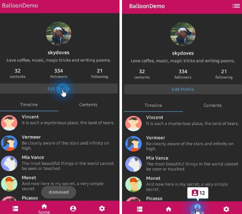
balloon.setWidthRatio(0.5f) // sets width as 50% of the horizontal screen's size.

Show and dismiss

This is how to show balloon popup and dismiss.

We can set the balloon popup's position using x-Offset and y-Offset attributes.

And show based on top/bottom/right/left alignment if we use showAlign__ method.

balloon.show(anchor: View) // shows the balloon on the center of an anchor view.
balloon.show(anchor: View, xOff: Int, yOff: Int) // shows the balloon on an anchor view with x-off and y-off.
balloon.showAlignTop(anchor: View) // shows the balloon on an anchor view as the top alignment.
balloon.showAlignTop(anchor: View, xOff: Int, yOff: Int) // shows top alignment with x-off and y-off.
balloon.showAlignBottom(anchor: View) // shows the balloon on an anchor view as the bottom alignment.
balloon.showAlignBottom(anchor: View, xOff: Int, yOff: Int) // shows bottom alignment with x-off and y-off.
balloon.showAlignRight(anchor: View) // shows the balloon on an anchor view as the right alignment.
balloon.showAlignRight(anchor: View, xOff: Int, yOff: Int) // shows right alignment with x-off and y-off.
balloon.showAlignLeft(anchor: View) // shows the balloon on an anchor view as the left alignment.
balloon.showAlignLeft(anchor: View, xOff: Int, yOff: Int) // shows left alignment with x-off and y-off.

Or we can show balloon popup using kotlin extension.

myButton.showAlignTop(balloon)

We can dismiss popup simply using Balloon.dismiss() method.

balloon.dismiss()
balloon.dismissWithDelay(1000L) // dismisses 1000 milliseconds later when the popup is shown

We can dismiss automatically some milliseconds later when the popup is shown using

setAutoDismissDuration method on Balloon.Builder.

Balloon.Builder(context)
   // dismisses automatically 1000 milliseconds later when the popup is shown.
   .setAutoDismissDuration(1000L)
   ...

Show sequentially

We can show balloon popup sequentially using relayShow method.

The relayShow method makes that setOnDismissListener of the first balloon is reset to show the

next balloon and returns an instance of the next balloon.

customListBalloon
  .relayShowAlignBottom(customProfileBalloon, circleImageView) // relay to customListBalloon
  .relayShowAlignTop(customTagBalloon, bottomNavigationView, 130, 0) // relay to customProfileBalloon

// show sequentially customListBalloon-customProfileBalloon-customTagBalloon
customListBalloon.showAlignBottom(toolbar_list)

Margin

If the location of the balloon according to the anchor is located at the boundaries on the screen,

the balloon will be stick to the end of the screen. In that case, we can resolve by giving margins to the balloon.

.setMargin(12) // sets the margin on the balloon all directions.
.setMarginLeft(14) // sets the left margin on the balloon.
.setMarginRight(14) // sets the right margin on the balloon.

Arrow Composition

We can customize the arrow on the balloon popup.

.setIsVisibleArrow(true) // sets the visibility of the arrow.
.setArrowSize(10) // sets the arrow size.
.setArrowSize(BalloonSizeSpec.WRAP) // sets arrow size depending on the original resources' size.
.setArrowPosition(0.8f) // sets the arrow position using the popup size's ratio (0 ~ 1.0)
.setArrowOrientation(ArrowOrientation.TOP) // sets the arrow orientation. top, bottom, left, right
.setArrowDrawable(ContextCompat.getDrawable(context, R.drawable.arrow)) // sets the arrow drawable.

ArrowPositionRules

We can determine the position of the arrow depending on the aligning rules using the ArrowPositionRules.

// Align the arrow position depending on an anchor.
// if `arrowPosition` is 0.5, the arrow will be located in the middle of an anchor.
.setArrowPositionRules(ArrowPositionRules.ALIGN_ANCHOR) // default

// Align the arrow position depending on the balloon popup body.
// if `arrowPosition` is 0.5, he arrow will be located in the middle of the tooltip.
.setArrowPositionRules(ArrowPositionRules.ALIGN_BALLOON)

ArrowOrientationRules

We can determine the orientation of the arrow depending on the aligning rules using the ArrowOrientationRules.

// Align depending on the position of an anchor.
// For example, `arrowOrientation` is ArrowOrientation.TOP and 
// we want to show up the balloon under an anchor using the `Balloon.showAlignBottom`.
// However, if there is not enough free space to place the tooltip at the bottom of the anchor,
// tooltips will be placed top of the anchor and the orientation of the arrow will be `ArrowOrientation.BOTTOM`.
.setArrowOrientationRules(ArrowOrientationRules.ALIGN_ANCHOR) // default

// Align to fixed ArrowOrientation value.
.setArrowOrientationRules(ArrowOrientationRules.ALIGN_FIXED)

Below previews are implemented using setArrowOrientation and setArrowPosition methods.

setArrowPosition measures the balloon popup size and sets the arrow's position using the ratio value.

Orientation: BOTTOM
Position: 0.62
showAlignTop
Orientation: TOP
Position : 0.5
showAlignBottom
Orientation: LEFT
Position: 0.5
showAlignRight
Orientation: RIGHT
Position: 0.5
showAlignLeft

Text Composition

We can customize the text on the balloon popup.

.setText("You can edit your profile now!")
.setTextSize(15f)
.setTextTypeface(Typeface.BOLD)
.setTextColor(ContextCompat.getColor(context, R.color.white_87))

If your text has HTML in it, you can enable HTML rendering by adding this:

.setTextIsHtml(true)

This will parse the text using Html.fromHtml(text).

TextForm

TextFrom is an attribute class that has some attributes about TextView for customizing popup text.

TextForm textForm = new TextForm.Builder(context)
  .setText("This is a TextForm")
  .setTextColorResource(R.color.colorPrimary)
  .setTextSize(14f)
  .setTextTypeface(Typeface.BOLD)
  .build();

builder.setTextForm(textForm);

This is how to create TextForm using kotlin dsl.

val form = textForm(context) {
  text = "This is a TextForm"
  textColor = ContextCompat.getColor(context, com.skydoves.balloondemo.R.color.white_87)
  textSize = 14f
  textTypeface = Typeface.BOLD
}

Icon Composition

We can customize the icon on the balloon popup.

.setIconSpace(10) // sets right margin of the icon.
.setIconSize(20) // sets size of the icon.
.setIconDrawable(ContextCompat.getDrawable(context, R.drawable.ic_edit)) // sets a drawable resource.

IconForm

IconForm is an attribute class that has some attributes about ImageView for customizing popup icon.

IconForm iconForm = new IconForm.Builder(context)
  .setDrawable(ContextCompat.getDrawable(context, R.drawable.arrow))
  .setIconColor(ContextCompat.getColor(context, R.color.colorPrimary))
  .setIconSize(20)
  .setIconSpace(12)
  .build();
  
builder.setIconForm(iconForm);

This is how to create IconForm using kotlin dsl.

val form = iconForm(context) {
  drawable = ContextCompat.getDrawable(context, R.drawable.arrow)
  iconColor = ContextCompat.getColor(context, R.color.skyblue)
  iconSize = 20
  iconSpace = 12
}

OnBalloonClickListener, OnBalloonDismissListener, OnBalloonOutsideTouchListener

We can listen to the balloon popup is clicked, dismissed or touched outside using listeners.

balloon.setOnBalloonClickListener(new OnBalloonClickListener() {
  @Override
  public void onBalloonClick() {
    // doSomething;
  }
});
    
balloon.setOnBalloonDismissListener(new OnBalloonDismissListener() {
  @Override
  public void onBalloonDismiss() {
    // doSomething;
  }
});

balloon.setOnBalloonOutsideTouchListener(new OnBalloonOutsideTouchListener() {
  @Override
  public void onBalloonOutsideTouch() {
    // doSomething;
  }
});

We can simplify it using kotlin.

.setOnBalloonClickListener { Toast.makeText(context, "clicked", Toast.LENGTH_SHORT).show() }
.setOnBalloonDismissListener { Toast.makeText(context, "dismissed", Toast.LENGTH_SHORT).show() }
.setOnBalloonOutsideTouchListener { Toast.makeText(context, "touched outside", Toast.LENGTH_SHORT).show() }

Customized layout

We can fully customize the balloon layout using below method.

.setLayout(R.layout.my_balloon_layout)

This is an example of implementing custom balloon popup.

Firstly create an xml layout file like layout_custom_profile on your taste.

val balloon = Balloon.Builder(context)
      .setLayout(R.layout.layout_custom_profile)
      .setArrowSize(10)
      .setArrowOrientation(ArrowOrientation.TOP)
      .setArrowPosition(0.5f)
      .setWidthRatio(0.55f)
      .setHeight(250)
      .setCornerRadius(4f)
      .setBackgroundColor(ContextCompat.getColor(this, R.color.black))
      .setBalloonAnimation(BalloonAnimation.CIRCULAR)
      .setLifecycleOwner(lifecycleOwner)
      .build()

And next we can get the inflated custom layout using getContentView method.

val button: Button = 
  balloon.getContentView().findViewById(R.id.button_edit)
button.setOnClickListener {
  Toast.makeText(context, "Edit", Toast.LENGTH_SHORT).show()
  balloon.dismiss()
}

Persistence

If you want to show-up the balloon popup only once or a specific number of times, here is how to implement it simply.

.setPreferenceName("MyBalloon") // sets preference name of the Balloon.
.setShowCounts(3) // show-up three of times the popup. the default value is 1.
.runIfReachedShowCounts {
  // do something after the preference showing counts is reached the goal.
}

But you can implement it more variously using Only.

only("introPopup", times = 3) {
  onDo { balloon.showAlignTop(anchor) }
}

Avoid Memory leak

Dialog, PopupWindow and etc.. have memory leak issue if not dismissed before activity or fragment are destroyed.

But Lifecycles are now integrated with the Support Library since Architecture Components 1.0 Stable released.

So we can solve the memory leak issue so easily.

Just use setLifecycleOwner method. Then dismiss method will be called automatically before activity or fragment would be destroyed.

.setLifecycleOwner(lifecycleOwner)

Lazy initialization

We can initialize the balloon property lazily using balloon keyword and Balloon.Factory abstract class.

The balloon extension keyword can be used on Activity, Fragment, and View.

Before

CustomActivity.kt

class CustomActivity : AppCompatActivity() {
  private val profileBalloon by lazy { BalloonUtils.getProfileBalloon(context = this, lifecycleOwner = this) }

  // ...
}

After

CustomActivity.kt

class CustomActivity : AppCompatActivity() {
  private val profileBalloon by balloon<ProfileBalloonFactory>()

  // ...
}

We should create a class which extends Balloon.Factory.

An implementation class of the factory must have a default(non-argument) constructor.


ProfileBalloonFactory.kt

class ProfileBalloonFactory : Balloon.Factory() {

  override fun create(context: Context, lifecycle: LifecycleOwner): Balloon {
    return createBalloon(context) {
      setLayout(R.layout.layout_custom_profile)
      setArrowSize(10)
      setArrowOrientation(ArrowOrientation.TOP)
      setArrowPosition(0.5f)
      setWidthRatio(0.55f)
      setHeight(250)
      setCornerRadius(4f)
      setBackgroundColor(ContextCompat.getColor(context, R.color.background900))
      setBalloonAnimation(BalloonAnimation.CIRCULAR)
      setLifecycleOwner(lifecycle)
    }
  }
}

BalloonOverlay

We can show an overlay window over the whole screen except an anchor view.

.setIsVisibleOverlay(true) // sets the visibility of the overlay for highlighting an anchor.
.setOverlayColorResource(R.color.overlay) // background color of the overlay using a color resource.
.setOverlayPadding(6f) // sets a padding value of the overlay shape internally.
.setBalloonOverlayAnimation(BalloonOverlayAnimation.FADE) // default is fade.
.setDismissWhenOverlayClicked(false) // disable dismissing the balloon when the overlay is clicked.

We can change the shape of the highlighting using .setOverlayShape.

.setOverlayShape(BalloonOverlayOval) // default shape
.setOverlayShape(BalloonOverlayRect)
.setOverlayShape(BalloonOverlayCircle(radius = 36f))
.setOverlayShape(BalloonOverlayRoundRect(12f, 12f))
OVAL CIRCLE RECT ROUNDRECT

And we can set the specific position of the overlay shape using the below method.
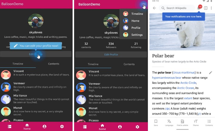
.setOverlayPosition(Point(x, y)) // sets a specific position of the overlay shape.

BalloonAnimation

We can implement popup animations when showing and dismissing.

BalloonAnimation.NONE
BalloonAnimation.FADE
BalloonAnimation.OVERSHOOT
BalloonAnimation.ELASTIC
BalloonAnimation.CIRCULAR
FADE OVERSHOOT ELASTIC CIRCULAR

Balloon builder methods

We can reference all kinds and descriptions of functions details here.

.setWidth(value: Int)
.setWidthRatio(@FloatRange(from = 0.0, to = 1.0) value: Float)
.setHeight(value: Int)
.setSize(value: Int, value: Int)
.setSpace(value: Int)
.setPadding(value: Int)
.setPaddingLeft(value: Int)
.setPaddingTop(value: Int)
.setPaddingRight(value: Int)
.setPaddingBottom(value: Int)
.setMargin(value: Int)
.setMarginLeft(value: Int)
.setMarginTop(value: Int)
.setMarginRight(value: Int)
.setMarginBottom(value: Int)
.setElevation(value: Int)
.setIsVisibleArrow(value: Boolean)
.setArrowSize(value: Int)
.setArrowPosition(@FloatRange(from = 0.0, to = 1.0) value: Float)
.setArrowOrientation(value: ArrowOrientation)
.setArrowPositionRules(ArrowPositionRules.ALIGN_ANCHOR)
.setArrowColor(value: Int)
.setArrowColorResource(@ColorRes value: Int)
.setArrowDrawable(value: Drawable?)
.setArrowDrawableResource(@DrawableRes value: Int)
.setArrowAlignAnchorPadding(value: Int)
.setArrowAlignAnchorPaddingRatio(value: Float)
.setBackgroundColor(value: Int)
.setBackgroundColorResource(@ColorRes value: Int)
.setBackgroundDrawable(value: Drawable?)
.setBackgroundDrawableResource(@DrawableRes value: Int)
.setCornerRadius(value: Float)
.setText(value: String)
.setTextResource(value: Int)
.setTextColor(value: Int)
.setTextColorResource(value: Int)
.setTextSize(value: Float)
.setTextTypeface(value: Int)
.setTextGravity(value: Int)
.setTextForm(value: TextForm)
.setIconDrawable(value: Drawable?)
.setIconDrawableResource(@DrawableRes value: Int)
.setIconSize(value: Int)
.setIconWidth(value: Int)
.setIconHeight(value: Int)
.setIconColor(value: Int)
.setIconColorResource(@ColorRes value: Int)
.setIconSpace(value: Int)
.setIconForm(value: IconForm)
.setIconGravity(value: IconGravity)
.setAlpha(@FloatRange(from = 0.0, to = 1.0) value: Float)
.setLayout(@LayoutRes layout: Int)
.setIsVisibleOverlay(value: Boolean)
.setOverlayColor(@ColorInt value: Int)
.setOverlayColorResource(@ColorRes value: Int)
.setOverlayPadding(@Dp value: Float)
.setOverlayPosition(value: Point)
.setOverlayShape(value: BalloonOverlayShape)
.setPreferenceName(value: String)
.setShowCount(value: Int)
.setFocusable(value: Boolean)
.setLifecycleOwner(value: LifecycleOwner)
.setDismissWhenClicked(value: Boolean)
.setDismissWhenLifecycleOnPause(value: Boolean)
.setDismissWhenTouchOutside(value: Boolean)
.setDismissWhenShowAgain(value: Boolean)
.setDismissWhenOverlayClicked(value: Boolean)
.setBalloonAnimation(value: BalloonAnimation)
.setOnBalloonClickListener(value: OnBalloonClickListener)
.setOnBalloonDismissListener(value: OnBalloonDismissListener)
.setOnBalloonInitializedListener(value: OnBalloonInitializedListener)
.setOnBalloonOutsideTouchListener(value: OnBalloonOutsideTouchListener)
.setOnBalloonOverlayClickListener(value: OnBalloonOverlayClickListener)
.setDismissWhenTouchOutside(value: Boolean)

GitHub

https://github.com/skydoves/balloon