Showcase

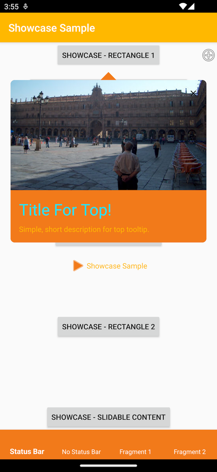
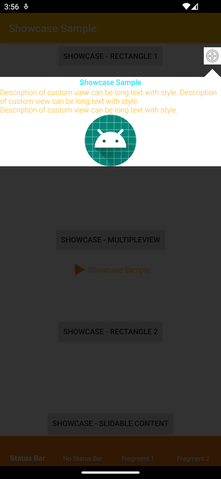
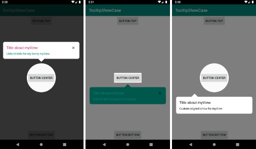
With Showcase, you can easily show tooltips. Showcase will highlight the view and show tooltip on it. You can customize title and description text fields, backgrounds and arrow positions. Also you can have callback when user quits from Showcase.
Installation
- To implement Showcase to your Android project via Gradle, you need to add Jitpack repository to your root build.gradle.
allprojects {
    repositories {
        ...
        maven { url 'https://jitpack.io' }
    }
}
- After adding Jitpack repository, you can add Showcase dependency to your app level build.gradle.
dependencies {
    implementation 'com.github.mohammadfrh:showCase:1.0.0'
}
⚠️ To use Showcase, you need to enable dataBinding from your main project’s build.gradle.
Usage
You can easily use ShowcaseManager.Builder to create Showcase.
val showcaseManager = ShowcaseManager.Builder()
    .view(myView)
    .titleText("Title about myView")
    .descriptionText("Little bit info for my lovely myView")
    .titleTextSize(22F)
    .titleTextColor(ContextCompat.getColor(this, R.color.blue))
    .windowBackgroundAlpha(127)
    .arrowPosition(ArrowPosition.DOWN)
    .resId(R.style.Showcase_Theme)
    .build()

showcaseManager.show(context)
Builder Configuration
| Usage | Description | Optional | Default Value | StyleRes |
|---|---|---|---|---|
builder.view(View) |
view to be focused on | no | null | no |
builder.resId(Int) |
Showcase.Theme style | yes | null | yes |
builder.titleText(String) |
text to be showed on top of the tooltip | yes | “” | no |
builder.descriptionText(String) |
description text will be displayed on tooltip | yes | “” | no |
builder.titleTextColor(Int) |
titleText’s color | yes | Color.BLACK | yes |
builder.descriptionTextColor(Int) |
descriptionText’s color | yes | Color.BLACK | yes |
builder.titleTextSize(Int) |
titleText’s text size in SP | yes | 18 SP | no |
builder.descriptionTextSize(Int) |
descriptionText’s text size in SP | yes | 14 SP | no |
builder.backgroundColor(Int) |
background color of tooltip | yes | Color.WHITE | yes |
builder.closeButtonColor(Int) |
closeButton’s color | yes | Color.BLACK | yes |
builder.showCloseButton(Boolean) |
show close button on tooltip | yes | true | yes |
builder.ArrowPosition(ArrowPosition) |
arrow can be placed under or over the tooltip | yes | ArrowPosition.AUTO | no |
builder.highlightType(HighlightType) |
view can be highlighted with a circle shape or rectangle | yes | HighlightType.RECTANGLE | no |
builder.cancelListener(CancelListener) |
will be called after user quit from tooltip | yes | null | no |
builder.arrowPercentage(Int) |
arrow position percentage can be decided | yes | null | no |
builder.windowBackgroundColor(Int) |
background of the window’s color can be decided | yes | Color.BLACK | yes |
builder.windowBackgroundTint(Int) |
alpha value of window’s background color | yes | 204 | no |
builder.titleTextSize(Int) |
titleText’s text size in SP | yes | 18 | no |
builder.cancellableFromOutsideTouch(Boolean) |
outside touch from tooltip will act as close click | yes | no | yes |
builder.build() |
will return ShowcaseManager instance | no | ||
showcaseManager.show(Context) |
show the tooltip with set attributes on | no |