DeterminateProgressView
This view is meant to be a customizable determinate progress view like the standard android indeterminate progress bar, but highly customizable
It is built with Kotlin and supports heavy customization options and a convenient way to animate progress automatically. You can use XML and Kotlin/Java functions to customize it. You can check out the very robust demo app over here
Installing
- Add the JitPack repo to your project level build.gradle
allprojects {
	repositories {
		...
		maven { url 'https://jitpack.io' }
	}
}
- Add the library to your app build.gradle
dependencies {
    implementation 'com.github.owl-93:DeterminateProgressView:v1.0'
}
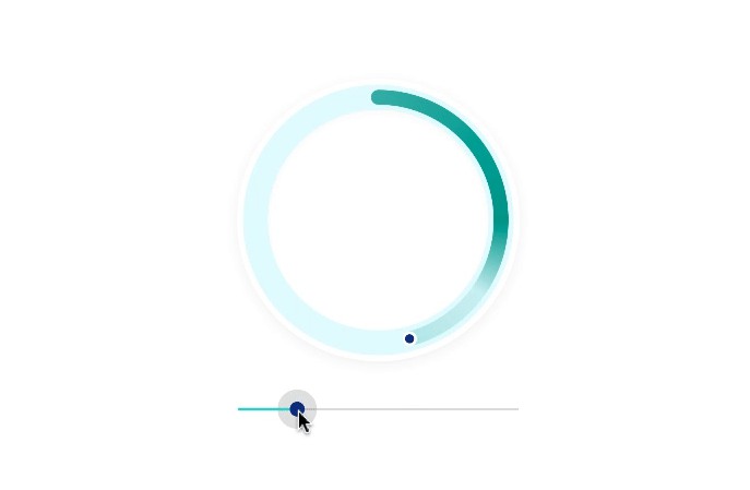
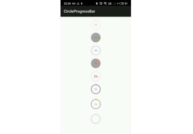
Example GIFS
General options

Styling options

Text Styling options

More Examples


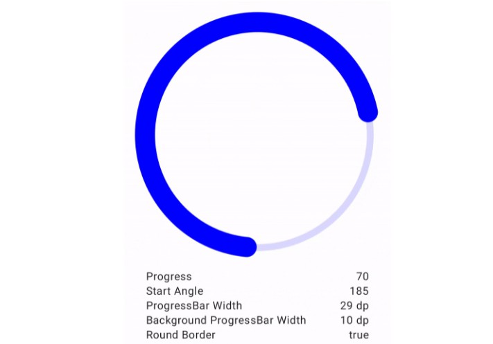
Progress Bar Attributes
| Attribute | XML attr | XML Type | XML Values | Kotlin field | Kotlin Type | Kotlin Values | Default Value |
|---|---|---|---|---|---|---|---|
| Progress | progress | float | 0 - maxValue | progress | Float | 0f - maxValue | maxValue |
| Max Value | maxValue | float | >0 | maxValue | Float | > 0f | 100f |
| Stroke Width | strokeWidth | dimen | >0 | strokeWidth | Float | > 0f | 20f |
| Stroke Color | strokeColor | color | @color, #hexcolor | strokeColor | Int | - | @colorPrimary |
| Draw Track | drawTrack | boolean | "true", "false" | drawTrack | Boolean | - | true |
| Track Color | trackColor | color | @color, #hexcolor | trackColor | Int | - | @colorPrimary |
| Track Width | trackWidth | dimen | @dimen, >= 0 | trackWidth | Float | - | strokeWidth/2 |
| Track Alpha | trackAlpha | float | >= 0 | trackAlpha | Int | - | 100 |
| Starting Angle | startingAngle | integer | >= 0 | startingAngle | Int | >=0f | 0 |
| Direction | direction | enum | "ccw", "cw" | direction | Direction | Direction | Direction.CW |
| Progress Anim. Duration | animateProgressDuration | integer | >0 | animationDuration | Long | >0f | 400L |
| Progress Anim. Interpolator | animationInterpolator | enum | "decelerate", "accelerate", "accelerate_decelerate", "linear", "anticipate", "overshoot", "anticipate_overshoot" | animationInterpolator | Animation.Interpolator | Animation.Interpolator | DeclerateInterpolator |
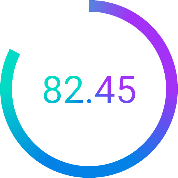
| Stroke Gradient Start Color | gradientStartColor | color | @color, #hexcolor | gradientStartColor | Int | - | - |
| Stroke Gradient Center Color | gradientCenterColor | color | @color, #hexcolor | gradientCenterColor | Int | - | - |
| Stroke Gradient End Color | gradientEndColor | color | @color, #hexcolor | gradientEndColor | Int | - | - |
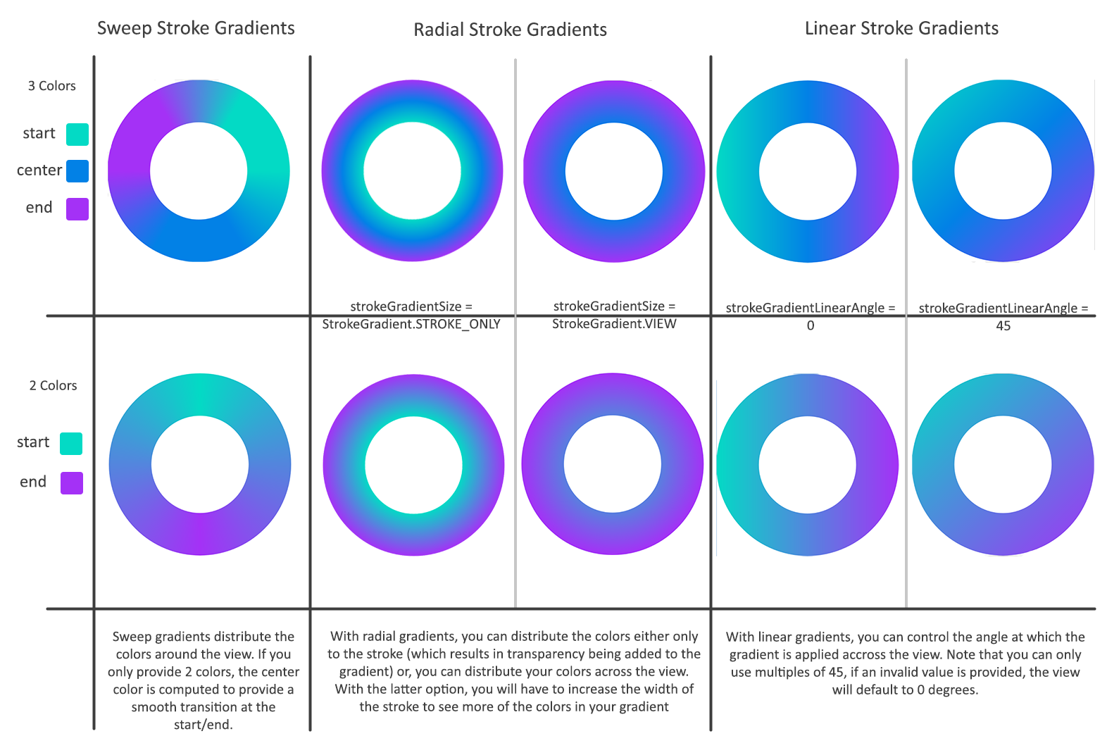
| Stroke Gradient Style | strokeGradientStyle | enum | "sweep", "linear", "radial" | strokeGradientStyle | Gradient | Gradient | Gradient.STYLE_SWEEP |
| Stroke Gradient Linear Angle | strokeGradient_linearAngle | integer | "0", "45", "90", "135", "180", "225", "270", "315" | strokeGradientLinearAngle | Int | 0, 45, 90, 135, 180, 225, 270, 315 | 0 |
| Stroke Gradient Radial Size | strokeGradientSize | enum | "view", "stroke_only" | strokeGradientSize | StrokeGradient | StrokeGradient | StrokeGradient.VIEW |
Progress Bar Attribute Details
- Progress - the current progress of the view
- Max Value - the upper range of the progress
- Stroke Width - the width of the progress bar
- Stroke Color - the color of the progress bar (note that providing strokeGradientStartColor and strokeGradientEndColor will override this)
- Draw Track - whether or not to draw the track for the progress bar
- Track Color - the color of the track
- Track Width - the width of the track this can be wider than, equal to, or smaller than the stroke
- Track Alpha - the alpha channel of the stroke color if not set by the color of track itself
- Starting Angle - the angle at which the progress bar starts, default is 0, (12:00)
- Direction - The direction that the progress bar moves
- Progress Anim. Duration - The duration to that the view uses when animateProgress() is called
- Progress Anim Interpolator - The interpolator to use when animateProgress() is called
- Stroke Gradient Start Color - the color to use at the beginning of a stroke gradient. MANDATORY IF USING A STROKE GRADIENT
- Stroke Gradient Center Color - the color to use in the middle of a stroke gradient. OPTIONAL
- Stroke Gradient End Color - the color to use at the beginning of a stroke gradient. MANDATORY IF USING A STROKE GRADIENT
- Stroke Gradient Style - the style of the gradient to apply to the stroke of the view, if using Gradient.SWEEP with only a start and end color, the start color will be centered at 12:00, if using Graident.SWEEP with a start, center, and end color, the start color will start at 12:00
- Stroke Gradient Linear Angle - if using Gradient.LINEAR or "linear" for the stroke gradient, the angle at which to apply the gradient across the stroke
- Stroke Gradient Radial Size - if using Gradient.Radial or "radial" for the stroke gradient, this determines if the radial stroke is scaled to fit the whole gradient within the stroke, or if the gradient colors should be distributed across the size of the view. Note that when using this mode, only the colors masked by the stroke will be visible. See screenshots for clarification.
Text Attributes
| Attribute | XML attr | XML Type | XML Values | Kotlin field | Kotlin Type | Kotlin Values | Default Value |
|---|---|---|---|---|---|---|---|
| Text Enabled | textEnabled | boolean | "true", "false" | textEnabled | Boolean | Boolean | true |
| Text Format | textFormat | enum | "pcnt", "pcnt_decimal", "integer", "progress" | textFormat | TextFormat | TextFormat | TextFormat.PERCENT |
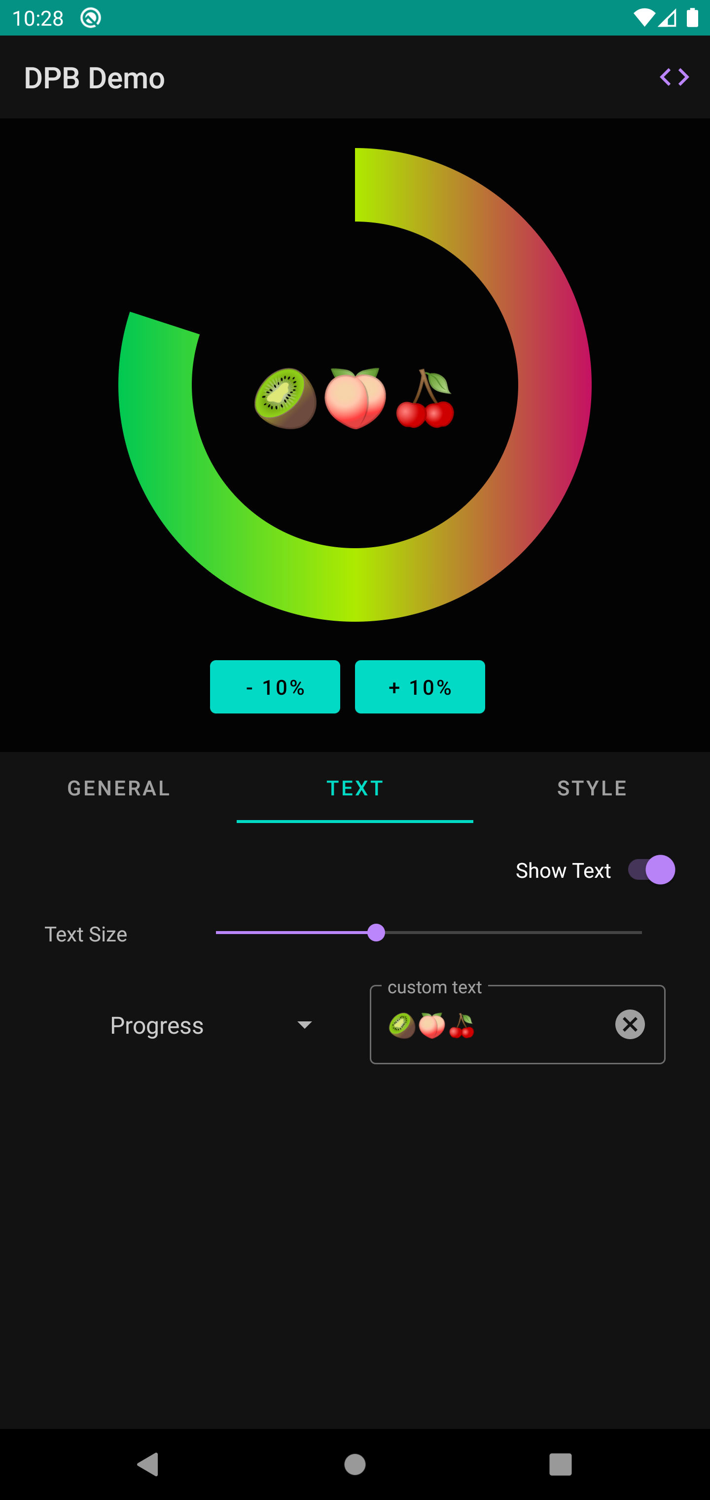
| Custom Text | text | string | @string, "string" | text | String | String | null |
| Text Color | textColor | color | @color, #hexcolor | textColor | Int | Int | @colorPrimary |
| Text Size | textSize | dimen | @dimen, >= 0 | textSize | Float | Float | 14f |
| Text Gradient Start Color | textGradientStartColor | color | @color, #hexcolor | textGradientStartColor | Int | - | - |
| Text Gradient Center Color | textGradientCenterColor | color | @color, #hexcolor | textGradientCenterColor | Int | - | - |
| Text Gradient End Color | textGradientEndColor | color | @color, #hexcolor | textGradientEndColor | Int | - | - |
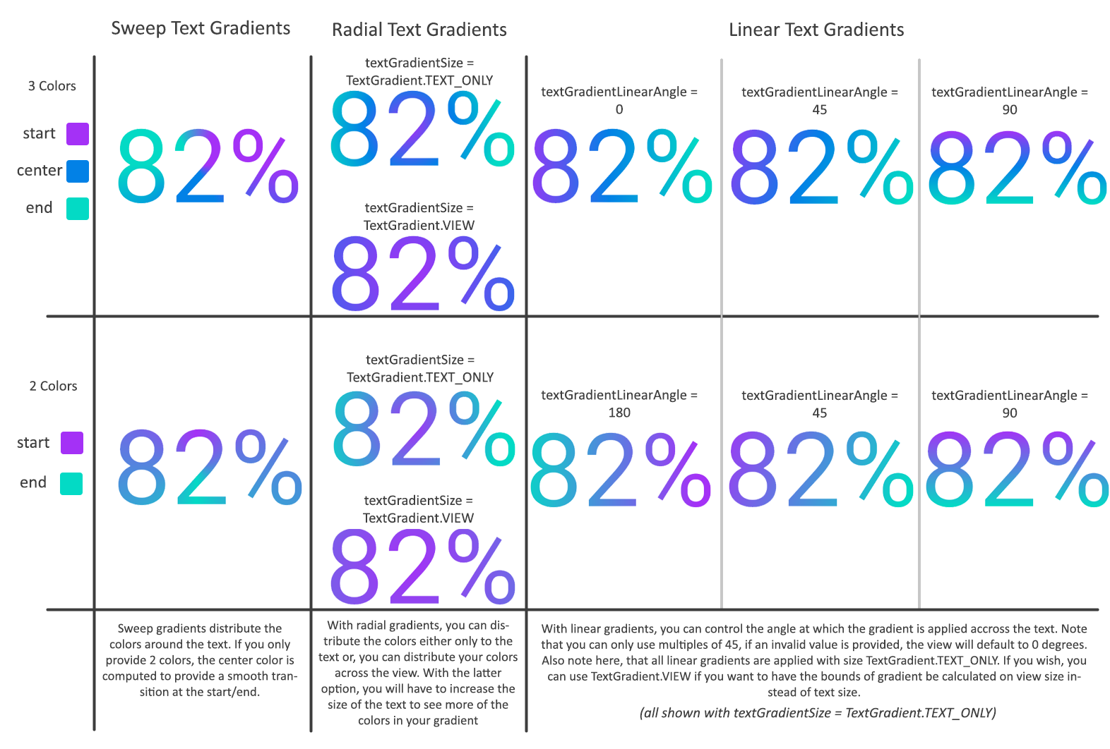
| Text Gradient Style | textGradientStyle | enum | "sweep", "linear", "radial" | textGradientStyle | Gradient | Gradient | Gradient.SWEEP |
| Text Gradient Linear Angle | textGradient_linearAngle | integer | "0", "45", "90", "135", "180", "225", "270", "315" | textGradientLinearAngle | Int | 0, 45, 90, 135, 180, 225, 270, 315 | 0 |
| Text Gradient Size | textGradientSize | enum | "view", "text_only" | textGradientSize | TextGradient | TextGradient | TextGradient.TEXT_ONLY |
Text Attribute Details
- Text Enabled - whether or not to show text in the center of the view
- Text Format - if not using custom text, and the text is enabled, what format should the text take. There are 4 options Percent, Percent with Decimal, Integer, and Float (default). (e.g. 65%, 65.25%, 65, 65.25). Note that the percent format uses the percentage of the progress relative to the max value, whereas the Integer and Float formats use the actual progress value. So, if your max value is 200, and your current progress is 100, the formats would read 50%, 50.00%, 100, 100.00 respectively. If none of these default formats are what you need, you can always use the custom text field to override this. Passing a non-empty value for the text attribute will override this text
- Custom Text - sets the text of the view to whatever you pass, this will override the default behavior which is to display the view progress in the view formatted as specified by the text format attribute. Note that if textEnabled is false, this will not display
- Text Size - the size of the view text
- Text Color - the color of the text, will be overridden if values are passed for textGradientStartColor and textGradientEndColor
- Text Gradient Start Color - the color to use at the beginning of a text gradient. MANDATORY IF USING A STROKE GRADIENT
- Text Gradient Center Color - the color to use in the middle of a text gradient. OPTIONAL
- Text Gradient End Color - the color to use at the beginning of a text gradient. MANDATORY IF USING A STROKE GRADIENT
- Text Gradient Style - the style of the gradient to use when drawing the text with a gradient. If using Gradient.SWEEP, the start color is at 12:00
- Text Gradient Linear Angle - if using Gradient.LINEAR, or "linear" for the textGradientStyle, the angle at which to apply the linear gradient across the text
- Text Gradient Size - if using Gradient.LINEAR, Gradient.RADIAL or "linear", "radial", the size of the gradient. If set to TextGradient.VIEW, the gradient colors will be spread across the whole view, but only visible on the text. If set to TextGradient.TEXT_ONLY, the gradient will be confined to the size of the bounding box for the text. See screenshots for clarification
Examples