Material Design in Practice.
Purpose
- Intended to be more understandable - A project to demonstrate the usage of color palette, typography and shapes as per the latest material design guidelines.
- Inspired from - https://github.com/material-components/material-components-android.
Configuration
- Uses both app wide and widget level theming.
- Min SDK support is API 19.
- This app will respond and auto switch to day/ night mode depending on the system settings.
Usage
-
themes.xml will do the job of referring to the appropriate styling templates on runtime - whether day or night.
-
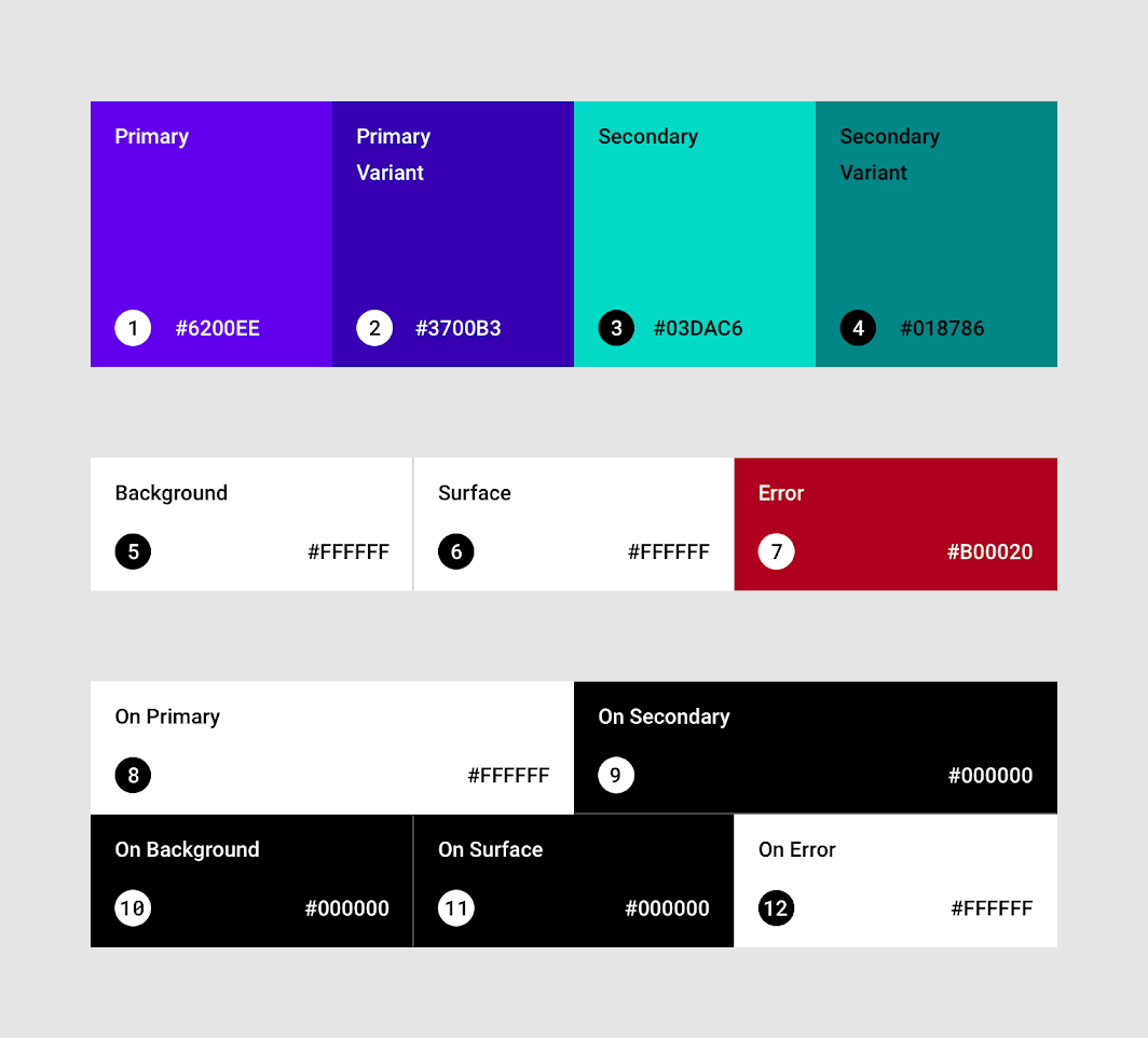
Use color palette generator tool for preparing a new color scheme, export to the Android format (color.xml) and use the color variables to replace the existing set in the project.
-
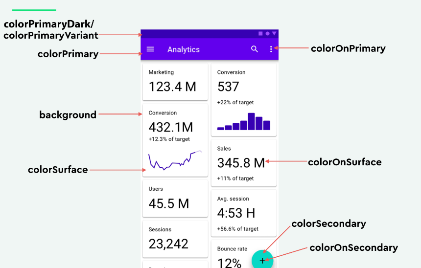
For applying app-wide default colors, you will be largely dealing with:
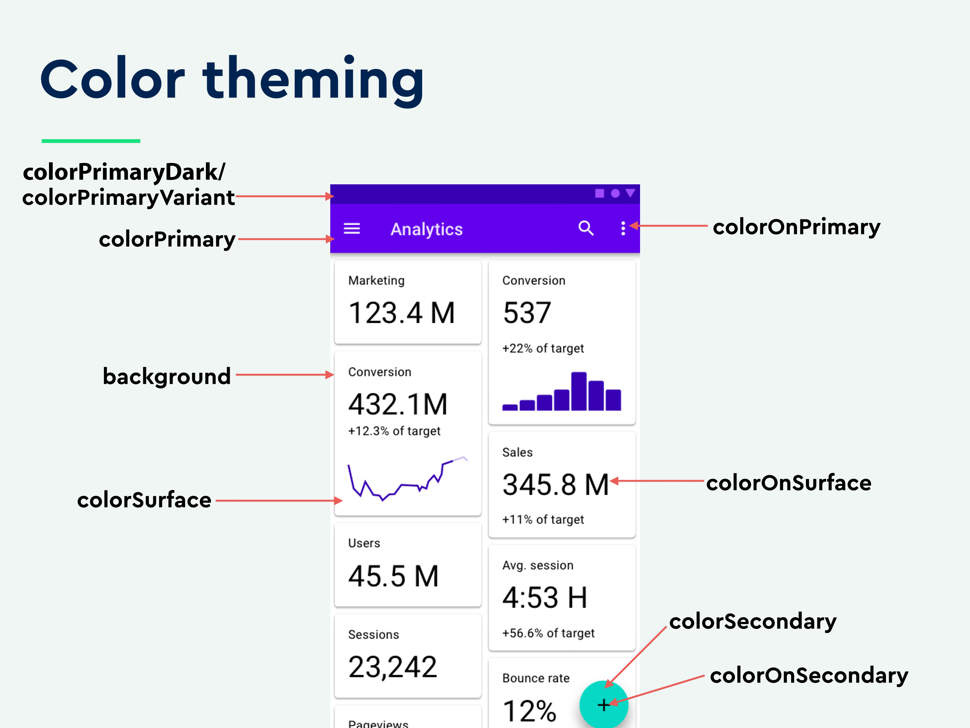
* colorPrimary * colorPrimaryDark/ colorPrimaryVariant * colorSecondary * colorSecondaryVariant * android:textColorPrimary * android:textColorSecondary * android:colorBackground -
If you wish to try different new schemes - simply replace the colors under "Base Color Scheme" and above "Other colors" in color.xml. You may leave 'Other colors' constant since they are neutral for most cases.
-
Concept:
 .
. -
Concept applied:
 .
. -
Take advantage of a new feature in the latest material design library that allows app-wide application of common styling for widgets from a single place - Refer to the base theme for an example.
Caveats
- For unclear reasons, colorPrimaryVariant does NOT reflect on the status bar color despite the official material design guidelines - https://material.io/design/color/the-color-system.html#color-theme-creation. However, colorPrimaryDark DOES work (Issue tracker).
So it's useful to maintain both variables even though they point to the exact same colors.
What's coming soon
- Application of material typography and shapes.
- Application of conditional theming attributes to take advantage of API specific features.
- More examples.
Try the demo app
Visit the releases section to download the latest iterations of the app.