CircleProgressBar

The CircleProgressBar extends View, It has both solid and line two styles. Besides, progress value can be freely customized. If you are interested in cool loading animations, you can see LoadingDrawable.

CircleProgressBar

Usage

Gradle

dependencies {
   compile 'com.dinuscxj:circleprogressbar:1.3.6'
}

Used in xml:

<com.dinuscxj.progressbar.CircleProgressBar
	android:id="@+id/line_progress"
	android:layout_marginTop="@dimen/default_margin"
	android:layout_width="50dp"
	android:layout_height="50dp" />

Attributes

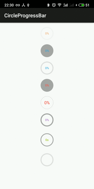
There are several attributes you can set:
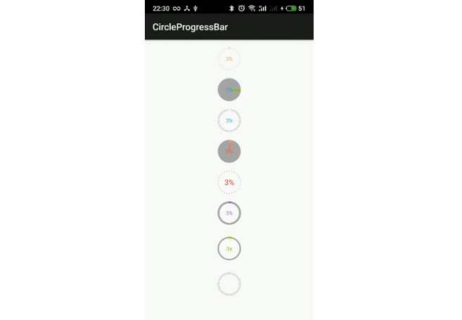
The progress style:

  • line (default)
  • solid_line
  • solid

The progress text:

  • text color
  • text size
  • visibility
  • format

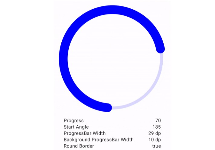
The progress circle:

  • width
  • start degree
  • start color
  • end color
  • background color
  • draw background outside progress

The progress shader

  • linear (default,but if start_color and end_color equivalence, will not set the shader)
  • radial
  • sweep

The progress blur (blur radius must larger than zero)

  • normal (default)
  • solid
  • outer
  • inner

The progress stroke cap

  • butt (default)
  • round
  • square

The line style:

  • width
  • count

for example :
In the xml

<com.dinuscxj.progressbar.CircleProgressBar
	android:layout_width="50dp"
	android:layout_height="50dp"

	app:progress_style="line"
	
	app:background_color="@color/holo_red_light"

	app:progress_text_color="@color/holo_purple"
	app:progress_text_size="@dimen/progress_text_size"

	app:progress_stroke_width="1dp"
	app:progress_start_color="@color/holo_purple"
	app:progress_end_color="@color/holo_green_light"
	app:progress_background_color="@color/holo_darker_gray"
	app:progress_start_degree="-90"
	app:drawBackgroundOutsideProgress="true"

	app:progress_shader="sweep"
    
	app:progress_stroke_cap="round"
	
	app:progress_blur_style="solid"
	app:progress_blur_radius="5dp"

	app:line_width="4dp"
	app:line_count="30"/>

format progress

     private static final class MyProgressFormatter implements ProgressFormatter {
         private static final String DEFAULT_PATTERN = "%d%%";
 
         @Override
         public CharSequence format(int progress, int max) {
             return String.format(DEFAULT_PATTERN, (int) ((float) progress / (float) max * 100));
         }
     }
     
     // set the ProgressFormatter as you want
     CircleProgressBar.setProgressFormatter(new MyProgressFromatter);
     // hide the progress
     CircleProgressBar.setProgressFormatter(null);
     

Advantages

  1. extends View, do not care to save the current state of progress, CircleProgressBar has written in to help us in onSaveInstanceState () and onRestoreInstanceState (Parcelable state).
  2. highly customizable, you can set the two styles of progress bar, you can set the color of the bars, you can set the color and size of the progress of the text, due to the progress of the code for formatting text uses String.format (), so progress text can be customized as needed
  3. Code elegant, very comprehensive code comments, neat format, you can set the relevant properties directly in xml.

GitHub