AnimatedBottomBar
A customizable and easy to use bottom bar view with sleek animations.
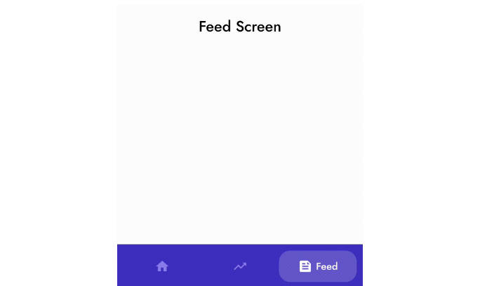
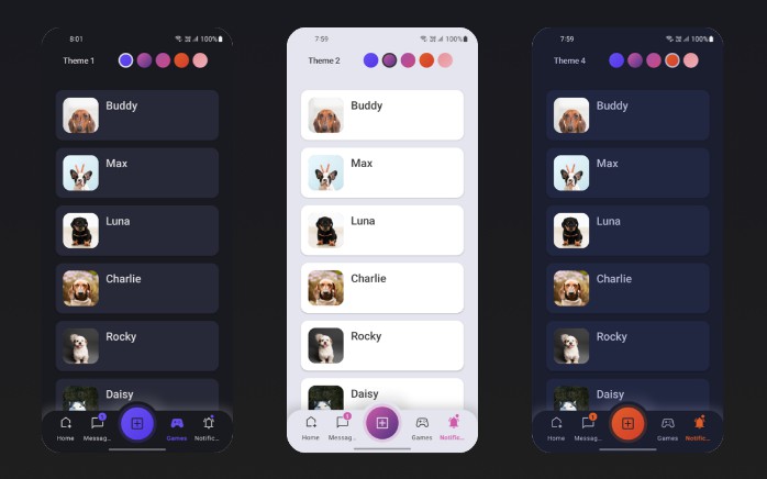
Examples


Demo app
Download the app showcasing the examples: demo.apk
Getting started

Add the following dependency to your build.gradle:
Define AnimatedBottomBar in your XML layout with custom attributes.
Create a file named tabs.xml in the res/menu/ resources folder:
Get notified when the selected tab changes:
Managing tabs
Short overview on how to manage tabs using code.
Creating new tabs
Adding new tabs
Removing tabs
Selecting tabs
Intercepting tabs
Could be useful for example restricting access to a premium area.
Usage with ViewPager
It is easy to use the BottomBar with a ViewPager or ViewPager2, you can simply use the setupWithViewPager() method. Please note that the number of tabs and ViewPager pages need to be identical in order for it to function properly.
Usage
Configuration
An overview of all configuration options. All options can also be accessed and set programmatically, by their equivalent name.
Tabs
| Attribute | Description | Default |
|---|---|---|
| abb_tabs | Tabs can be defined in a menu file (Menu resource), in the res/menu/ resource folder. The icon and title attribute are required. <menu xmlns:android="http://schemas.android.com/apk/res/android">
<item
android:id="@+id/tab_example"
android:icon="@drawable/ic_example"
android:title="@string/tab_example" />
...etc
</menu>
|
|
| abb_selectedIndex | Define the default selected tab index. | |
| abb_selectedTabId | Define the default selected tab by its ID, for example @id/tab_id |
Tab appearance
| Attribute | Description | Default |
|---|---|---|
| abb_tabColor | The color of the icon or text when the tab is not selected. | @color/textColorPrimary |
| abb_tabColorSelected | The color of the icon or text when the tab is selected. | @color/colorPrimary |
| abb_textAppearance | Customize the look and feel of text in tabs, down below is an example of a custom text appearance. Define a new style in res/values/styles.xml: <style name="CustomText">
<item name="android:textAllCaps">true</item>
<item name="android:fontFamily">serif</item>
<item name="android:textSize">16sp</item>
<item name="android:textStyle">italic|bold</item>
</style>

|
|
| abb_rippleEnabled | Enables the 'ripple' effect when selecting a tab.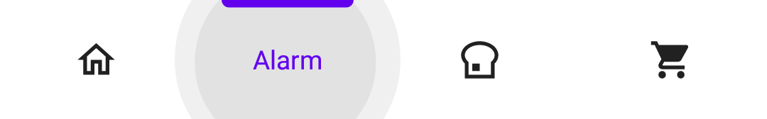 |
false |
| abb_rippleColor | Change the color of the aforementioned ripple effect. | Default theme color |
Animations
| Attribute | Description | Default |
|---|---|---|
| abb_selectedTabType |
Determines whether the icon or text should be shown when a tab has been selected. icon  text 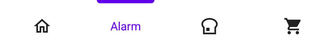 |
icon |
| abb_tabAnimation |
The enter and exit animation style of the tabs which are not selected. none  slide  fade  |
fade |
| abb_tabAnimationSelected |
The enter and exit animation style of the selected tab. none  slide  fade |
slide |
| abb_animationInterpolator |
The interpolator used for all animations. See "Android Interpolators: A Visual Guide" for more information on available interpolators. Example value: @android:anim/overshoot_interpolator 
|
FastOutSlowInInterpolator |
Indicator
| Attribute | Description | Default |
|---|---|---|
| abb_indicatorColor | The color of the indicator. | @android/colorPrimary |
| abb_indicatorHeight | The height of the indicator. | 3dp |
| abb_indicatorMargin | The horizontal margin of the indicator. This determines the width of the indicator. | 0dp |
| abb_indicatorAppearance |
Configure the shape of the indicator either to be square or round. invisible  square  round  |
square |
| abb_indicatorLocation |
Configure the location of the selected tab indicator, top, bottom or invisible. top bottom  |
top |
| abb_indicatorAnimation |
The animation type of the indicator when changing the selected tab. none 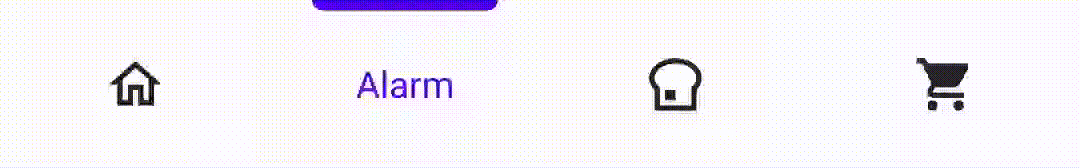 slide fade 
|
slide |