compose-swipeBox
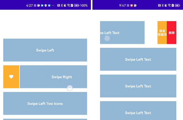
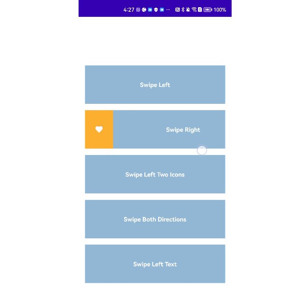
This Library provides a composable widget SwipeBox that can be swiped left or right to show the action buttons. It supports the custom designs for the action buttons. It also provides the composable widgets SwipeIcon and SwipeText for easy design of action buttons.

Usage
The core component of this library is the SwipeBox Please refer to the comment at the top of this file for detail usage. Also, you can refer to SwipeBoxExample for more examples.
At all, it is very easy to use:
@OptIn(ExperimentalMaterialApi::class)
@Composable
fun SwipeBoxAtEnd() {
    val coroutineScope = rememberCoroutineScope()
    SwipeBox(
        modifier = Modifier.fillMaxWidth(),
        swipeDirection = SwipeDirection.EndToStart,
        endContentWidth = 60.dp,
        endContent = { swipeableState, endSwipeProgress ->
            SwipeIcon(
                imageVector = Icons.Outlined.Delete,
                contentDescription = "Delete",
                tint = Color.White,
                background = Color(0xFFFA1E32),
                weight = 1f,
                iconSize = 20.dp
            ) {
                coroutineScope.launch {
                    swipeableState.animateTo(0)
                }
            }
        }
    ) { _, _, _ ->
        Box(
            modifier = Modifier
                .fillMaxWidth()
                .height(90.dp)
                .background(Color(148, 184, 216)),
            contentAlignment = Alignment.Center
        ) {
            Text(
                text = "Swipe Left", color = Color.White, fontSize = 14.sp,
                fontWeight = FontWeight.Bold
            )
        }
    }
}
For SwipeBox which support to swipe at both directions:
@OptIn(ExperimentalMaterialApi::class)
@Composable
fun SwipeBoxAtBoth() {
    val coroutineScope = rememberCoroutineScope()
    SwipeBox(
        modifier = Modifier.fillMaxWidth(),
        swipeDirection = SwipeDirection.Both,
        startContentWidth = 60.dp,
        startContent = { swipeableState, endSwipeProgress ->
            SwipeIcon(
                imageVector = Icons.Outlined.Favorite,
                contentDescription = "Favorite",
                tint = Color.White,
                background = Color(0xFFFFB133),
                weight = 1f,
                iconSize = 20.dp
            ) {
                coroutineScope.launch {
                    swipeableState.animateTo(0)
                }
            }
        },
        endContentWidth = 60.dp,
        endContent = { swipeableState, endSwipeProgress ->
            SwipeIcon(
                imageVector = Icons.Outlined.Delete,
                contentDescription = "Delete",
                tint = Color.White,
                background = Color(0xFFFA1E32),
                weight = 1f,
                iconSize = 20.dp
            ) {
                coroutineScope.launch {
                    swipeableState.animateTo(0)
                }
            }
        }
    ) { _, _, _ ->
        Box(
            modifier = Modifier
                .fillMaxWidth()
                .height(90.dp)
                .background(Color(148, 184, 216)),
            contentAlignment = Alignment.Center
        ) {
            Text(
                text = "Swipe Both Directions", color = Color.White, fontSize = 14.sp,
                fontWeight = FontWeight.Bold
            )
        }
    }
}
Download
The Current Release Version is 0.0.2. For future release, please refer to the release session of the github repository.
allprojects {
  repositories {
    ...
    maven { url 'https://jitpack.io' }
  }
}

dependencies {
    implementation("com.github.kevinnzou:compose-swipeBox:0.0.2")
}
License
Compose SwipeBox is distributed under the terms of the Apache License (Version 2.0). See the license for more information.