Compose Zoom

Zoom Modifiers, zoomable image and layouts with limit pan bounds, fling and moving back to valid bounds and callbacks that return current transformation or visible image section
zoom.mp4
Gradle Setup
To get a Git project into your build:
- Step 1. Add the JitPack repository to your build file Add it in your root build.gradle at the end of repositories:
allprojects {
  repositories {
      ...
      maven { url 'https://jitpack.io' }
  }
}
- Step 2. Add the dependency
dependencies {
    implementation 'com.github.SmartToolFactory:Compose-Zoom:<version>'
}
Modifier.zoom()
Modifier that zooms, pans, and rotates any Composable it set to. when [clip] is true
Modifier.clipToBounds() is used to limit content inside Composable bounds
consume param is for Modifier.pointerInput to consume current events to prevent other
gestures like scroll, drag or transform to initiate.
Callbacks notify user that gesture has started, going on finished with [ZoomData] that
contains current transformation information
fun Modifier.zoom(
    key: Any? = Unit,
    consume: Boolean = true,
    clip: Boolean = true,
    zoomState: ZoomState,
    onGestureStart: ((ZoomData) -> Unit)? = null,
    onGesture: ((ZoomData) -> Unit)? = null,
    onGestureEnd: ((ZoomData) -> Unit)? = null
)
Parameters
- key/key1-key2/keys are used for restarting
Modifier.pointerInput(*keys)and remember for gettingZoomState - consume flag to prevent other gestures such as scroll, drag or transform to get
- clip when set to true clips to parent bounds. Anything outside parent bounds is not drawn empty space on sides or edges of parent.
- zoomState State of the zoom that contains option to set initial, min, max zoom, enabling rotation, pan or zoom and contains current [ZoomData]event propagations
- onGestureStart callback to to notify gesture has started and return current ZoomData of this modifier
- onGesture callback to notify about ongoing gesture and return current ZoomData of this modifier
- onGestureEnd callback to notify that gesture finished and return current ZoomData of this modifier
ZoomState
Create and [remember] the [ZoomState] based on the currently appropriate transform configuration to allow changing pan, zoom, and rotation.
@Composable
fun rememberZoomState(
    initialZoom: Float = 1f,
    initialRotation: Float = 0f,
    minZoom: Float = 1f,
    maxZoom: Float = 5f,
    zoomable: Boolean = true,
    pannable: Boolean = true,
    rotatable: Boolean = false,
    limitPan: Boolean = false,
    key1: Any? = Unit
): ZoomState {
    return remember(key1) {
        ZoomState(
            initialZoom = initialZoom,
            initialRotation = initialRotation,
            minZoom = minZoom,
            maxZoom = maxZoom,
            zoomable = zoomable,
            pannable = pannable,
            rotatable = rotatable,
            limitPan = limitPan
        )
    }
}
Parameters
- initialZoom zoom set initially
- initialRotation rotation set initially
- minZoom minimum zoom value
- maxZoom maximum zoom value
- limitPan limits pan to bounds of parent Composable. Using this flag prevents creating empty space on sides or edges of parent
- zoomable when set to true zoom is enabled
- pannable when set to true pan is enabled
- rotatable when set to true rotation is enabled
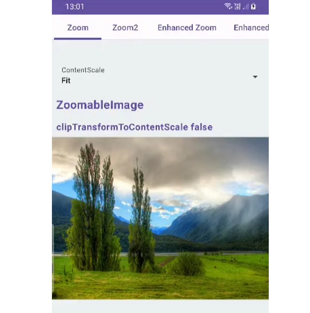
ZoomableImage
Zoomable image that zooms in and out in [ [minZoom], [maxZoom] ] interval and translates zoomed image based on pointer position. Double tap gestures reset image translation and zoom to default values with animation. Callbacks notify user that gesture has started, going on finished with [ZoomData] that contains current transformation information
@Composable
fun ZoomableImage(
    modifier: Modifier = Modifier,
    imageBitmap: ImageBitmap,
    alignment: Alignment = Alignment.Center,
    contentScale: ContentScale = ContentScale.Fit,
    contentDescription: String? = null,
    alpha: Float = DefaultAlpha,
    colorFilter: ColorFilter? = null,
    filterQuality: FilterQuality = DrawScope.DefaultFilterQuality,
    initialZoom: Float = 1f,
    minZoom: Float = 1f,
    maxZoom: Float = 5f,
    limitPan: Boolean = true,
    zoomable: Boolean = true,
    pannable: Boolean = true,
    rotatable: Boolean = false,
    clip: Boolean = true,
    clipTransformToContentScale: Boolean = false,
    consume: Boolean = true,
    onGestureStart: (ZoomData) -> Unit = {},
    onGesture: (ZoomData) -> Unit = {},
    onGestureEnd: (ZoomData) -> Unit = {}
)
Parameters
- initialZoom zoom set initially
- minZoom minimum zoom value this Composable can possess
- maxZoom maximum zoom value this Composable can possess
- clip whether image should be clip to bounds of Image
- clipTransformToContentScale when set true zoomable image takes borders of image drawn while zooming in. [contentScale] determines whether will be empty spaces on edges of Composable
- limitPan limits pan to bounds of parent Composable. Using this flag prevents creating empty space on sides or edges of parent.
- consume flag to prevent other gestures such as scroll, drag or transform to get event propagations
- zoomable when set to true zoom is enabled
- pannable when set to true pan is enabled
- rotatable when set to true rotation is enabled
- onGestureStart callback to to notify gesture has started and return current ZoomData of this modifier
- onGesture callback to notify about ongoing gesture and return current ZoomData of this modifier
- onGestureEnd callback to notify that gesture finished and return current ZoomData of this modifier
Modifier.enhancedZoom()
Modifier that zooms in or out of Composable set to. This zoom modifier has option to move back to bounds with an animation or option to have fling gesture when user removes from screen while velocity is higher than threshold to have smooth touch effect.
fun Modifier.enhancedZoom(
    key: Any? = Unit,
    clip: Boolean = true,
    enhancedZoomState: EnhancedZoomState,
    enabled: (Float, Offset, Float) -> Boolean = DefaultEnabled,
    zoomOnDoubleTap: (ZoomLevel) -> Float = enhancedZoomState.DefaultOnDoubleTap,
    onGestureStart: ((EnhancedZoomData) -> Unit)? = null,
    onGesture: ((EnhancedZoomData) -> Unit)? = null,
    onGestureEnd: ((EnhancedZoomData) -> Unit)? = null,
)
Parameters
- key is used for [Modifier.pointerInput] to restart closure when any keys assigned change
- clip when set to true clips to parent bounds. Anything outside parent bounds is not drawn empty space on sides or edges of parent.
- enhancedZoomState State of the zoom that contains option to set initial, min, max zoom, enabling rotation, pan or zoom and contains current [EnhancedZoomData]event propagations. Also contains [Rect] of visible area based on pan, zoom and rotation
- zoomOnDoubleTap lambda that returns current [ZoomLevel] and based on current level enables developer to define zoom on double tap gesture
- enabled lambda can be used selectively enable or disable pan and intercepting with scroll, drag or lists or pagers using current zoom, pan or rotation values
- onGestureStart callback to to notify gesture has started and return current [EnhancedZoomData] of this modifier
- onGesture callback to notify about ongoing gesture and return current [EnhancedZoomData] of this modifier
- onGestureEnd callback to notify that gesture finished return current [EnhancedZoomData] of this modifier
EnhancedZoomState
Create and [remember] the [EnhancedZoomState] based on the currently appropriate transform configuration to allow changing pan, zoom, and rotation. Allows to change zoom, pan, translate, or get current state by calling methods on this object. To be hosted and passed to [Modifier.enhancedZoom]. Also contains [EnhancedZoomData] about current transformation area of Composable and visible are of image being zoomed, rotated, or panned. If any animation is going on current [EnhancedZoomState.isAnimationRunning] is true and [EnhancedZoomData] returns rectangle that belongs to end of animation.
fun Modifier.enhancedZoom(
    key: Any? = Unit,
    clip: Boolean = true,
    enhancedZoomState: EnhancedZoomState,
    enabled: (Float, Offset, Float) -> Boolean = DefaultEnabled,
    zoomOnDoubleTap: (ZoomLevel) -> Float = enhancedZoomState.DefaultOnDoubleTap,
    onGestureStart: ((EnhancedZoomData) -> Unit)? = null,
    onGesture: ((EnhancedZoomData) -> Unit)? = null,
    onGestureEnd: ((EnhancedZoomData) -> Unit)? = null,
)
Parameters
- initialZoom zoom set initially
- minZoom minimum zoom value
- maxZoom maximum zoom value
- fling when set to true dragging pointer builds up velocity. When last pointer leaves Composable a movement invoked against friction till velocity drops below to threshold
- moveToBounds when set to true if image zoom is lower than initial zoom or panned out of image boundaries moves back to bounds with animation.
- zoomable when set to true zoom is enabled
- pannable when set to true pan is enabled
- rotatable when set to true rotation is enabled
- limitPan limits pan to bounds of parent Composable. Using this flag prevents creating empty space on sides or edges of parent
EnhancedZoomableImage
Zoomable image that zooms in and out in [ [minZoom], [maxZoom] ] interval and pans zoomed image
based on pointer position. Double tap gestures reset image translation and zoom to default values
with animation. Difference between ZoomaableImage and EnhancedZoomableImage is this version
can animate back to bounds and have fling gesture that doesn’t stop movement when last pointer
is up but continues motion agains friction.
moveToBound is true image moves to bounds when moved out of bounds. When
fling is set to true image moves until velocity drops below threshold.
@Composable
fun EnhancedZoomableImage(
    modifier: Modifier = Modifier,
    imageBitmap: ImageBitmap,
    alignment: Alignment = Alignment.Center,
    contentScale: ContentScale = ContentScale.Fit,
    contentDescription: String? = null,
    alpha: Float = DefaultAlpha,
    colorFilter: ColorFilter? = null,
    filterQuality: FilterQuality = DrawScope.DefaultFilterQuality,
    initialZoom: Float = 1f,
    minZoom: Float = .5f,
    maxZoom: Float = 5f,
    limitPan: Boolean = true,
    fling: Boolean = false,
    moveToBounds: Boolean = true,
    zoomable: Boolean = true,
    pannable: Boolean = true,
    rotatable: Boolean = false,
    clip: Boolean = true,
    enabled: (Float, Offset, Float) -> Boolean = DefaultEnabled,
    zoomOnDoubleTap: (ZoomLevel) -> Float = DefaultOnDoubleTap,
    clipTransformToContentScale: Boolean = false,
    onGestureStart: ((EnhancedZoomData) -> Unit)? = null,
    onGesture: ((EnhancedZoomData) -> Unit)? = null,
    onGestureEnd: ((EnhancedZoomData) -> Unit)? = null
)
Parameters
- initialZoom zoom set initially
- minZoom minimum zoom value this Composable can possess
- maxZoom maximum zoom value this Composable can possess
- limitPan limits pan to bounds of parent Composable. Using this flag prevents creating empty space on sides or edges of parent.
- fling when set to true dragging pointer builds up velocity. When last pointer leaves Composable a movement invoked against friction till velocity drops down to threshold
- moveToBounds when set to true if image zoom is lower than initial zoom or panned out of image boundaries moves back to bounds with animation.
- zoomable when set to true zoom is enabled
- pannable when set to true pan is enabled
- rotatable when set to true rotation is enabled
- clip when set to true clips to parent bounds. Anything outside parent bounds is not drawn
- clipTransformToContentScale when set true zoomable image takes borders of image drawn while zooming in. [contentScale] determines whether will be empty spaces on edges of Composable
- zoomOnDoubleTap lambda that returns current [ZoomLevel] and based on current level enables developer to define zoom on double tap gesture
- enabled lambda can be used selectively enable or disable pan and intercepting with scroll, drag or lists or pagers using current zoom, pan or rotation values
- onGestureStart callback to to notify gesture has started and return current ZoomData of this modifier
- onGesture callback to notify about ongoing gesture and return current ZoomData of this modifier
- onGestureEnd callback to notify that gesture finished and return current ZoomData of this modifier
Modifier.animatedZoom()
Modifier that zooms in or out of Composable set to. This zoom modifier has option to move back to bounds with an animation or option to have fling gesture when user removes from screen while velocity is higher than threshold to have smooth touch effect.
Difference between Modifier.enhancedZoom() and Modifier.animatedZoom() is enhanced zoom
uses Bitmap dimensions and returns a callback that returns [EnhandedZoomData] that contains
visible image area which is suitable for crop while Modifier.animatedZoom() requires
dimensions of Composable to have valid pan limiting behavior. More suitable for zooming
Composables while enhanced zoom is more suitable for iamge zooming.
fun Modifier.animatedZoom(
    vararg keys: Any?,
    clip: Boolean = true,
    animatedZoomState: AnimatedZoomState,
    enabled: (Float, Offset, Float) -> Boolean = DefaultEnabled,
    zoomOnDoubleTap: (ZoomLevel) -> Float = animatedZoomState.DefaultOnDoubleTap,
)
Parameters
- keys are used for [Modifier.pointerInput] to restart closure when any keys assigned change
- clip when set to true clips to parent bounds. Anything outside parent bounds is not drawn
- animatedZoomState State of the zoom that contains option to set initial, min, max zoom, enabling rotation, pan or zoom
- zoomOnDoubleTap lambda that returns current [ZoomLevel] and based on current level enables developer to define zoom on double tap gesture
- enabled lambda can be used selectively enable or disable pan and intercepting with scroll, drag or lists or pagers using current zoom, pan or rotation values
AnimatedZoomState
Create and [remember] the [AnimatedZoomState] based on the currently appropriate transform configuration to allow changing pan, zoom, and rotation.
Allows to change zoom, pan, translate, or get current state by calling methods on this object. To be hosted and passed to [Modifier.animatedZoom].
@Composable
fun rememberAnimatedZoomState(
    contentSize: DpSize = DpSize.Zero,
    initialZoom: Float = 1f,
    minZoom: Float = 1f,
    maxZoom: Float = 5f,
    fling: Boolean = true,
    moveToBounds: Boolean = false,
    zoomable: Boolean = true,
    pannable: Boolean = true,
    rotatable: Boolean = false,
    limitPan: Boolean = true,
    key1: Any? = Unit
)
Parameters
- contentSize when the content that will be zoomed is not parent pass child size to bound content correctly inside parent. If parent doesn’t have any content this parameter is not required
- initialZoom zoom set initially
- minZoom minimum zoom value
- maxZoom maximum zoom value
- fling when set to true dragging pointer builds up velocity. When last
- pointer leaves Composable a movement invoked against friction till velocity drops below to threshold
- moveToBounds when set to true if image zoom is lower than initial zoom or panned out of image boundaries moves back to bounds with animation.
- zoomable when set to true zoom is enabled
- pannable when set to true pan is enabled
- rotatable when set to true rotation is enabled
- limitPan limits pan to bounds of parent Composable. Using this flag prevents creating empty space on sides or edges of parent
AnimatedZoomLayout
Layout that can zoom, rotate, pan its content with fling and moving back to bounds animation.
@Composable
fun AnimatedZoomLayout(
    modifier: Modifier = Modifier,
    clip: Boolean = true,
    initialZoom: Float = 1f,
    minZoom: Float = 1f,
    maxZoom: Float = 3f,
    fling: Boolean = true,
    moveToBounds: Boolean = false,
    zoomable: Boolean = true,
    pannable: Boolean = true,
    rotatable: Boolean = false,
    limitPan: Boolean = true,
    enabled: (Float, Offset, Float) -> Boolean = DefaultEnabled,
    zoomOnDoubleTap: (ZoomLevel) -> Float = DefaultOnDoubleTap,
    content: @Composable () -> Unit
)
Parameters
- clip when set to true clips to parent bounds. Anything outside parent bounds is not
- drawn
- minZoom minimum zoom value
- maxZoom maximum zoom value
- fling when set to true dragging pointer builds up velocity. When last pointer leaves Composable a movement invoked against friction till velocity drops below to threshold
- moveToBounds when set to true if image zoom is lower than initial zoom or panned out of image boundaries moves back to bounds with animation.
- zoomable when set to true zoom is enabled
- pannable when set to true pan is enabled
- rotatable when set to true rotation is enabled
- limitPan limits pan to bounds of parent Composable. Using this flag prevents creating empty space on sides or edges of parent
- zoomOnDoubleTap lambda that returns current [ZoomLevel] and based on current level enables developer to define zoom on double tap gesture
- enabled lambda can be used selectively enable or disable pan and intercepting with scroll, drag or lists or pagers using current zoom, pan or rotation values