ViewPagerIndicator
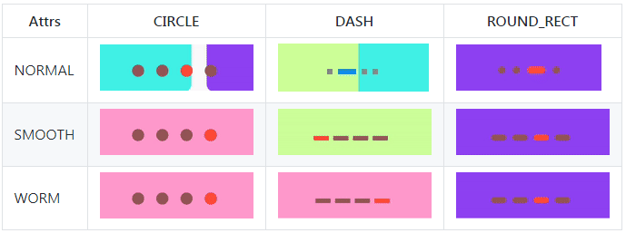
IndicatorView supports three Indicator Styles and three Indicator Slide mode now.
| Attrs | CIRCLE | DASH | ROUND_RECT |
|---|---|---|---|
| NORMAL |  |
 |
 |
| SMOOTH |  |
 |
 |
| WORM |  |
 |
 |
API
| Method | Description | Default |
|---|---|---|
| setIndicatorStyle(Int) | set indicator style | enum(CIRCLE, DASH、ROUND_RECT) default CIRCLE |
| setSliderColor(normalColor: Int,selectedColor: Int) | set indicator slider color | normalColor:color of indicator dot not selected, default value "#8C6C6D72", checkedColor:color of indicator selected default value is "#8C18171C" |
| setSlideMode(slideMode: Int) | set indicator slide mode | enum(NORMAL;SMOOTH;WORM),default value NORMAL |
| setSliderWidth(indicatorWidth:Int) | set indicator slider width,if it's Circle indicator the parameter is diameter of circle | default value is 8dp |
| setSliderWidth(normalWidth Int , checkWidth Int) | set indicator slider width,if is circle style,the width is diameter of circle | default is 8dp |
| setIndicatorHeight(indicatorHeight Int) | set indicator hight,it's only used when the indicator style is DASH or ROUND_RECT | default value is normalIndicatorWidth/2 |
| setSliderGap(indicatorMargin Int ) | set the gap of indicator slider | default value is indicator slider width(or the diameter of circle) |
| setupWithViewPager(ViewPager) | To link a IndicatorView with a ViewPager together. | |
| setupWithViewPager(ViewPager2) | To link a IndicatorView with a ViewPager2 together. |
Usage
1.Gradle dependency
Please add it in your root build.gradle at the end of repositories:
allprojects {
		repositories {
			...
			maven { url 'https://jitpack.io' }
		}
	}
Then add the dependency in your app build.gradle
implementation 'com.github.zhpanvip:viewpagerindicator:latestVersion'
latestVersion:
2.Add IndicatorView in layout.xml
    <RelativeLayout
            android:layout_width="match_parent"
            android:layout_height="@dimen/dp_200"
            tools:context=".MainActivity">

            <androidx.viewpager.widget.ViewPager
                android:id="@+id/banner_view"
                android:layout_width="match_parent"
                android:layout_height="match_parent" />

            <com.zhpan.indicator.IndicatorView
                android:id="@+id/indicator_view"
                android:layout_width="wrap_content"
                android:layout_height="wrap_content"
                android:layout_alignParentBottom="true"
                android:layout_centerHorizontal="true"
                android:layout_margin="@dimen/dp_10" />

    </RelativeLayout>
3.Use IndicatorView with ViewPager/ViewPager2:
        indicatorView
                    .setSliderColor(getResColor(R.color.red_normal_color), getResColor(R.color.red_checked_color))
                    .setSliderWidth(resources.getDimension(R.dimen.dp_17))
                    .setSliderHeight(resources.getDimension(R.dimen.dp_5))
                    .setSlideMode(IndicatorSlideMode.WORM)
                    .setIndicatorStyle(IndicatorStyle.CIRCLE)
                    .setupWithViewPager(viewPager)