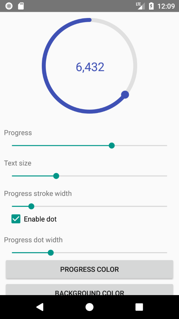
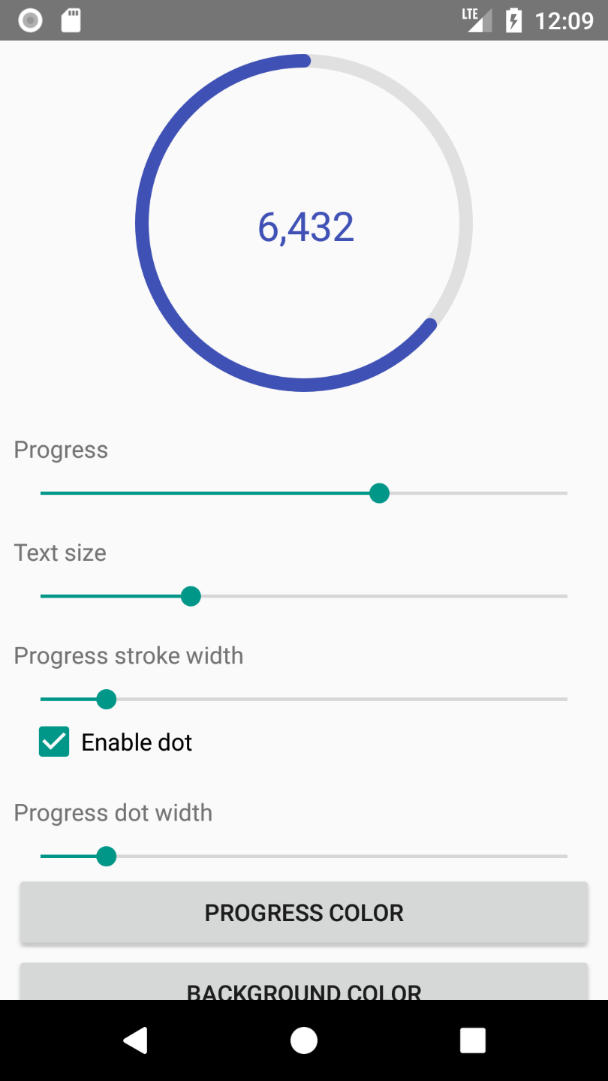
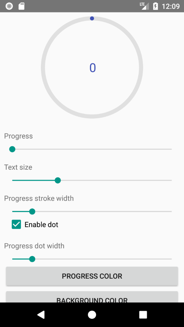
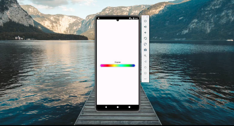
CircularProgressIndicator
Customizable circular progress indicator.
How to use
Add view to your layout:
Since all attributes have default values, you can specify none of them. Thus following code also works:
Than find it in code and set progress:
Attributes
| Description | XML | Java | Default value |
|---|---|---|---|
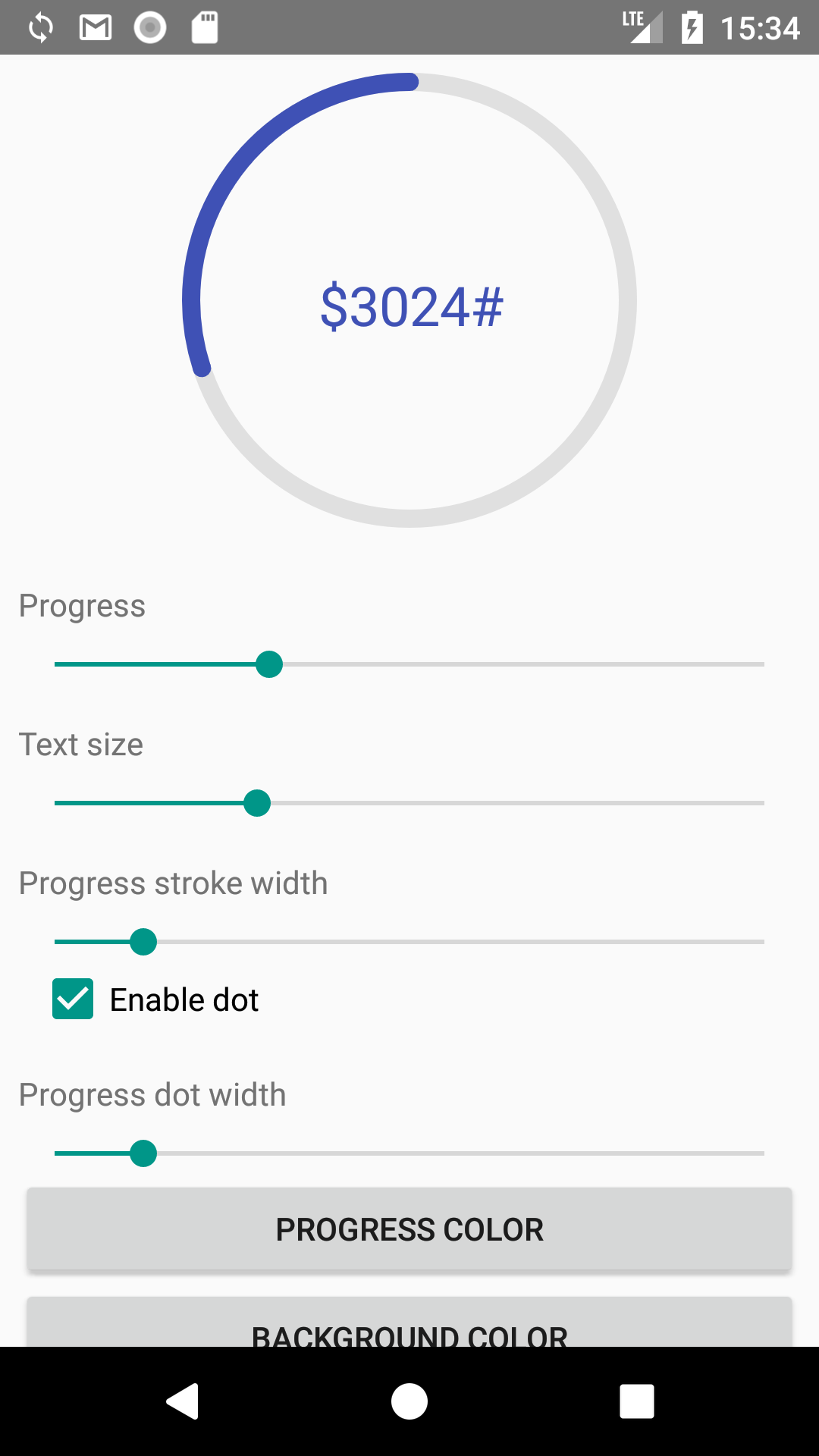
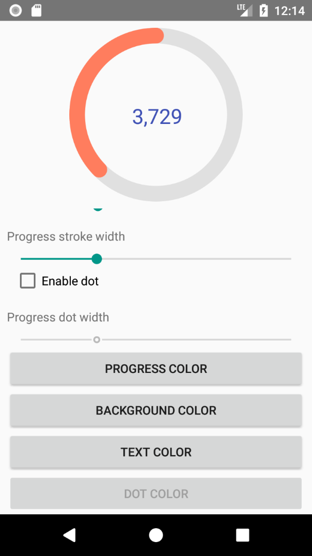
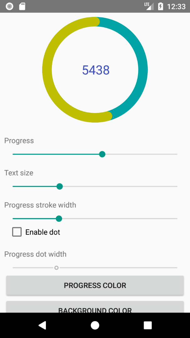
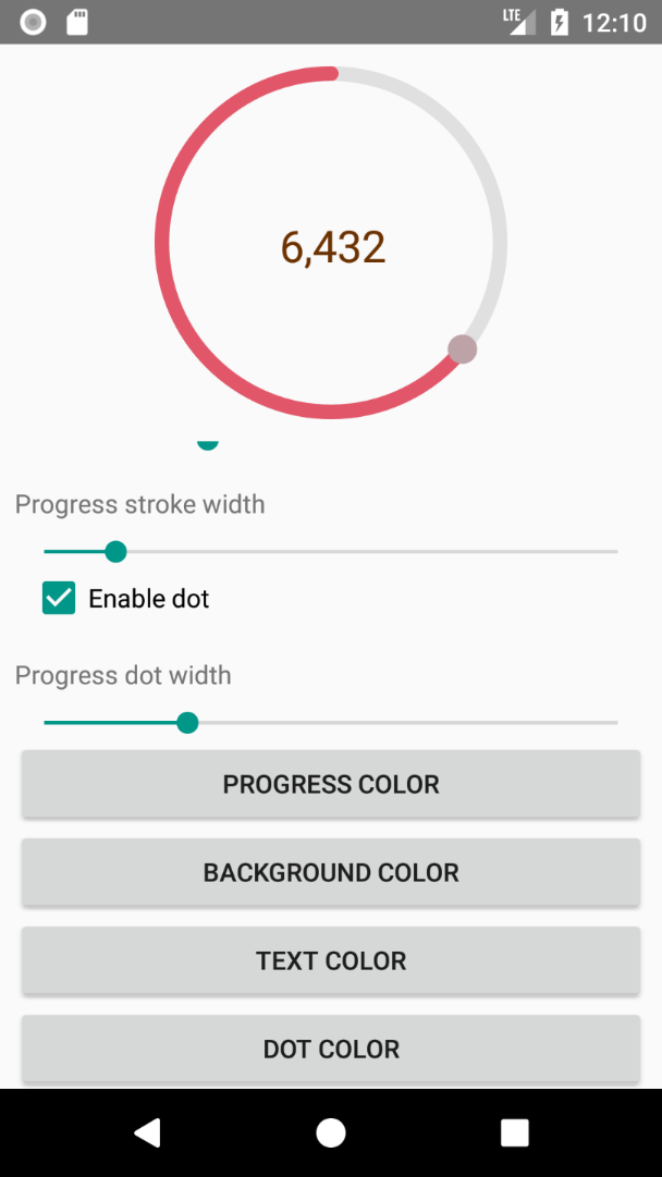
| Progress color | app:progressColor |
setter: setProgressColor(color)getter: getProgressColor() |
#3f51b5 |
| Progress background color | app:progressBackgroundColor |
setter: setProgressBackgroundColor(color)getter: getProgressBackgroundColor() |
#e0e0e0 |
| Width of progress stroke | app:progressStrokeWidth |
setters: setProgressStrokeWidthDp(widthInDp) or setProgressStrokeWidthPx(widthInPx)getter: getProgressStrokeWidth() (returns width in pixels) |
8dp |
Whether to draw dot. true or false |
app:drawDot |
setter: setShouldDrawDot(shoulDrawDot)getter: isDotEnabled() |
true |
| Dot color | app:dotColor |
setter: setDotColor(dotColor)getter: getDotColor() |
same as progress color |
| Dot width | app:dotWidth |
setters: setDotWidthDp(widthInDp) or setDotWidthPx(widthInPx)getter: getDotWidth() (returns width in pixels) |
same as progress stroke width |
| Progress text size | app:textSize |
setters: setTextSizeSp(sizeInSp) or setTextSizePx(sizeInPx)getter: getTextSize() (returns size in pixels) |
24sp |
| Progress text color | app:textColor |
setter: setTextColor(textColor)getter: getTextColor() |
same as progress color |
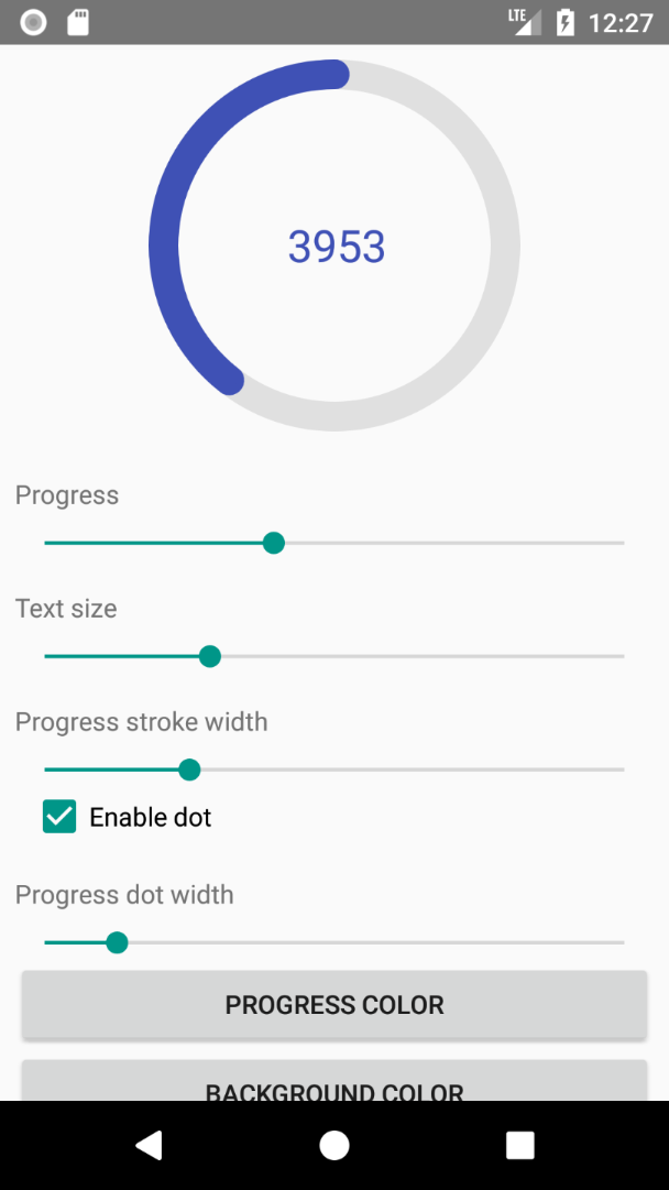
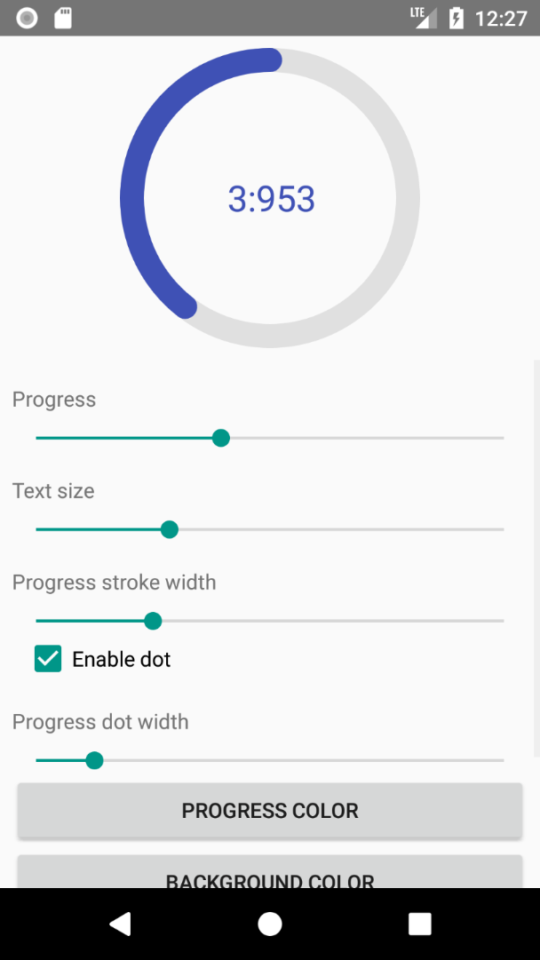
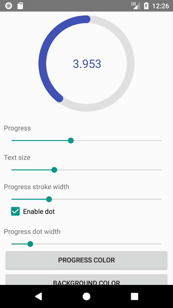
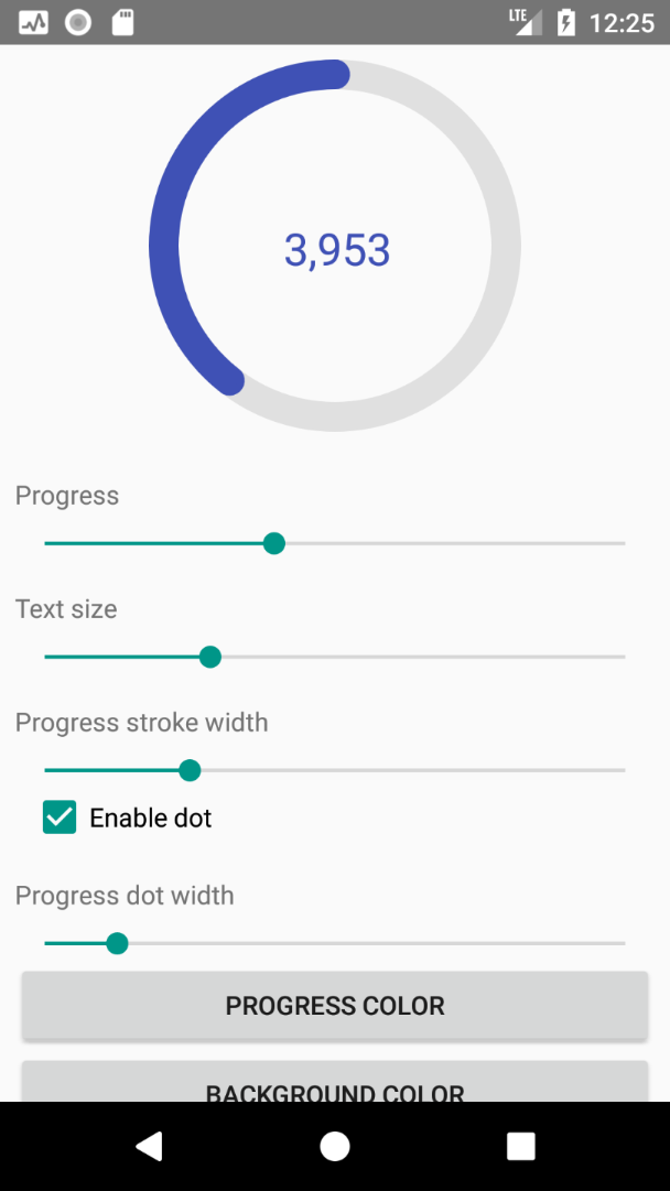
Whether to use delimiter or not. true or false |
app:useProgressTextDelimiter |
setter: setShouldUseDelimiter(shouldUseDelimiter)getter: isTextDelimiterEnabled() |
true |
| The delimiter to use in progress text | app:progressTextDelimiter |
setter: setProgressTextDelimiter(delimiter)getter: getProgressTextDelimiter() |
, |
| Prefix for progress text | app:progressTextPrefix |
setter: setProgressTextPrefix(prefix)getter: getProgressTextPrefix() |
null (disabled) |
| Suffix for progress text | app:progressTextSuffix |
setter: setProgressTextSuffix(suffix)getter: getProgressTextSuffix() |
null (disabled) |
Download using Gradle
Add this in your root build.gradle at the end of repositories in allprojects section:
Then add this dependency to your module-level build.gradle in dependencies section: