MsProgressView
MsProgressView is an Android library that provides customizable circular and horizontal progress views to display ongoing tasks, loading animations, or any other progress indication purposes.
Features
- Circular Progress View: A customizable circular progress view with various styles and animation options.
- Horizontal Progress View: A customizable horizontal progress view for linear progress display.
- Easy Integration: Simple integration with your Android project using Gradle or Maven.
- Customizable Appearance: Customize the colours, sizes, and other attributes to match your app’s design.
- Progress Indicators: Show progress in percentages or any other appropriate format.
Ingeration
You can install the library by adding the following dependency to your project:
Step 1: Add this to setting.gradle file
allprojects {
		repositories {
			...
			maven { url 'https://jitpack.io' }
		}
	}
Step 2: Add this to your App Level Gradle File: (Replace the Tag with the Latest Version of the MsProgressView)
dependencies {
	        implementation 'com.github.shubhasai:MsProgressView:Tag'
	}
Examples
-
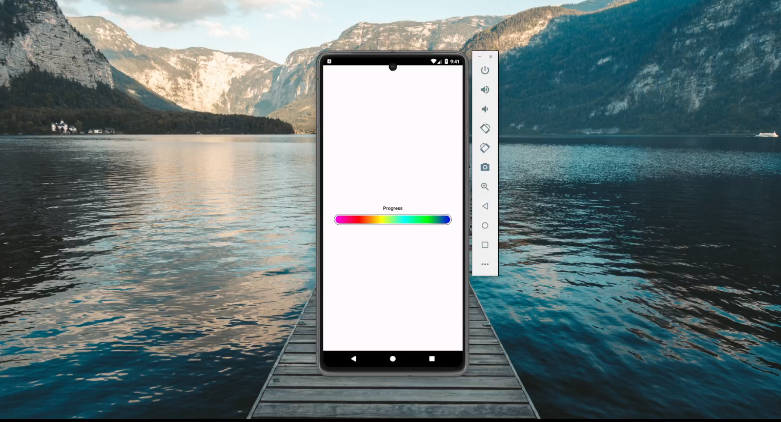
Horizontal Progress View:
HorizontalProgress(percentage =0.5f,
                         number = 100,
                         modifier = Modifier
                         .padding(16.dp))
Preview:

-
Circular Progress View:
CircularProgress(percentage =0.85f,
                         number = 100,
                         modifier = Modifier
                         .padding(16.dp))
Preview:

More Customization :
-
Horizontal Progress View:
Parameter Purpose Default Value Modifier Modifier for the composable function Modifier percentage Progress percentage value Float number Max Progress value in Integer Int fontSize Font size for the text 28.sp width Width of the progress view 350.dp height Height of the progress view 50.dp color Color of the progress indicator Color.Blue animDuration Duration of the animation in milliseconds 1000 animDelay Delay before the animation starts 0 radius Corner radius of the progress view 20.dp backgroundColor Background color of the progress view Color.LightGray textColor Color of the text Color.Black percentageTextColor Color of the percentage text Color.White percentageTextSize Font size for the percentage text 20.sp -
Circular Progress View:
Parameter Purpose Value Modifier Modifier for the composable function Modifier percentage Progress percentage value Float number Max Progress value in Integer Int fontSize Font size for the text 28.sp radius Radius of the circular progress view 50.dp color Color of the progress indicator Color.Blue strokeWidth Width of the progress indicator 8.dp animDuration Duration of the animation (in ms) 1000 animDelay Delay before the animation starts 0 capRounded Whether to use rounded line cap true startAngle Starting angle of the progress arc -90f maxAngle Maximum angle of the progress arc 360f textColor Color of the text Color.Black useCenter Whether to include center in the arc false
-