IndicatorScrollView

Reacts dynamically with an indicator when the scroll is changed.

DoubleLiftv

DoubleLift

Including in your project

Download
JitPack

Add below codes to your root build.gradle file (not your module build.gradle file).

allprojects {
    repositories {
        jcenter()
    }
}

And add a dependency code to your module's build.gradle file.

dependencies {
    implementation "com.github.skydoves:indicatorscrollview:1.0.2"
}

Usage

Add following XML namespace inside your XML layout file.

xmlns:app="http://schemas.android.com/apk/res-auto"

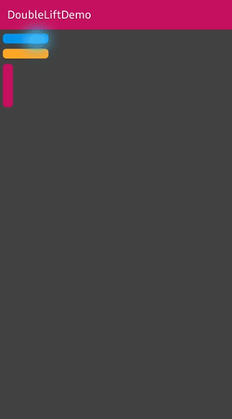
IndicatorScrollView & indicatorView in layout

Here is a basic example of implementing IndicatorScrollView and indicatorView.

<com.skydoves.indicatorscrollview.IndicatorScrollView 
  xmlns:android="http://schemas.android.com/apk/res/android"
  xmlns:app="http://schemas.android.com/apk/res-auto"
  android:id="@+id/indicatorScrollView"
  android:layout_width="match_parent"
  android:layout_height="wrap_content">

  <LinearLayout
    android:layout_width="match_parent"
    android:layout_height="wrap_content"
    android:orientation="horizontal">

    <com.skydoves.indicatorscrollview.IndicatorView
      android:id="@+id/indicatorView"
      android:layout_width="60dp"
      android:layout_height="match_parent"
      android:background="@color/background800"
      android:paddingLeft="6dp"
      android:paddingRight="6dp"
      app:indicator_expandingRatio="0.2" // expands when an indicator item reaches the display's height ratio.
      app:indicator_expandingAllItemRatio="0.9" // expands all items when scroll reaches a specific position ratio.
      app:indicator_itemPadding="6dp" // padding size between indicator items.
    />
      
    <LinearLayout
      android:layout_width="match_parent"
      android:layout_height="match_parent"
      android:orientation="vertical"
      android:paddingBottom="40dp">
   
      // some complicated views..
   
      <LinearLayout // This layout will be used for composing indicator.
        android:id="@+id/section1"
        android:layout_width="match_parent"
        android:layout_height="wrap_content"/>
        
      <LinearLayout  // This layout will be used for composing indicator.
        android:id="@+id/section2"
        android:layout_width="match_parent"
        android:layout_height="wrap_content"        
   
    </LinearLayout/>
  </LinearLayout>
</com.skydoves.indicatorscrollview.IndicatorScrollView>

IndicatorScrollView

IndicatorScrollView is a scrollView for reacting with IndicatorView when scroll is changed.

It extends NestedScrollView. So it must have a ViewGroup child like what LinearLayout or RelativeLayout.

IndicatorView

IndicatorView is an indicator view for reacting to IndicatorScrollView when the scroll is changed.

It should be used in IndicatorScrollView.

Create using builder class

We can create an instance of the IndicatorView using IndicatorView.Builder class.

val indicatorView = IndicatorView.Builder(this)
  .setIndicatorItemPadding(16)
  .setExpandingRatio(0.2f)
  .setExpandingAllItemRatio(1.0f)
  .build()

Binding

We should bind an IndicatorView to IndicatorScrollView like bellow.

indicatorScrollView.bindIndicatorView(indicatorView)

IndicatorItem

IndicatorItem is an attribute item data for composing the IndicatorView.

We can create an instance of the IndicatorItem using the IndicatorItem.Builder class.

val myIndicatorItem = 
    IndicatorItem.Builder(section1) // section1 is the target view for the start of expanding.
    .setItemColor(myColor) // sets the background color of the indicator item using value.
    .setItemColorResource(R.color.colorPrimary) // sets the background color of the item using resource.
    .setItemIcon(myIcon) // sets the icon of the indicator item using drawable.
    .setItemIconResource(R.drawable.ic_heart) // sets the icon of the indicator item using resource.
    .setItemDuration(400) // sets the expanding and collapsing duration.
    .setItemCornerRadius(40f) // sets the corner radius of the indicator item.
    .setItemIconTopPadding(12) // sets the padding top value between the indicator items.
    .setExpandedSize(600) // customizes the fully expanded height size.
    .build()

We can create it using kotlin dsl.

val myIndicatorItem = indicatorItem(section1) {
  setItemColor(myColor) // sets the background color of the indicator item using value.
  setItemColorResource(R.color.colorPrimary) // sets the background color of the item using resource.
  setItemIcon(myIcon) // sets the icon of the indicator item using drawable.
  setItemIconResource(R.drawable.ic_heart) // sets the icon of the indicator item using resource.
  setItemDuration(400) // sets the expanding and collapsing duration.
  setItemCornerRadius(40f) // sets the corner radius of the indicator item.
  setItemIconTopPadding(12) // sets the padding top value between the indicator items.
  setExpandedSize(600) // customizes the fully expanded height size.
}

And add the instance of the IndicatorItem to IndicatorView.
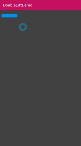
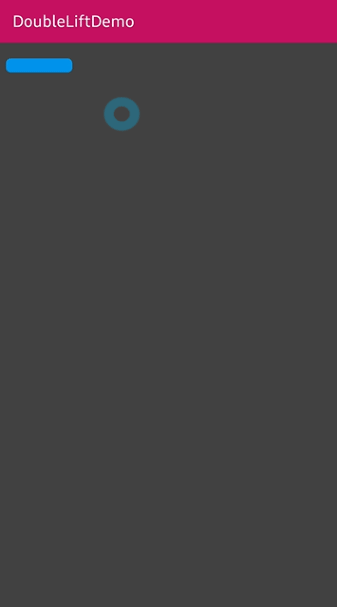
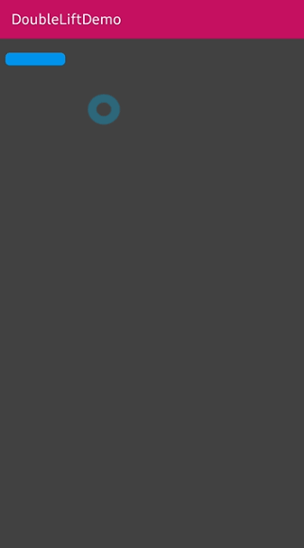
indicatorView.addIndicatorItem(myIndicatorItem)

// or we can use plus operator.
indicatorView + myIndicatorItem

IndicatorAnimation

We can customize the expanding and collapsing animation.

IndicatorAnimation.NORMAL
IndicatorAnimation.Accelerator
IndicatorAnimation.Bounce
NORMAL Accelerator Bounce
67661136-c749d180-f9a3-11e9-82c4-48975a704412 67661132-c749d180-f9a3-11e9-8689-904d60a74e42 67661134-c749d180-f9a3-11e9-9dfe-6071936f1a30

IndicatorView Attributes

Attributes Type Default Description
expandingRatio Float 0.2 expands when an indicator item reaches the display's height ratio.
expandingAllItemRatio Float 0.9 expands all items when scroll reaches a specific position ratio.
itemPadding Dimension 6dp padding size between indicator items.

GitHub