Sheets

Sleek dialogs and bottom-sheets for quick use in your app. Choose one of the available sheets or build custom sheets on top of the existing functionality.

Get started
A sheet can dynamically be displayed as either a dialog or as a bottom-sheet.
Check out the sample.
You have to use the core module as it is the foundation of any sheet.
In your top-level build.gradle file:
repositories {
  ...
  mavenCentral()
}
In your app build.gradle file:

dependencies {
  ...
  implementation 'com.maxkeppeler.sheets:core:<latest-version>'
}
Base functions
Following functions can be called from any type of sheet.
| Function | Action |
|---|---|
| style() | Display as dialog or bottom-sheet. |
| title() | Set the title text. |
| titleColor() | Set the title text color. |
| titleColorRes() | Set the title text color by a resource. |
| withCoverImage() | Add a cover image. |
| topStyle() | Specify the style of the cover image and top bar. |
| positiveButtonStyle() | Define the style of the positive button (Text, Filled, Outlined). |
| negativeButtonStyle() | Define the style of the negative button (Text, Filled, Outlined). |
| withIconButton() | Add up to 3 icon buttons to the top bar. |
| closeIconButton() | Set a custom close icon button. |
| displayHandle() | Display the handle. |
| displayCloseButton() | Display close icon button. |
| displayToolbar() | Display toolbar. (Close icon button, title, divider and icon buttons) |
| peekHeight() | Set the peek height. (Only bottom-sheet) |
| cornerRadius() | Set corner radius. |
| cornerFamily() | Set corner family. (Cut or rounded) |
| borderWidth() | Set the border width. |
| borderColor() | Set the border color. |
| cancelableOutside() | Make sheet cancelable outside of the dialog view. |
| onNegative() | Set the negative button text and listener. |
| onPositive() | Set the positive button text and listener. |
| onDismiss() | Set a listener that is invoked when the sheet is dismissed. |
| onCancel() | Set a listener that is invoked when the sheet is cancelled (only if cancelable). |
| onClose() | Set a listener that is invoked when the sheet is closed. |
| show() | show the sheet. |
Each sheet has an extension function called build and show.
Use build to build a sheet and display it later.
val sheet = InfoSheet().build(context) {
  // build sheet
}

sheet.show() // Show sheet when ready
Use show if you want to build and then immediately display it.
InfoSheet().show(context) {
  // build sheet
} // Show sheet
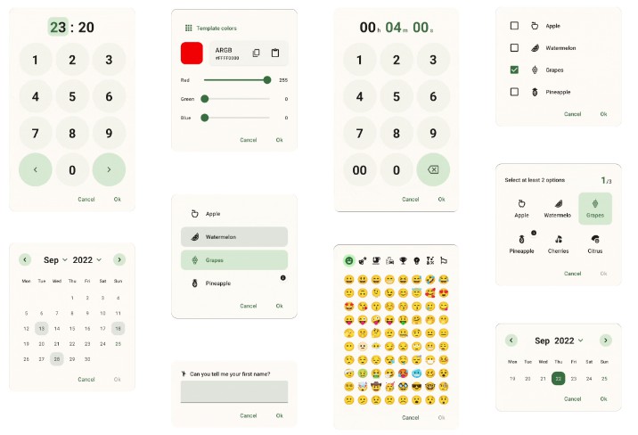
Info

The Info Sheet lets you display information or warning.
Showcase as Dialog


Showcase as BottomSheet


dependencies {
  ...
  implementation 'com.maxkeppeler.sheets:info:<latest-version>'
}
Usage
For the default info sheet use it as following:
InfoSheet().show(context) {
  title("Do you want to install Awake?")
  content("Awake is a beautiful alarm app with morning challenges, advanced alarm management and more.")
  onNegative("No") {
    // Handle event
  }
  onPositive("Install") {
    // Handle event
  }
}
| Function | Action |
|---|---|
| content() | Set content text. |
| drawable() | Set drawable. |
| drawableColor() | Set drawable color. |
| customView() | Use a custom view. |
Options

The Options Sheet lets you display a grid or list of options.
Showcase as Dialog

Showcase as BottomSheet

Showcase some variants as Dialogs


Showcase some variants as BottomSheets


dependencies {
  ...
  implementation 'com.maxkeppeler.sheets:info:<latest-version>'
}
dependencies {
  ...
  implementation 'com.maxkeppeler.sheets:options:<latest-version>'
}
Usage
For the default options sheet use it as following:
OptionsSheet().show(context) {
  title("Text message")
  with(
    Option(R.drawable.ic_copy, "Copy"),
    Option(R.drawable.ic_translate, "Translate"),
    Option(R.drawable.ic_paste, "Paste")
  )
  onPositive { index: Int, option: Option ->
    // Handle selected option
  }
}
| Function | Action |
|---|---|
| multipleChoices() | Allow multiple choices content. |
| displayMultipleChoicesInfo() | Display info of the multiple choices. |
| maxChoicesStrictLimit() | Specify that the max choices is strict and more choices can’t be selected temporarily. |
| minChoices() | Set the minimum amount of choices. |
| maxChoices() | Set the maximum amount of choices. |
| onPositiveMultiple() | Set listener for multiple choices. |
| displayButtons() | Display buttons and require a positive button click for selection. |
| displayMode() | Display options in a list or a vertical/ horizontal growing scrollable grid. |
| preventIconTint() | (Global) Prevents the lib to use a tint for the icons. Keeps the default colors of a drawable. |
Option
| Function | Action |
|---|---|
| selected() | Preselect an option. |
| disable() | Disable an option. |
| preventIconTint() | (Local) Prevents the lib to use a tint for the icons. Keeps the default colors of a drawable. |
Note: Preselected options automatically increase the current selection while disabled options decrease the maximum amount of choices.
Clock Time

The Clock Time Sheet lets you quickly pick a time.
Showcase as Dialog

Showcase as BottomSheet

dependencies {
  ...
  implementation 'com.maxkeppeler.sheets:time-clock:<latest-version>'
}
Usage
For the default clock time sheet, in 24-hours format, use it as following:
ClockTimeSheet().show(context) {
  title("Wake-up time")
  onPositive { clockTimeInMillis: Long ->
    // Handle selected time
  }
}
| Function | Action |
|---|---|
| format24Hours() | Use 24-hours or 12-hours format. |
| currentTime() | Set the current time in milliseconds. |
Time

The Time Sheet lets you pick a duration time in a specific format.
Showcase as Dialog

Showcase as BottomSheet

dependencies {
  ...
  implementation 'com.maxkeppeler.sheets:time:<latest-version>'
}
Usage
For the default time sheet use it as following:
TimeSheet().show(context) {
  title("Snooze time")
  onPositive { durationTimeInMillis: Long ->
    // Handle selected time
  }
}
| Function | Action |
|---|---|
| format() | Select the time format. (hh:mm:ss, mm:ss, …) |
| currentTime() | Set the current time in seconds. |
| minTime() | Set the minimum time. |
| maxTime()` | Set the maximum time. |
Input

The Input Sheet lets you display a form consisting of various inputs.
Showcase as Dialog

Showcase as BottomSheet

Showcase some variants as Dialogs

Showcase some variants as BottomSheets

dependencies {
  ...
  implementation 'com.maxkeppeler.sheets:input:<latest-version>'
}
Usage
For the default input sheet use it as following:
InputSheet()).show(context) {
    title("Short survey")
  with(InputEditText {
    required())
    label("Your favorite TV-Show")
    hint("The Mandalorian, ...")
    validationListener { value -> } // Add custom validation logic
    changeListener { value -> } // Input value changed
    resultListener { value -> } // Input value changed when form finished
  })
  with(InputCheckBox("binge_watching") { // Read value later by index or custom key from bundle
    label("Binge Watching")
    text("I'm regularly binge watching shows on Netflix.")
    // ... more options
  })
  with(InputRadioButtons() {
    required()
    label("Streaming service of your choice")
    options(mutableListOf("Netflix", "Amazon", "Other"))
  })
  // ... more input options
  onNegative { showToast("InputSheet cancelled", "No result") }
  onPositive { result ->
      showToastLong("InputSheet result", result.toString())
      val text = result.getString("0") // Read value of inputs by index
      val check = result.getBoolean("binge_watching") // Read value by passed key
  }
}
| Function | Action |
|---|---|
| with() | Add an input. (see input options) |
| displayInput() | Set visibility of a specific input. |
Input options:
InputEditTextInputCheckBoxInputSwitchInputRadioButtonsInputSpinnerInputSeparator
Input
| Function | Action |
|---|---|
| label() | Set the label text. |
| content() | Set content text. (e. g. to explain a survey) |
| drawable() | Set the drawable. |
| required() | Mark input as required. |
| visible() | Set initial visibility. |
| changeListener() | Set listener to observe changes. |
| resultListener() | Set listener for final value. |
InputEditText
| Function | Action |
|---|---|
| hint() | Set the hint text. |
| defaultValue() | Set default text. |
| inputType() | Set the android.text.InputType‘s. |
| inputFilter() | Set the android.text.inputFilter |
| maxLines() | Set the max amount of lines. |
| endIconMode() | Set TextInputLayout.EndIconMode. |
| endIconActivated() | Set the EndIcon activated. |
| passwordVisible() | Make the password initially visible or invisible. |
| validationListener() | Validate the text input with your own logic. |
InputCheckBox
| Function | Action |
|---|---|
| text() | Set the text. |
| defaultValue() | Set default value. |
InputSwitch
| Function | Action |
|---|---|
| text() | Set the text. |
| defaultValue() | Set default value. |
InputRadioButtons
| Function | Action |
|---|---|
| options() | Set a list of RadioButton options. |
| selected() | Set a selected index. |
InputSpinner
| Function | Action |
|---|---|
| noSelectionText() | Set the text that is displayed, when nothing is selected. |
| options(MutableList of String) | Set a list of options. |
| options(MutableList of SpinnerOption) | Set a list of options with optional icon for each option. |
| selected() | Set a selected index. |
Calendar

The Calendar Sheet lets you pick a date or date range. This type was build using the library CalendarView.
Showcase as Dialog

Showcase as BottomSheet

dependencies {
  ...
  implementation 'com.maxkeppeler.sheets:calendar:<latest-version>'
}
Usage
For the default time sheet use it as following:
CalendarSheet().show(this) { // Build and show
  title("What's your date of birth?") // Set the title of the sheet
  onPositive { dateStart, dateEnd ->
    // Handle date or range
  }
| Function | Action |
|---|---|
| selectionMode() | Choose the selection mode (date or range). |
| calendarMode() | Choose the calendar mode (week with various rows or month-view). |
| disableTimeline() | Disable either past or future dates. |
| rangeYears() | Set the range of years into past and future. |
| disable() | Pass a Calendar object to disable various dates for selection. |
| displayButtons() | Show or hide the buttons view. |
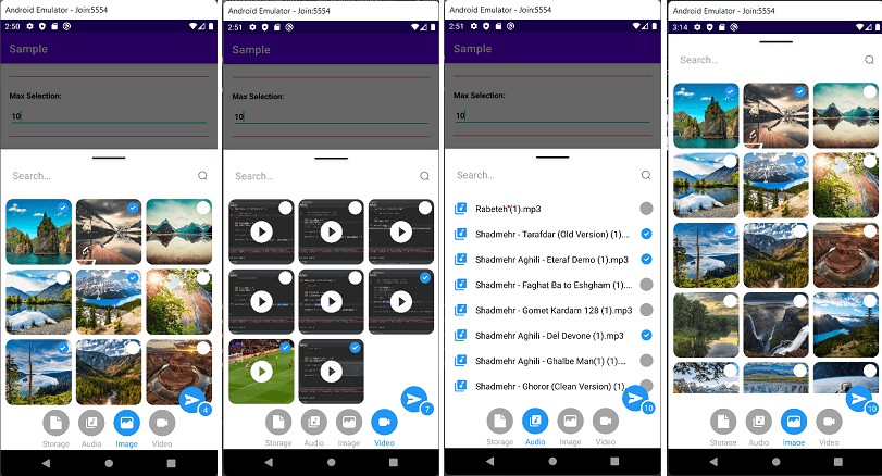
Storage

The Storage Sheet lets you pick one or more files or folders.
Showcase as Dialog

Showcase as BottomSheet

dependencies {
  ...
  implementation 'com.maxkeppeler.sheets:storage:<latest-version>'
}
Usage
For the default storage sheet use it as following:
StorageSheet().show(this) {
  fileDisplayMode(FileDisplayMode.HORIZONTAL)
  selectionMode(StorageSelectionMode.FILE)
  onPositive { files -> /* Handle files or folders */ }
}
| Function | Action |
|---|---|
| fileDisplayMode() | Display a file either horizontal or vertical. |
| fileColumns() | Specify the amount of colums in which the files are displayed. |
| selectionMode() | Select either files or folders. |
| selected() | Define files that are by default selected. |
| homeLocation() | Define the home location. User can not navigate higher than the home location. |
| currentLocation() | Define the current location when the sheet is opened. |
| filter() | A FileFilter to ignore certain files. |
| multipleChoices() | Allow multiple choices for files or folders. |
| displayMultipleChoicesInfo() | Display info of the multiple choices. |
| minChoices() | Set the minimum amount of choices. |
| maxChoices() | Set the maximum amount of choices. |
| onCreateFolder() | Pass a listener that is invokes when the user is allowed and intends to create a folder. Return a fitting name through the callback variable. |
Color

The Color Sheet lets you pick a color. Display the default material colors or specify which colors can be choosen from. You can allow to chose a custom color as well.
Showcase as Dialog


Showcase as BottomSheet


dependencies {
  ...
  implementation 'com.maxkeppeler.sheets:color:<latest-version>'
}
Usage
For the default color sheet use it as following:
ColorSheet().show(context) {
  title("Background color")
  onPositive { color ->
    // Use color
  }
}
| Function | Action |
|---|---|
| defaultView() | Select the default color view (Colors from templates or custom). |
| disableSwitchColorView() | Disable to switch between color views. |
| defaultColor() | Set default selected color. |
| colors() | Pass all colors to be displayed in the color templates view. |
| disableAlpha() | Disable alpha colors for custom colors. |
Custom
With just the ‘core’ module you are able to create your own sheet based on this library. You can use some components and styles within your own custom sheet automatically. By default the buttons and toolbar view with logic is ready to be used by your own implementation.
Showcase as Dialog

Showcase as BottomSheet

dependencies {
  ...
  implementation 'com.maxkeppeler.sheets:core:<latest-version>'
}
Get started
You can find a custom sheet implementation in the sample module.
-
Step: Create a class and extend from the class
Sheet.class CustomSheet : Sheet() {
-
Step: Implement the method:
onCreateLayoutViewand pass your custom layout.override fun onCreateLayoutView(): View {
return LayoutInflater.from(activity).inflate(R.layout.sheets_custom, null)
}
All of the base functionality can be used and on top of that you can extend the logic and behavior as you wish.
Components
You are free to use the components this library uses for it’s sheet types.
SheetsTitleSheetsContentSheetsDigitSheetsNumericalInputSheetsDividerSheetsButtonSheetsEditSheetsRecyclerViewSheetsValue
Lottie

The Lottie modules gives you the ability to use a Lottie animations as cover view.
Showcase as Dialog

Showcase as BottomSheet

dependencies {
  ...
  implementation 'com.maxkeppeler.sheets:lottie:<latest-version>'
}
Usage
You can use the Lottie animation as a cover for any type of sheet.
InfoSheet().show(this) {
  title("Team Collaboration")
  content("In the world of software projects, it is inevitable...")
  ...
  withCoverLottieAnimation(LottieAnimation {
    setAnimation(R.raw.anim_lottie_business_team)
    ... Setup Lottie animation
  })
  ...
}
| Function | Action |
|---|---|
| playCoverAnimation() | Play the animation. |
| resumeCoverAnimation() | Resume the animation. |
| pauseCoverAnimation() | Pause the animation. |
| cancelCoverAnimation() | Cancel the animation. |
Appearance
By default, the library switches to either day or night mode depending on the attr textColorPrimary.
By default it uses the activity’s colorPrimary. The default highlightColor is generated based on the color sheetsPrimaryColor, or if not available colorPrimary.
Base
You want a different sheet background shape?
Then just override the corner family and radius.
<item name="sheetsCornerRadius">12dp</item>
<item name="sheetsCornerFamily">cut</item>
Just overwrite the base colors, if you want to achieve a different look of the sheets than your app.
<item name="sheetsPrimaryColor">@color/customPrimaryColor</item>
<item name="sheetsHighlightColor">@color/customHighlightColor</item>
<item name="sheetsBackgroundColor">@color/customBackgroundColor</item>
<item name="sheetsDividerColor">@color/customDividerColor</item>
<item name="sheetsIconsColor">@color/customIconsColor</item>
You can override the basic style of a sheet. Instead of displaying the toolbar, you can just hide it and display the typical handle.
<item name="sheetsDisplayHandle">true</item>
<item name="sheetsDisplayToolbar">false</item>
<item name="sheetsDisplayCloseButton">false</item>
Change the appearance of the title.
<item name="sheetsTitleColor">@color/customTitleTextColor</item>
<item name="sheetsTitleFont">@font/font</item>
<item name="sheetsTitleLineHeight">@dimen/dimen</item>
<item name="sheetsTitleLetterSpacing">value</item>
Change the appearance of the content text.
<item name="sheetsContentColor">@color/customContentTextColor</item>
<item name="sheetsContentInverseColor">@color/customContentTextInverseColor</item>
<item name="sheetsContentFont">@font/font</item>
<item name="sheetsContentLineHeight">@dimen/dimen</item>
<item name="sheetsContentLetterSpacing">value</item>
Change the appearance of the value texts. (e.g. the time in the TimeSheet & ClockTimeSheet or the selected date & period in the Calendarsheet.)
<item name="sheetsValueTextActiveColor">@color/customValueTextColor</item>
<item name="sheetsValueFont">@font/font</item>
<item name="sheetsValueLineHeight">@dimen/dimen</item>
<item name="sheetsValueLetterSpacing">value</item>
Change the appearance of the digit keys on the numerical input.
<item name="sheetsDigitColor">@color/customDigitTextColor</item>
<item name="sheetsDigitFont">@font/font</item>
<item name="sheetsDigitLineHeight">@dimen/dimen</item>
<item name="sheetsDigitLetterSpacing">value</item>
Buttons
Override the appearance of the button text.
<item name="sheetsButtonTextFont">@font/font</item>
<item name="sheetsButtonTextLetterSpacing">value</item>
Override the general appearance of the buttons (negative and positive button).
<item name="sheetsButtonColor">@color/customButtonColor<item>
<item name="sheetsButtonTextFont">@font/font<item>
<item name="sheetsButtonTextLetterSpacing">value<item>
<item name="sheetsButtonCornerRadius">12dp<item>
<item name="sheetsButtonCornerFamily">cut<item>
<item name="sheetsButtonWidth">match_content/wrap_content<item>
Override the appearance of the negative button.
<item name="sheetsNegativeButtonType">text_button/outlined_button/button<item>
<item name="sheetsNegativeButtonCornerRadius">12dp<item>
<item name="sheetsNegativeButtonCornerFamily">cut<item>
Override the appearance of the positive button.
<item name="sheetsPositiveButtonType">text_button/outlined_button/button<item>
<item name="sheetsPositiveButtonCornerRadius">12dp<item>
<item name="sheetsPositiveButtonCornerFamily">cut<item>
Override the border appearance of the outlined button.
<item name="sheetsButtonOutlinedButtonBorderColor">@color/borderColor<item>
<item name="sheetsButtonOutlinedButtonBorderWidth">1dp<item>
The corner family and radius is applied to the button shape or in the case of a outlined or text button, to the ripple background shape.
Fine control
You can even define the corner family and radius of the negative and positive button for each corner.
<item name="sheetsNegativeButtonBottomLeftCornerRadius">4dp<item>
<item name="sheetsNegativeButtonBottomLeftCornerFamily">cut<item>
...
<item name="sheetsPositiveButtonBottomRightCornerRadius">8dp<item>
<item name="sheetsPositiveButtonBottomRightCornerFamily">rounded<item>
Handle
The size and the appearance of the handle can be changed like this:
<item name="sheetsHandleCornerRadius">8dp</item>
<item name="sheetsHandleCornerFamily">rounded</item>
<item name="sheetsHandleFillColor">?sheetPrimaryColor</item>
<item name="sheetsHandleBorderColor">?sheetPrimaryColor</item>
<item name="sheetsHandleBorderWidth">1dp</item>
<item name="sheetsHandleWidth">42dp</item>
<item name="sheetsHandleHeight">4dp</item>
OptionsSheet
Override appearance of selected options.
<item name="sheetsOptionSelectedImageColor">@color/customSelectedOptionImageColor</item>
<item name="sheetsOptionSelectedTextColor">@color/customSelectedOptionTextColor</item>
Override appearance of disabled options.
<item name="sheetsOptionDisabledImageColor">@color/customDisabledOptionImageColor</item>s
<item name="sheetsOptionDisabledTextColor">@color/customDisabledOptionImageColor</item>
<item name="sheetsOptionDisabledBackgroundColor">@color/customDisabledOptionBackgColor</item>
InputSheet
Override the appearance of the TextInputLayout (used for the InputEditText).
<item name="sheetsTextInputLayoutCornerRadius">12dp</item>
<item name="sheetsTextInputLayoutBottomLeftCornerRadius">12dp</item>
... and for all other corners
<item name="sheetsTextInputLayoutEndIconColor">@color/customEndIconColor</item>
<item name="sheetsTextInputLayoutHelperTextColor">@color/customHelperTextColor</item>
<item name="sheetsTextInputLayoutBoxStrokeColor">@color/customBoxStrokeColor</item>
<item name="sheetsTextInputLayoutHintTextColor">@color/customHintTextColor</item>
<item name="sheetsTextInputLayoutBoxStrokeErrorColor">@color/customBoxStrokeErrorColor</item>
<item name="sheetsTextInputLayoutErrorTextColor">@color/customErrorTextColor</item>
Misc
Support this project
- Leave a star and tell others about it
- Watch for updates and improvements.
- Open an issue if you see or got any error.
- Leave your thanks here and showcase your implementation.
- Donate me a coffee.
Contribute
- Open an issue to discuss what you would like to change.
- Fork the Project
- Create your feature branch (feature-[some-name])
- Commit your changes
- Push to the branch (origin feature-[some-name])
- Open a pull request
Donate
Show your appreciation by donating me a coffee. Thank you very much!


Showcase
Check out some apps which are using this library.
-
Aquafy – Beautiful hydration tracker and reminder.
-
Awake – Intelligent alarms and wake-up challenges and sleep tracking to improve your daily sleep and day-time quality.
-
Sign for Spotify – Playlist and control widgets for Spotify content.
-
Buddha Quotes – Open Source Buddha Quotes.
License
Copyright 2020 Maximilian Keppeler https://maxkeppeler.com

Licensed under the Apache License, Version 2.0 (the "License");
you may not use this file except in compliance with the License.
You may obtain a copy of the License at

   http://www.apache.org/licenses/LICENSE-2.0

Unless required by applicable law or agreed to in writing, software
distributed under the License is distributed on an "AS IS" BASIS,
WITHOUT WARRANTIES OR CONDITIONS OF ANY KIND, either express or implied.
See the License for the specific language governing permissions and
limitations under the License.