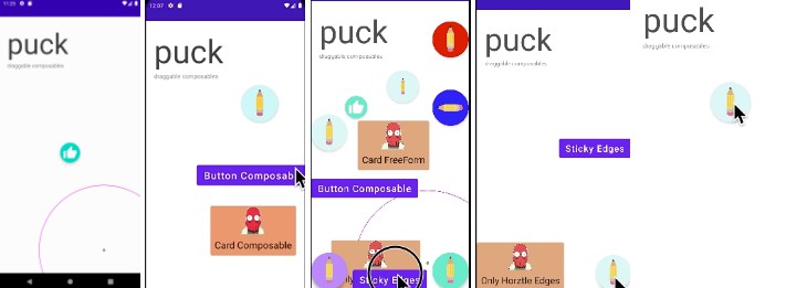
Puck
Make Composables Draggable.


Including in your project

Gradle
Add below codes to your root build.gradle file (not your module build.gradle file).
allprojects {
    repositories {
        mavenCentral()
    }
}
And add a dependency code to your module‘s build.gradle file.
dependencies {
    implementation 'com.github.Shivamdhuria:puck:Version'
}
Usage
//Currently just copy the library module to your project. haven’t uploaded on jitpack yet
        setContent {
            // this keeps parents size
            val parentSize = remember { mutableStateOf(Size.Zero) }
            PuckTheme {
                // A surface container using the 'background' color from the theme
                Surface(modifier = Modifier.fillMaxSize(), color = MaterialTheme.colors.background) {
                    Box(modifier = Modifier
                        .onGloballyPositioned { coordinates ->
                            //Set parents Size
                            parentSize.value = coordinates.size.toSize()
                        }
                        .fillMaxSize()
                    ) {
                        //Adding puck to Card Composable
                        Card(
                            modifier = Modifier
                                .puck(parentSize, behaviour = FreeForm), backgroundColor = PINK200
                        ) {
                            Column(horizontalAlignment = Alignment.CenterHorizontally) {
                                Image(
                                    painterResource(drawable.zoid),
                                    contentDescription = "",
                                    contentScale = ContentScale.Crop,
                                    modifier = Modifier
                                        .height(70.dp)
                                        .width(70.dp)
                                )
                                Text(text = "Card Composable", fontSize = 24.sp, modifier = Modifier.padding(10.dp))
                            }
                        }
                        //Adding puck to Button Composable
                        Button(onClick = { }, modifier = Modifier.puck(parentSize, behaviour = FreeForm, animationDuration = 700)) {
                            Text(text = "Button Composable", fontSize = 24.sp)
                        }

                       //Adding puck to FAB Composable
                        FloatingActionButton(
                            onClick = {},
                            modifier = Modifier
                                .puck(parentSize, FreeForm, animationDuration = 700)
                                .width(90.dp)
                                .height(90.dp),
                        ) {
                            Image(
                                painterResource(drawable.pencil),
                                contentDescription = "",
                                modifier = Modifier
                                    .height(50.dp)
                                    .width(50.dp)
                            )
                        }
                    }
                }
            }
Behaviours
Currently Puck supports three behaviours
- Freeform
- Sticky
- Gravity
FreeForm
Freeform makes Composable draggable anywhere in the screen. If the user drags a composable out of screen area, it is coerced within the bounds of the screen.
For adding Freeform behaviour to any composable, do –
FloatingActionButton(onClick = {},
                            modifier = Modifier
                                .puck(parentSize, behaviour = FreeForm)
                                .width(90.dp)
                                .height(90.dp)) {
                            //Image or anything
                        }
Sticky
You can also make Composables stick to the edges or corners of the screen. Simple flick the Composable in the direction you want it to stick and it will follow the trajectory and stick there. To use stick you need to pass a parameter (EDGES, CORNERS,VERTICAL EDGsE HORIZONATL EDGES). Puck will automatically make the set parameter “sticky”.
FloatingActionButton(onClick = {},
                           modifier = Modifier
                                .puck(parentSize, behaviour = Sticky(Corners), animationDuration = 500)
                                .width(90.dp)
                                .height(90.dp),
                            backgroundColor = WHITE200
                        ) {
                            Image()
                        }
Gravity
We can define gravity points with center and radius. Any composable that falls within this circle’s gravity field will “zap” towards this center.
Note: The circle isn’t actualy drawn as above while using puck. I have shown the circle only for demonstration purposes.

val circle = Circle(800f, 1800f, 500f)
FloatingActionButton(onClick = {},
                           modifier = Modifier
                                .puck(parentSize,behaviour = Gravity(circle), animationDuration = 500)
                                .width(90.dp)
                                .height(90.dp),
                            backgroundColor = WHITE200
                        ) {
                            Image()
                        }
Attributes
- isPointsTowardsCenter – Currently this only works for Sticky(Edges) mode. Composable will always point towards center by using rotation animation. When a composable is dragged, the rotation value is set to default (0f), after the drag ends and the commposable sticks to any of the edges, the composable rotates according and points towards center.

-
animationDuration – This is time taken in milli seconds for the drag animation. The lesser the time the quicker the animation. (Note: When the behaviour is set to Freeform, a composable is draggable without any animation.)
-
focusedSizeMultiplier – When a composable is in pressed state, its size increases by this factor. You can set it to 1, if you don’t want to increase it’s size when in pressed date
-
onOffsetChanged – This returns the latest int offset of the composable’s position after the drag ends. You should ideally use it to save the latest offset in shared preferences/ datastore to use it again and position the composable when the app restarts again.
Code & Issues
If you are a developer and you wish to contribute to the app please raise an issue, discuss, fork and submit a pull request.
Follow Github Flow for collaboration!
Find this repository useful? ❤️
Support it by joining starring this repository. ⭐
And follow me on Medium, Github and Twitter
Project Maintainers
This project is founded and actively maintained by Shivam Dhuria.
License
Copyright 2021 Shivam Dhuria

Licensed under the Apache License, Version 2.0 (the "License");
you may not use this file except in compliance with the License.
You may obtain a copy of the License at

   http://www.apache.org/licenses/LICENSE-2.0

Unless required by applicable law or agreed to in writing, software
distributed under the License is distributed on an "AS IS" BASIS,
WITHOUT WARRANTIES OR CONDITIONS OF ANY KIND, either express or implied.
See the License for the specific language governing permissions and
limitations under the License.