ColorPicker Compose
? Jetpack Compose color picker library that allows you to get colors from any images like gallery pictures by tapping on the desired color. Also, it supports brightness and alpha slider, which can adjust your ARGB factors.


Download

Gradle
Add the dependency below to your module‘s build.gradle file:
dependencies {
    implementation "com.github.skydoves:colorpicker-compose:1.0.0"
}
SNAPSHOT
See how to import the snapshot
Including the SNAPSHOT
Snapshots of the current development version of ColorPicker-Compose are available, which track the latest versions.
To import snapshot versions on your project, add the code snippet below on your gradle file:
repositories {
   maven { url 'https://oss.sonatype.org/content/repositories/snapshots/' }
}
Next, add the dependency below to your module‘s build.gradle file:
dependencies {
    implementation "com.github.skydoves:colorpicker-compose:1.0.1-SNAPSHOT"
}
Usage
First, you should initialize ColorPickerController, which allows you to control color pickers and all subcomponents.
val controller = rememberColorPickerController()
Next, you can implement a color picker with the ImageColorPicker composable function.
ImageColorPicker(
    modifier = Modifier.fillMaxSize(),
    paletteImageBitmap = ImageBitmap.imageResource(R.drawable.palettebar),
    controller = controller
)
ImageColorPicker
ImageColorPicker allows you to get colors from any images such as gallery pictures or drawble resources by tapping on the desired color.
It interacts with the ColorPickerController to control the color picker and other components. You can use the ImageColorPicker as the following example:
ImageColorPicker(
    modifier = Modifier
        .fillMaxWidth()
        .height(450.dp)
        .padding(10.dp),
    controller = controller,
    paletteImageBitmap = ImageBitmap.imageResource(R.drawable.palettebar),
    paletteContentScale = PaletteContentScale.FIT,
    onColorChanged = { colorEnvelope: ColorEnvelope ->
        // do something
    }
)
With the modernstorage‘s Photo Picker, you can set an desired image as the palette like the below:
val context = LocalContext.current
val photoPicker =
    rememberLauncherForActivityResult(PhotoPicker()) { uris ->
        val uri = uris.firstOrNull() ?: return@rememberLauncherForActivityResult

        val bitmap = if (Build.VERSION.SDK_INT >= Build.VERSION_CODES.P) {
            ImageDecoder.decodeBitmap(ImageDecoder.createSource(context.contentResolver, uri))
        } else {
            MediaStore.Images.Media.getBitmap(context.contentResolver, uri)
        }

        controller.setPaletteImageBitmap(bitmap.asImageBitmap())
    }
As you can see the above, you can set the palette with the setPaletteImageBitmap function of the controller.
PaletteContentScale
You can adjust your palette’s image scale with the setPaletteContentScale function of the controller as the below:
controller.setPaletteContentScale(PaletteContentScale.FIT) // scale the image to fit width and height.
controller.setPaletteContentScale(PaletteContentScale.CROP) // center crop the image.
HsvColorPicker
HsvColorPicker allows you to get colors from HSV color palette by tapping on the desired color.
It interacts with the ColorPickerController to control the color picker and other components. You can use the HsvColorPicker as the following example:
HsvColorPicker(
    modifier = Modifier
        .fillMaxWidth()
        .height(450.dp)
        .padding(10.dp),
    controller = controller,
    onColorChanged = { colorEnvelope: ColorEnvelope ->
        // do something
    }
)
Note: If you use
HsvColorPicker, you can not set the palette and content scale with thesetPaletteImageBitmapandsetPaletteContentScalefunctions.
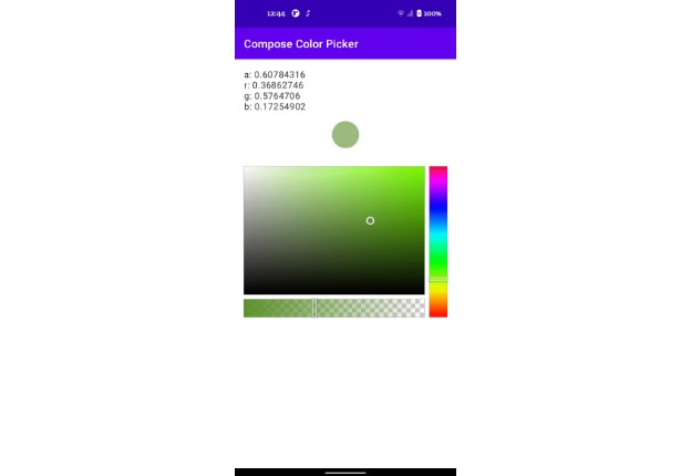
ColorEnvelope
ColorEnvelope is a data transfer object that includes updated color factors. If you pass the onColorChanged lambda function to the ImageColorPicker or HsvColorPicker, the lambda receives ColorEnvelope.
ColorEnvelope includes the following properties:
onColorChanged = { colorEnvelope: ColorEnvelope ->
    val color: Color = colorEnvelope.color // ARGB color value.
    val hexCode: String = colorEnvelope.hexCode // Color hex code, which represents color value.
    val fromUser: Boolean = colorEnvelope.fromUser // Represents this event is triggered by user or not.
}
ColorPickerController
ColorPickerController interacts with color pickers and it allows you to control the all subcomponents.
Custom Wheel
You can customize the wheel with the following functions:
.setWheelRadius(40.dp) // set the radius size of the wheel.
.setWheelColor(Color.Blue) // set the color of the wheel.
.setWheelAlpha(0.5f) // set the transparency of the wheel.
.setWheelImageBitmap(imageBitmap) // set the wheel image with your custom ImageBitmap.
Select Points
You can select specific points with the functions below:
.selectByCoordinate(x = 100f, y = 100f, fromUser = false) // select x = 100, y = 100.
.selectCenter(fromUser = false) // select center of the palette.
Debounce
You can set the debounce duration, which decides to invoke the color listener from the last tapping. Debounce can be useful to reduce overhead. For example, communicating with IoT devices or relevant works that require heavy operations.
.setDebounceDuration(300L)
Enable and Disable
You can enable or disable your color picker with the below function:
.setEnabled(false)

AlphaSlider
AlphaSlider allows you to adjust the alpha value of the selected color from color pickers.
AlphaSlider needs to be tied to the ColorPickerController, and the value changes will be assembled with the selected color factors.
You can implement AlphaSlider as the following example:
AlphaSlider(
    modifier = Modifier
        .fillMaxWidth()
        .height(35.dp)
        .padding(10.dp)
    controller = controller,
)
You can customize the border of the sider with the following parameters:
AlphaSlider(
    borderRadius = 6.dp,
    borderSize = 5.dp,
    borderColor = Color.LightGray,
    ..
)
You can customize the wheel of the sider with the following parameters:
AlphaSlider(
    wheelRadius = 30.dp,
    wheelColor = Color.White,
    wheelPaint = Paint().apply { color = wheelColor },
    wheelImageBitmap = ImageBitmap.imageResource(R.drawable.wheel),
    ..
)
Also, you can customize tiles of the background with the following parameters:
AlphaSlider(
    tileOddColor = Color.White,
    tileEvenColor = Color.LightGray,
    tileSize = 30.dp,
    ..
)

BrightnessSlider
BrightnessSlider allows you to adjust the brightness value of the selected color from color pickers.
BrightnessSlider needs to be tied to the ColorPickerController, and the value changes will be assembled with the selected color factors.
You can implement BrightnessSlider as the following example:
BrightnessSlider(
    modifier = Modifier
        .fillMaxWidth()
        .height(35.dp)
        .padding(10.dp)
    controller = controller,
)
You can customize the wheel of the sider with the following parameters:
BrightnessSlider(
    wheelRadius = 30.dp,
    wheelColor = Color.White,
    wheelPaint = Paint().apply { color = wheelColor },
    wheelImageBitmap = ImageBitmap.imageResource(R.drawable.wheel),
    ..
)
AlphaTile
AlphaTile allows you to display ARGB colors including transparency with tiles.
AlphaTile(
    modifier = Modifier
        .size(80.dp)
        .clip(RoundedCornerShape(6.dp))
    controller = controller
)
Also, you can customize tiles of the background with the following parameters:
AlphaTile(
    tileOddColor = Color.White,
    tileEvenColor = Color.LightGray,
    tileSize = 30.dp,
    ..
)
Find this repository useful? ❤️
Support it by joining stargazers for this repository. ⭐ Also, follow me on GitHub for my next creations! ?
License
Designed and developed by 2022 skydoves (Jaewoong Eum)

Licensed under the Apache License, Version 2.0 (the "License");
you may not use this file except in compliance with the License.
You may obtain a copy of the License at

   http://www.apache.org/licenses/LICENSE-2.0

Unless required by applicable law or agreed to in writing, software
distributed under the License is distributed on an "AS IS" BASIS,
WITHOUT WARRANTIES OR CONDITIONS OF ANY KIND, either express or implied.
See the License for the specific language governing permissions and
limitations under the License.