
? Bulletin lets you display a changelog in your app quickly and easily with Jetpack Compose! ?


Quick Start
In your project-level build.gradle file:
allprojects {
    repositories {
        mavenCentral()
    }
}
In your app or module build.gradle file:
dependencies {
    implementation("com.tobianoapps:bulletin:1.0.1")
}
Displaying a Bulletin
Bulletin lets you provide a changelog:
▶️ Kotlin DSL
val sampleBulletin = bulletin {
releases = listOf(
Release(
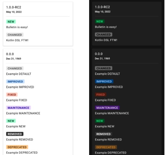
time = 1652229320349,
label = "1.0.0-RC2",
changes = listOf(
change {
changeType = NEW
summary = "Bulletin is easy!"
},
change {
changeType = DEFAULT
summary = "Kotlin DSL FTW!"
}
)
),
Release(...)
...
)
}
Then:
BulletinScreen(bulletin = sampleBulletin)
▶️ Local JSON
Save a .json file in your Android project’s assets folder then:
BulletinScreen(
    filename = "bulletin.json",
    onError = { /* handle error */ }
    )
Note: implementing the error callback is optional but strongly recommended.
Click to see JSON format
[
   {
      "time":1652229320349,
      "label":"1.0.0-RC2",
      "changes":[
         {
            "changeType":"NEW",
            "summary":"Bulletin is easy!"
         },
         {
            "changeType":"DEFAULT",
            "summary":"Kotlin DSL FTW!"
         }
      ]
   },
   {
    "more..."
   }
]
▶️ Remote JSON
Expose a public endpoint that serves json data then:
BulletinScreen(
    url = "https://mywebsite.com/api/changelog/",
    onError = { /* handle error */ }
    )
Note: implementing the error callback is optional but strongly recommended.
Click to see JSON format
[
   {
      "time":1652229320349,
      "label":"1.0.0-RC2",
      "changes":[
         {
            "changeType":"NEW",
            "summary":"Bulletin is easy!"
         },
         {
            "changeType":"DEFAULT",
            "summary":"Kotlin DSL FTW!"
         }
      ]
   },
   {
    "more..."
   }
]
To display a custom loading indicator, just pass your own Composable:
BulletinScreen(
    url = "https://mywebsite.com/api/changelog/",
    urlLoadingView = { CustomLoadingView() },
    onError = { /* handle error */ }
    )
The default HTTP timeout duration of 5 seconds can be customized as follows:
BulletinScreen(
    url = "https://mywebsite.com/api/changelog/",
    timeout = 10000L,
    onError = { /* handle error */ }
    )
Check out the sample project for detailed examples.
Callbacks
Bulletin provides callbacks that you can optionally implement.
BulletinScreen(
            ...
            onReleaseHeaderClick = { release ->
                Log.i("TAG", "Release ${release.label} header clicked")
            },
            onChangeClick = { change ->
                Log.i("TAG", "Clicked on \"${change.summary}\"")
            },
            onError = { error ->
                Log.e("TAG", "An error occurred: $error")
            }
        )
Dialog
Although displaying a Bulletin as a dialog is left for the user to implement, the sample project includes a demonstration, so make sure to check it out!


Customization
While Bulletin is meant to be a quick and easy way to display a changelog in your app (with light and dark modes supported out-of-the box), the library also provides some extensive customization options.


BulletinConfig
To customize a Bulletin‘s attributes, simply implement a custom BulletinConfig. You can choose to implement as few or as many custom attributes as desired.
val customBulletinConfig = bulletinConfig {
    bulletinColors = customBulletinColors
    style = customBulletinStyle
    groupByChangeType = true
    showHeaderDivider = false
    showReleaseDate = true
    zoneId = ZoneId.of("Europe/Paris")
    locale = Locale.FRANCE
}

val customBulletinStyle = bulletinStyle {
    cardStyle = customCardStyle
    tagStyle = customTagStyle
}

fun cardDateStyle(): TextStyle = TextStyle(
    color = Color.Blue,
    fontWeight = FontWeight.Thin,
    fontStyle = FontStyle.Italic
)

fun cardTitleStyle(): TextStyle = TextStyle(
    color = Color.Green,
    fontSize = 23.sp,
    fontWeight = FontWeight.Bold
)

val customCardStyle = bulletinCardStyle {
    shape = CutCornerShape(8.dp)
    elevation = 10.dp
    paddingHorizontal = 34.dp
    verticalSpacing = 32.dp
    cardDateStyle = {
        if (isSystemInDarkTheme())
            cardDateStyle().copy(color = Color.White)
        else
            cardDateStyle()
    }
    cardTitleStyle = {
        if (isSystemInDarkTheme())
            cardTitleStyle().copy(color = Color.LightGray)
        else
            cardTitleStyle()
    }
    borderStroke = BorderStroke(width = 3.dp, color = Color.DarkGray)
}

val customTagStyle = bulletinTagStyle {
   // custom values
}

// more custom values
Then:
Bulletin(
    ...
    bulletin = sampleBulletin,
    bulletinConfig = customBulletinConfig
    ...
    )
A complete implementation of a BulletinConfig is included in the sample project.
Change type labels

To override the strings used on the change type labels, simply provide your custom implementation in your project’s strings.xml file:
<resources>
    <string name="bulletin_change_type_default">misc</string>
    <string name="bulletin_change_type_improved">enhanced</string>
    <string name="bulletin_change_type_fixed">bug</string>
    <string name="bulletin_change_type_maintenance">these can be anything</string>
    <string name="bulletin_change_type_new">?</string>
    <string name="bulletin_change_type_removed">gone</string>
    <string name="bulletin_change_type_deprecated">obsolete</string>
    <string name="bulletin_change_type_security">notice</string>
</resources>
Contributions
Contributions, suggestions, bug reports are welcomed. Keep in mind that this is developed in my spare time, which means limited time can be dedicated to the project. I’ll do my best to fix bugs but new features may not be added.