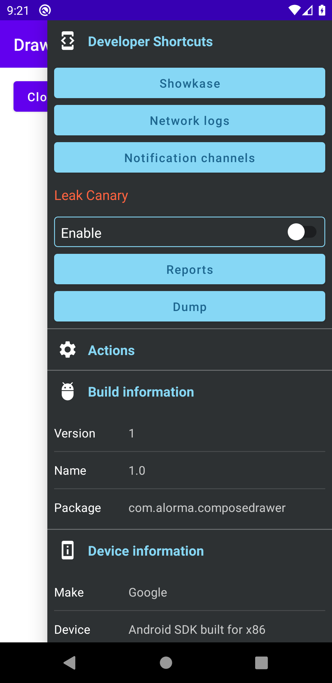
Compose-Debug-Drawer
Debug Drawer for Jetpack Compose.
This library is built for compose : beta-01
Composable Debug Drawer for Jetpack Compose apps
Install
allprojects {
    repositories {
        //...
        mavenCentral()
    }
}
Add dependencies:
implementation 'com.github.alorma:drawer-base:$version'
implementation 'com.github.alorma:drawer-modules:$version'
Setup
Wrap your content with DebugDrawerLayout:
DebugDrawerLayout(
    drawerModules = {
        TODO()
    }
) {
    // TODO Add your APP Content here
}
Debug vs Release
If you don't want DebugDrawer layout code in release you can wrap it on a custom function:
src/debug/...
@Composable
fun ConfigureScreen(bodyContent: @Composable () -> Unit) {
    DebugDrawerLayout(
        drawerModules = { ... },
        bodyContent = { bodyContent() },
    )
}
src/release/...
@Composable
fun ConfigureScreen(bodyContent: @Composable () -> Unit) {
    bodyContent()
}
Modules
Add modules as a list of DebugModules
DebugDrawerLayout(
    debug = { BuildConfig.DEBUG },
    drawerModules = {
        DeviceModule()
        BuildModule()
    }
) {
    // TODO Add your APP Content here
}
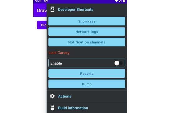
Actions Module
This module has a composable slot.
You can build any of the provided actions, or build your own.
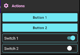
Actions
-
ButtonAction: Shows a
Buttonwith given text, and register a lambda to receive it's click -
SwitchAction: Shows a
Switchand register a lambda to receive it's changes
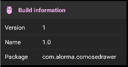
Build Module
Shows information about the app: Version code, Version name and Package
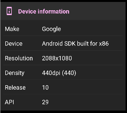
Device Module
Shows information about device running the app such as Device, and manufacturer
Custom Module
Debug drawer can show any @Composable function.
If you want to provide a custom module that looks like the ones provided by the library:
@Composable
fun CustomModule(
    modifier: Modifier = Modifier,
    icon: @Composable (() -> Unit)? = null,
    title: String,
    items: List<Pair<String, String>>
) {
    DebugDrawerModule(
        modifier = modifier,
        icon = icon,
        title = title
    ) {
        // Module content
    }
}
Theming && Customization
Use drawerColors to customize drawer theme colors.
DebugDrawerLayout(
    drawerColors = YourColorScheme, // darkColors() or lightColors()
)
If you want to modify the drawer colors, use DebugDrawerDefaults.colors.copy(...)
Modules list UI
Update module UI by pass Modifier
DebugDrawerLayout(
    drawerModules = {
        val modulesModifier = Modifier
            .padding(4.dp)
            .clip(shape = MaterialTheme.shapes.medium)
            .background(color = MaterialTheme.colors.surface)
        DeviceModule(modulesModifier)
        BuildModule(modulesModifier)
    }
)