Card Drawer
CardDrawer is a library that allows developers to add a custom cool Drawer to their Jetpack
Compose apps. The library provides a customizable drawer that lets users select items.

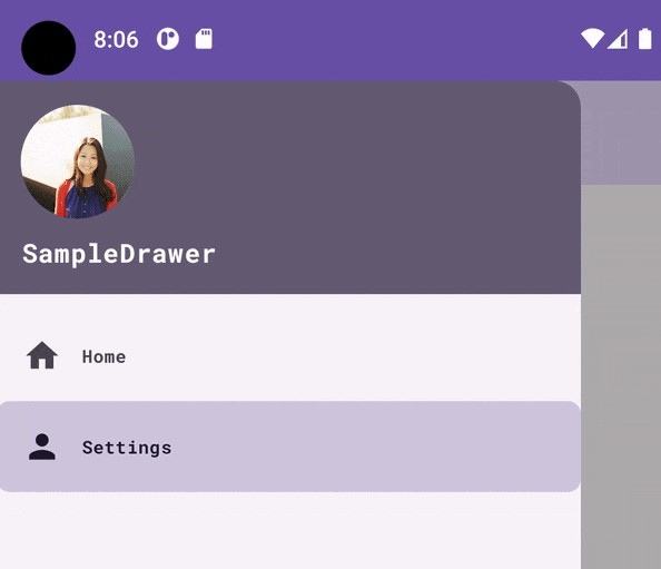
| Opened | Closed |
|---|---|
 |
 |
Quickstart
Here’s a quick example of how to use the library:
- Add the JitPack repository to your project-level build.gradle or settings.gradle file:
    allprojects {
    repositories {
        maven { url 'https://jitpack.io' }
    }
}
- Add the library dependency to your app-level build.gradle file:
    dependencies {
    implementation 'com.github.razaghimahdi:Card-Drawer:1.0.0'
}
- Use the CardDrawer in your app:
val drawerState = rememberCardDrawerState(initialValue = CardDrawerValue.Closed)
val coroutineScope = rememberCoroutineScope()

CardDrawer(
    drawerState = drawerState,
    drawerContent = { DrawerContent(drawerState) }
) {
    MainScreen(drawerState)
}

// make it open
coroutineScope.launch { drawerState.open()}

// make it close
coroutineScope.launch { drawerState.close()}
- Customize CardDrawer:
CardDrawer(
    modifier = Modifier,
    gesturesEnabled = true,
    drawerBackgroundColor = MaterialTheme.colors.surface,
    drawerContentColor = contentColorFor(drawerBackgroundColor),
    contentCornerSize = 0.dp,
    contentBackgroundColor = MaterialTheme.colors.surface,
    drawerContent = { DrawerContent(drawerState) },
    drawerState = drawerState
) {
    MainScreen(drawerState)
}
Example
For a more detailed example, check out the example app included in the repository.
Parameter
CardDrawer has this Parameters:
| Parameter | Description |
|---|---|
drawerContent |
A Composable function that represents the content inside the drawer. |
modifier |
An optional Modifier that can be used to apply additional styling or layout information to the drawer. |
drawerState |
A CardDrawerState object that represents the state of the drawer (e.g. open, closed, partially open). |
gesturesEnabled |
A Boolean value that determines whether or not the drawer can be interacted with via gestures (e.g. swipe to open/close). |
drawerBackgroundColor |
A Color value that specifies the background color to be used for the drawer sheet. |
drawerContentColor |
A Color value that specifies the color of the content to be used inside the drawer sheet. Defaults to the contentColorFor function applied to the drawerBackgroundColor. |
contentCornerSize |
A Dp value that specifies the size of the shape of the content. |
contentBackgroundColor |
A Color value that specifies the background color to be used for the content outside of the drawer. |
content |
A Composable function that represents the content outside of the drawer. |
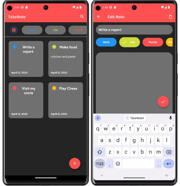
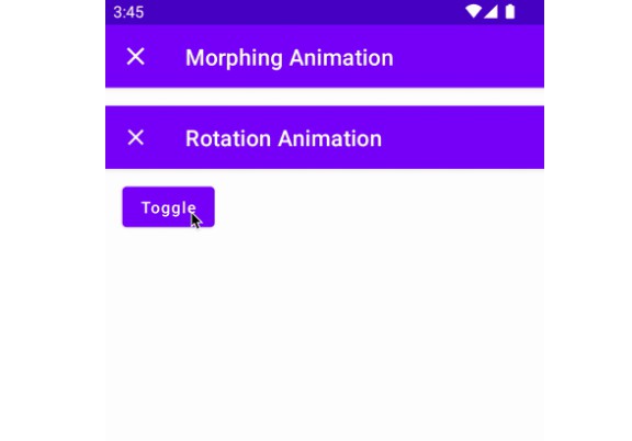
Screenshots
Contributing
Contributions are welcome! If you find a bug or would like to create a new feature, please submit a pull request.
License
This library is licensed under the MIT License. See LICENSE.txt
Developed by Mahdi Razzaghi Ghaleh