Custom Circle Progress View in Jetpack Compose
Summary
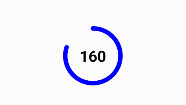
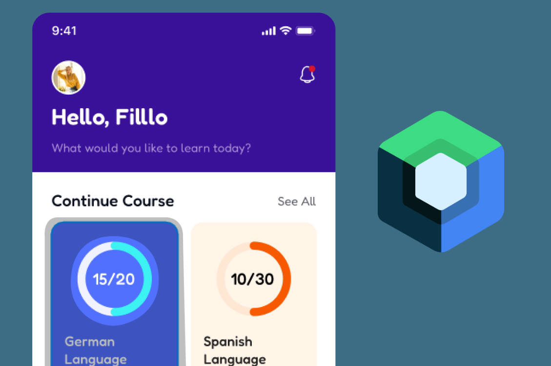
The custom circle progress view is designed to address the limitations of default progress indicators by offering greater flexibility in terms of color, size, animation, and overall appearance. It leverages the power of Jetpack Compose’s declarative UI components and animation capabilities to create a visually appealing and interactive user experience.

Technology
- Canvas in Jetpack Compose
Behavior
The custom circle progress view offers the following features:
- Customization: Developers can customize the progress value, circle radius, stroke width, progress color, background color, and animation settings.
@Composable
internal fun CircleProgressCustom(
    modifier: Modifier = Modifier,
    baseColor: Color = MaterialTheme.colorScheme.surface,
    progressColor: Color = MaterialTheme.colorScheme.primary,
    allSteps: Int,
    finishedSteps: Int,
    sizeStroke: Dp,
    textColor: Color = Color.White,
    textFontSize: Dp = 20.dp
)
- Animation: The progress can be animated using Jetpack Compose’s animation APIs, with options to enable or disable animations based on requirements.
Preview

License
This project is licensed under the MIT License. Feel free to use and modify the code according to your needs. If you find this project helpful, consider giving it a star or sharing it with others.
associated with this repository for a detailed explanation of the implementation and usage of the custom circle progress view in Jetpack Compose.