Synth
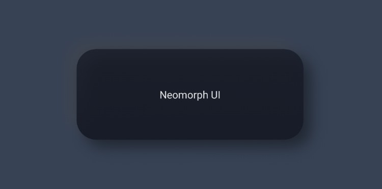
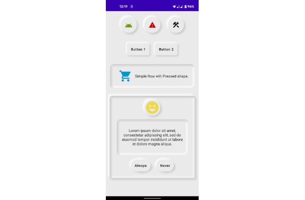
Synth is CRED's inbuilt library for using Neumorphic components in your app.
What really is Neumorphism? It's an impressionistic style, playing with light, shadow, and depth to create a digital experience inspired by the physical world. That's the definition anyway. Our recommendation is you try it out to see what you make of it. If you do create something with Synth, let us know. We're excited to see where you take it.
A note for the curious: if you wish to learn more about Synth, we have a post detailing the concept and CRED's philosophy behind it here.
Install
You can install synth by adding this to your build.gradle file:
dependencies {
  implementation 'club.cred.android:synth:1.0.0'
}
Usage & SDK Limitations
To use synth, the parent layout which contains the synth views must specify:
Synth renders neumorphic components only on devices running API 28 (Pie) or later. This is because Synth internally uses BlurMaskFilter to render shadows and highlights which are drawn outside of the view bounds — this allows you to align Synth views with other views easily.
The issue below API 28, is, to make BlurMaskFilter work, we need to use hardware acceleration on the view which causes the shadows and highlights to be clipped. We could solve for this by adding padding to the views (similar to how CardView does it) but chose not to because of alignment issues.
In lieu of this, we decided to introduce "compat" version of all our views which render a simple single colored background on the view on devices below API 28.
Buttons
Soft button

Soft button renders the elevated neumorphic platform on which the text is drawn. this elevated platform can be customized in two ways:
- By specifying a color for the platform, synth will attempt to compute the light and dark shadow colors
- By specifying a complete appearance for all aspects of the elevated platform
Flat button

Flat button renders a flat surface on top of the elevated neumorphic platform. This flat surface can be customized in two ways:
- By specifying a color for the surface, synth will attempt to compute the gradients, borders, etc of the surface
- By specifying a complete appearance for all aspects of the flat surface
Image button

Image button is simply an image view with a neumorphic platform
Adding drawable to buttons

You can add a drawable to a button (to the left of the text). Synth will render a neumorphic pit on which the drawable is rendered. This pit can be customized in two ways:
- By not specifying anything, synth will take either the
neuPlatformColor(if it's a soft button) orneuFlatButtonColor(if it's a flat button) and compute the gradient colors and pressed colors.
- By specifying a complete appearance for all aspects of the icon pit
All button attributes
| Attribute | Description | Value |
|---|---|---|
app:neuButtonType |
type of the button | elevated_flat or elevated_soft |
app:neuButtonRadius |
corner radius of button | dimension |
app:neuPlatformColor |
color of neumorphic platform | color |
app:neuPlatformAppearance |
appearance of neumorphic platform | style resource |
app:neuFlatButtonColor |
color of flat button surface | color |
app:neuFlatButtonAppearance |
appearance of flat button surface | style resource |
app:neuButtonDrawable |
drawable resource of left icon | drawable resource |
app:neuButtonDrawablePitRadius |
radius of the pit behind the icon | dimension |
app:neuButtonIconAppearance |
appearance of the pit behind the icon | style resource |
app:neuButtonCompatColor |
color of button on compat devices | color |
PitView and ElevatedView

PitViewandElevatedVieware simple Views that can be used to simulate a debossed or embossed neumorphic platform- They are not ViewGroups so ideally they can be used in a
ConstraintLayoutwith other Views that are constrained to thePitVieworElevatedView. - To use these freely with your views,
PitDrawableandElevatedDrawablecan be set as background for your Views programmatically.
PitView
PitView shadows can be specified in two ways:
- By specifying a color for the pit, synth will attempt to compute the shadows of the pit
- By specifying a complete appearance for all aspects of the pit
PitView attributes
| attribute | description | value |
|---|---|---|
app:pitColor |
color of pit from which shadows colors will be computed | color |
app:pitViewAppearance |
appearance of pit | style resource |
app:neuCornerRadius |
corner radius of pit | dimension |
app:pitClipType |
edge(s) of pit which should be clipped (no shadows or corner arc will be drawn) | no_clip, top, bottom, left, right, left_right, top_bottom |
app:pitDepth |
depth of pit | dimension |
ElevatedView
ElevatedView internally uses the same neumorphic platform that is used to draw the buttons. To specify the appearance and shadows of the ElevatedView, the same attributes of soft button can be used:
- By specifying
app:neuPlatformColor, synth will compute the shadows and gradients of the view. - By specifying the complete appearance using
app:neuPlatformAppearance(same as soft button).
ElevatedView attributes
| attribute | description | value |
|---|---|---|
app:neuPlatformColor |
color of elevated view | color |
app:neuPlatformAppearance |
appearance of the elevated view (same as soft button) | style resource |
app:neuCornerRadius |
corner radius of the elevated view | dimension |
app:neuShadowOffset |
shadow offset | dimension |
Min SDK
We support a minimum SDK of 21. But the neumorphic components will be rendered appropriately only on devices running SDK version 28 or above.


