Android-Bootstrap
Android Bootstrap is an Android library which provides custom views styled according to the Twitter Bootstrap Specification.
This allows you to spend more time on development rather than trying to get a consistent theme across your app, especially if you are already familiar with the Bootstrap Framework.
Quick Start
Add the following dependency to your build.gradle, ensuring you replace 'X.X.X' with the latest version on the button above:
You should also override your application class with the following:
You should then checkout the library and investigate the sample code, which covers most of the features.
The sample app is also available on Google Play.
Support
If you have a question about how to use the project, please ask a question on StackOverflow, using the tag android-bootstrap-widgets.
If you think you have found a bug in the library, you should create a new issue instead.
Javadoc
The javadoc for the project is hosted on Github.
Examples
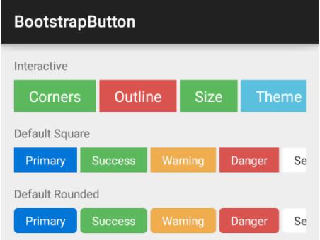
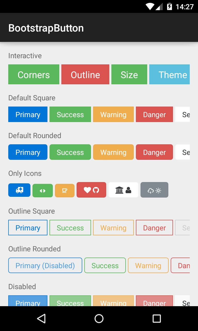
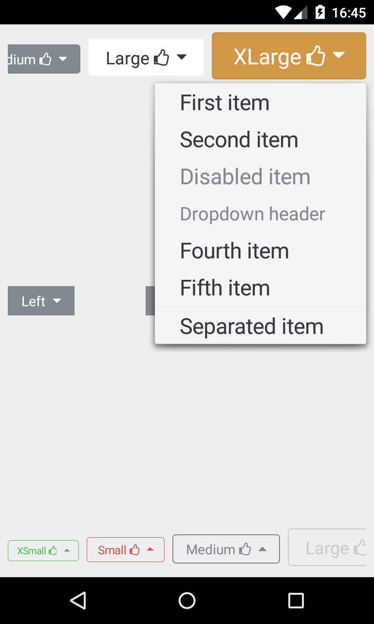
BootstrapButton
A button that supports Glyph icons, and is themeable using Bootstrap Brands.
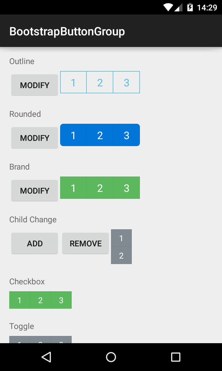
BootstrapButtonGroup
Allows BootstrapButtons to be grouped together and their attributes controlled en masse.
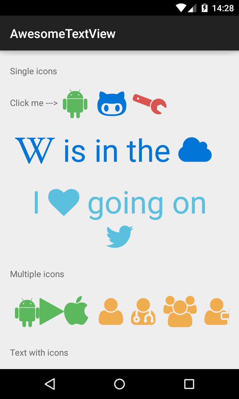
AwesomeTextView
A text widget that displays Glyph icons, and is themeable using Bootstrap Brands.
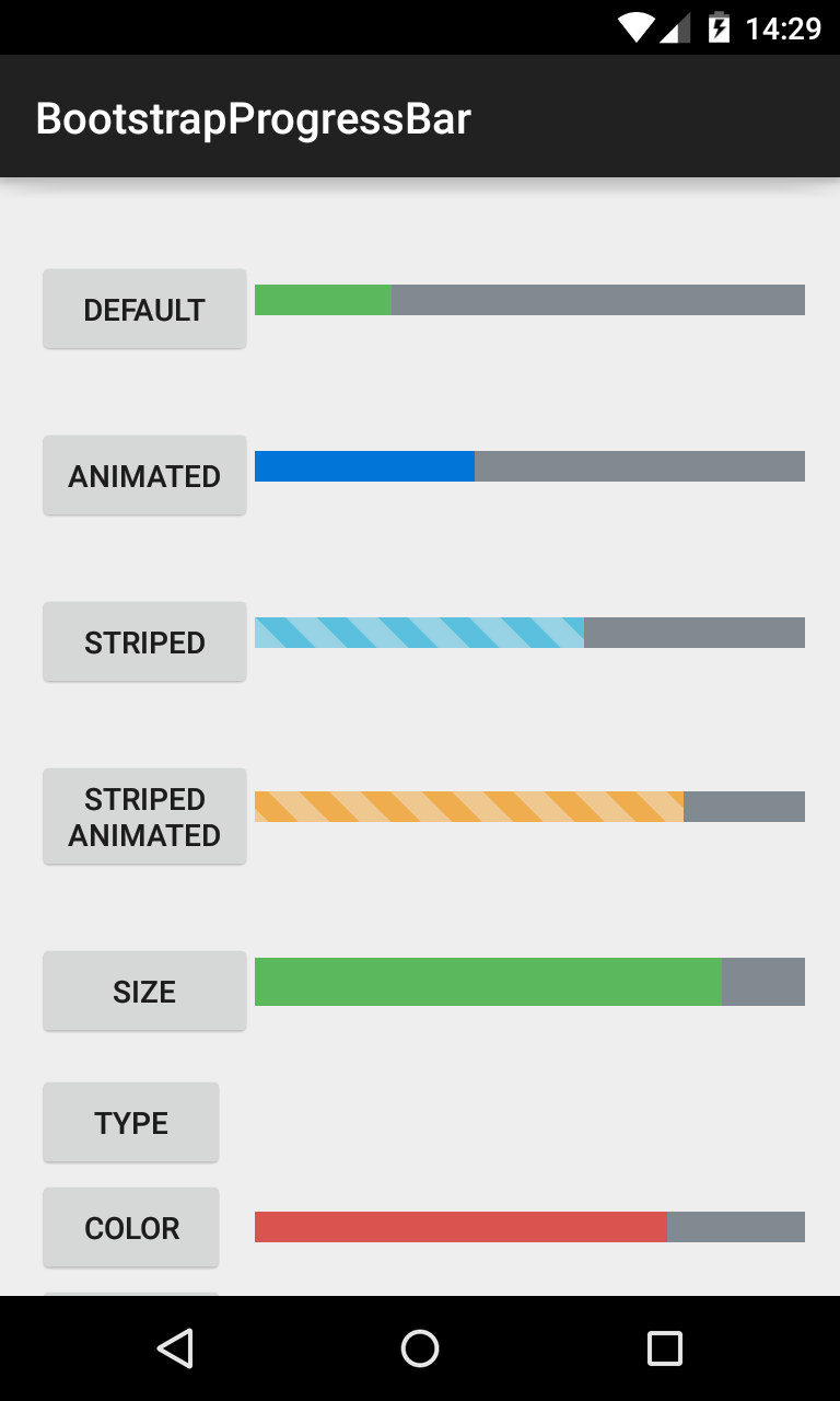
BootstrapProgressBar
Displays progress in a bar from 0-100, and animates updates to the current progress.
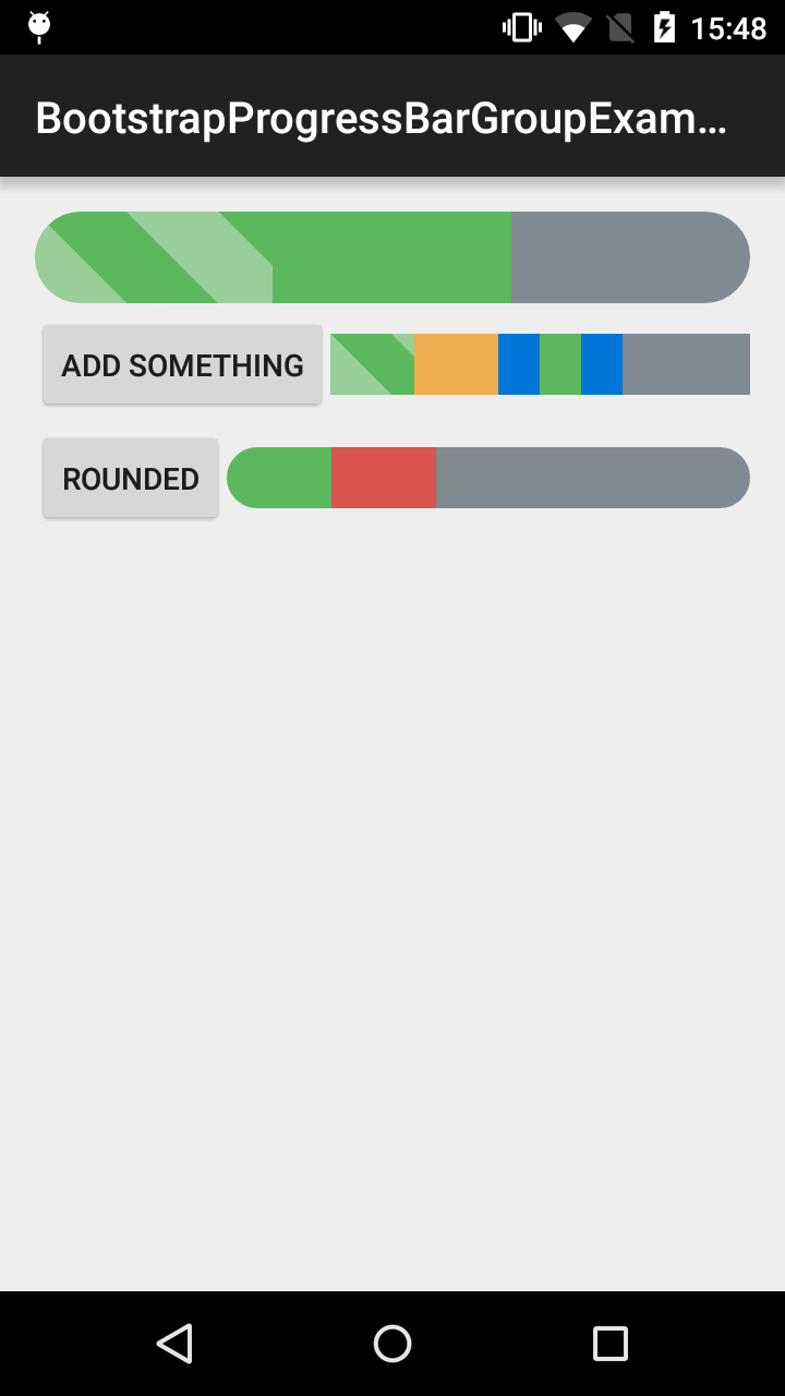
BootstrapProgressBarGroup
Allows BootstrapProgressBars to be group together to have the effect of stacked progress bar.
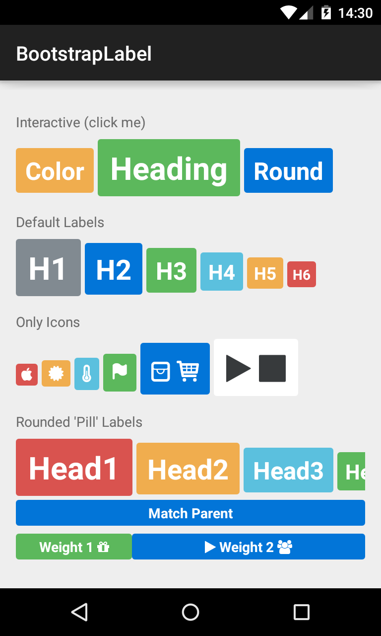
BootstrapLabel
Displays non-clickable text in a widget similar to the BootstrapButton, sizable using H1-H6 elements.
BootstrapEditText
Allows editing of text in a widget themed using BootstrapBrand.

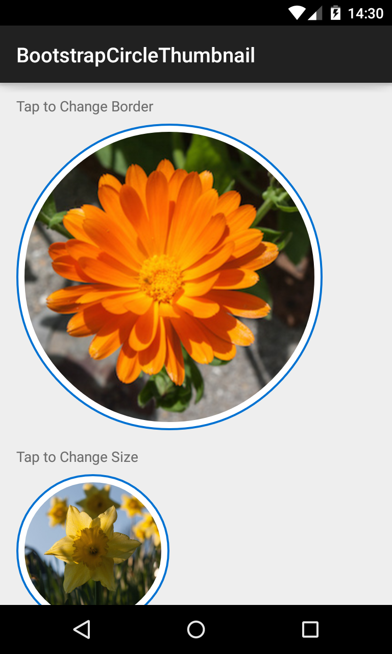
BootstrapCircleThumbnail
Displays images in a center-cropped Circular View, themed with BootstrapBrand.
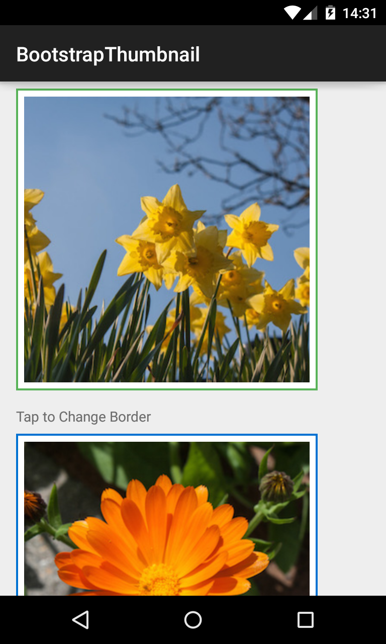
BootstrapThumbnail
Displays images in a rectangular View, themed with BootstrapBrand.
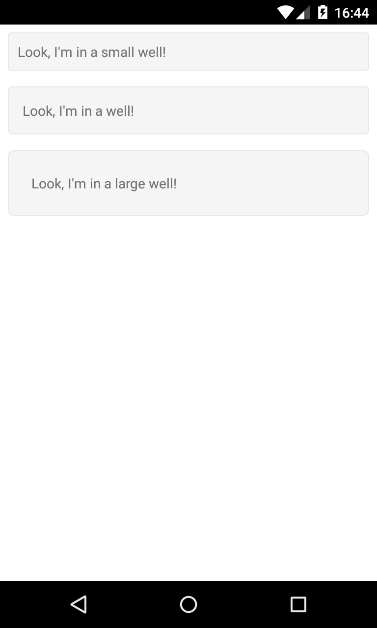
BootstrapWell
Displays a view in a themed container.
BootstrapDropDown
Displays a view with dropdown options, supplied by an array of strings.
Custom Styles
Custom styles can be applied to any of the views in this library by creating a class which implements
BootstrapBrand, and setting it on the View. Please see the sample code of BootstrapButton for more detail.