BGABadgeView-Android
The demo shows:
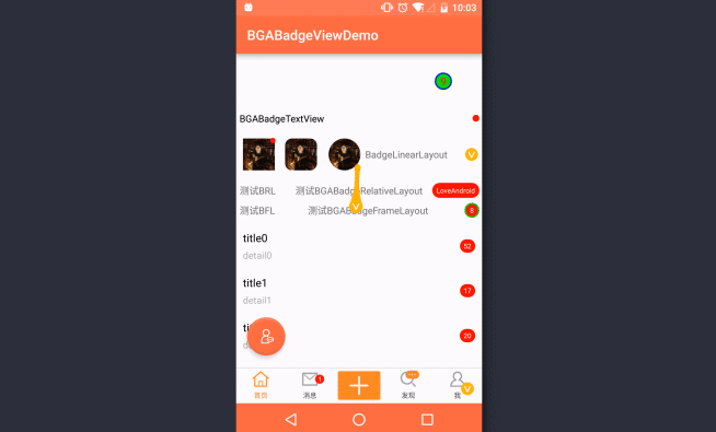
- The latest message number of weibo at the bottom tab
- The VIP badge located in lower-right Corner of User’s Photo in the weibo user list
- The new message in the weixin message page
- The subscribe message in the weixin message page
- User’s round corner photo made by RoundedBitmapDrawable from v4 package
- Delete badge by drag and drop
The realization of explosion effect refers to ExplosionField with the modify of only retaining one View,and only refresh the field around of badge
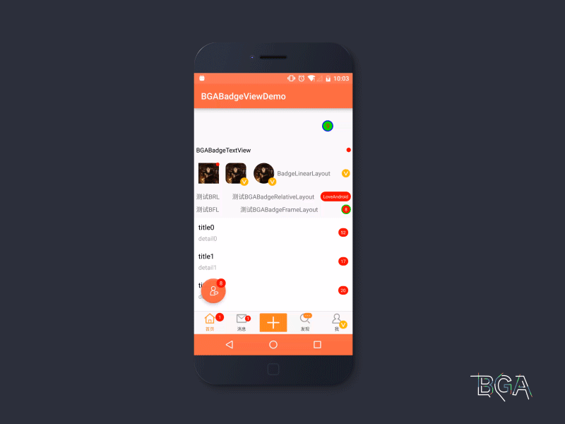
Screenshots
Gradle Dependencies

Initialize BGABadge
Add BGABadge annotation to any class, such as newly created class BGABadgeInit
Supported badge style for now
| Class name | usage scenario |
|---|---|
| BGABadgeRadioButton | Bottom navigation of weibo home page |
| BGABadgeImageView | User’s photo of weibo user list |
| BGABadgeTextView | You can alternatively use BGABadgeCheckedTextView |
| BGABadgeLinearLayout | Message number in the right of item in the list |
| BGABadgeRelativeLayout | Message number in the right of item in the list |
| BGABadgeFrameLayout | Message number in the right of item in the list |
Interface/api explain
The customed attribution
| The customed attribution | Explain | Default value |
|---|---|---|
| badge_bgColor | Badge background | Color.RED |
| badge_textColor | Text color of badge | Color.WHITE |
| badge_textSize | Text font size of badge | 10sp |
| badge_verticalMargin | The distance in pixels from the top edge of badge’s background to the top edge of the host or from the bottom edge of badge’s bottom to the host’s bottom | 4dp |
| badge_horizontalMargin | The distance in pixels from the edge of badge’s background to the left or right edge of the host | 4dp |
| badge_padding | Badge’s padding | 4dp |
| badge_gravity | Badge’s gravity, it’s layout direction | For BGABadgeImageView and BGABadgeRadioButton, upper right.For others, the default is the right side of the vertical center |
| badge_draggable | The badge can be drag or not | false |
| badge_isResumeTravel | When the badge is dragged out of path, if it can resume the path in case of put back | false |
| badge_borderWidth | Border width of badge | 0dp |
| badge_borderColor | Border color of badge | Color.WHITE |
| badge_dragExtra | Extra distance of trigger drag event | 4dp |


