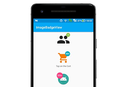
Badger
Badger is a generalized single purpose library for adding badges to drawables
in general and menu items in particular.
[sett] (also set) - The earth or burrow of a badger.
Running with the Badger theme, it is all about the method sett. Home to the
badger, it is comprised of many tunnels and several entrances. It is the ideal
entry point to provide you with badges where mere drawables lived before.
Usage
The Badger.sett() methods add a BadgeDrawable to the original drawable.
This results in a LayerDrawable with the BadgeDrawable added to the layer
with id badger_drawable. If the original drawable is a LayerDrawable having
a badge already set, this one gets reused instead.
Add a badge to a MenuItem
Add a badge to an ImageView
Add a badge to a Drawable
The BadgeDrawable
The BadgeDrawable implements handling of alpha values and color filters for a
default Drawable. Badger includes a general TextBadge with a single
purpose implementation CountBadge.
The BadgeDrawable.Factory
The type of the badge itself is determined by the implementation of the
BadgeDrawable.Factory supplied.
The provided BadgeDrawable implementations define their own factories
TextBadge.Factory and CountBadge.Factory.
The BadgeShape
The BadgeShape is a simplified version of an Android Shape to be used with
TextBadge. With its scale, aspectRatio and gravity it defines the
actual size and position of the badge itself.
BadgeShape itself provides factories for circle, square, oval, rect,
round-rect and round-square.
scale
The scale determines the actual size of the badge drawable relative to the
size of the original drawable.
aspectRatio
The aspectRatio determines the actual shape of the badge itself. It is the
ratio between width and height. A value bigger than 1 makes the badge wider
than high, a value smaller than 1 makes it higher than wide.
gravity
The gravity determines the actual position of the badge inside the original
drawable. Layout directions are supported.
radiusFactor
The radiusFactor determines the actual radius of the circle, used to round the
corners of the rectangle, relative to the radius of the inner circle of the
badge.
Installation
Step 1 Add JitPack in your root build.gradle at the end of repositories:
Step 2 Add the dependency
or for the legacy version
Shortcomings
The TextBadge only supports the RTL layout direction for Android Marshmallow
and later.
Badger requires to have the buildToolsVersion up-to-date. Please update to the lasted buildToolsVersion if the following issue appears:
Error:(330) Attribute "colorAccent" has already been defined
Error:(573) Attribute "titleTextColor" has already been defined
Error:Execution failed for task ':app:processDebugResources'.
> com.android.ide.common.process.ProcessException: Failed to execute aapt
