MaterialIntroView
Beautiful and highly customisable material-design based android library to help your users get started with your awesome app! Based originally on iammert/MaterialIntroView.
Modifications/additions from the base lib:
- [x] Migrate to AndroidX
- [x] Migrated to Kotlin
- [x] Add customisation options like help icon color, card background color, dot icon color
- [x] Update Sample
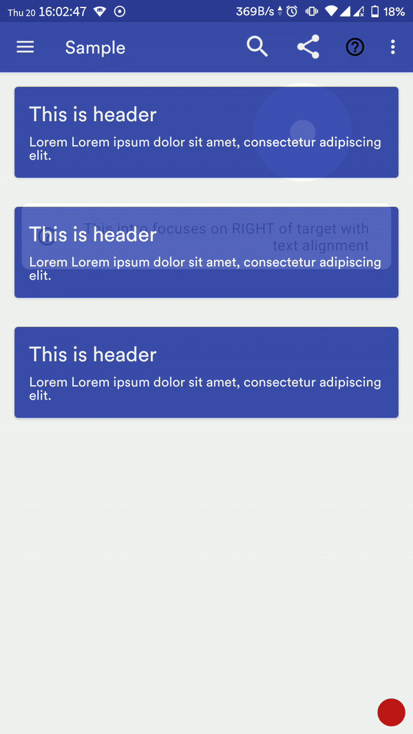
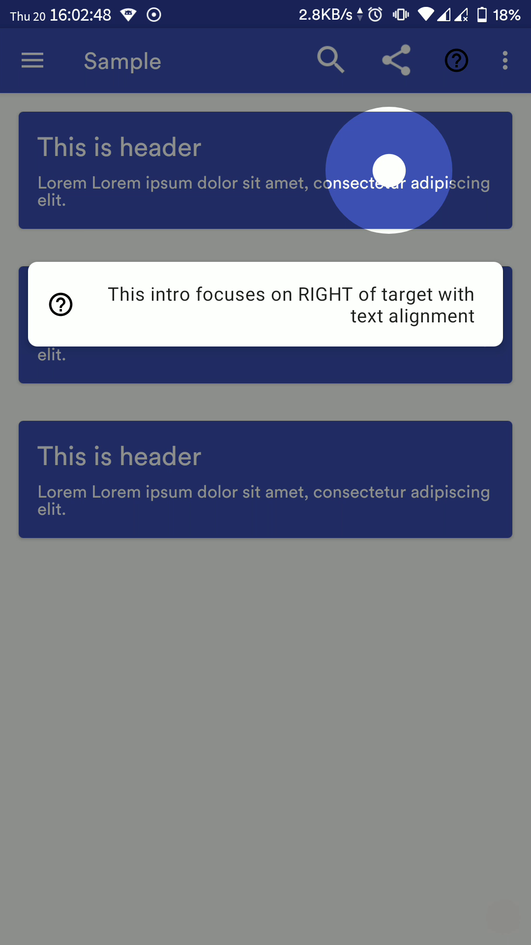
- [x] Custom align text in info card
- [x] Custom help icon in info card
- [x] Custom typeface for info text
- [x] Custom Info View inside info card (using view or layout resource)
- [x] Kotlin extension function for activity
- [x] Full integration with MaterialIntroConfiguration
- [x] Enhanced MaterialIntroListener, know when user has clicked or MIV was dismissed because it was set as saved
- [x] Add option (userClickAsDisplayed) to set view intro as displayed only if user clicks on target view or outside too (if dismissOnTouch is enabled)
- [x] More kotlin friendly
- [x] Add Sequence
- [x] Singleton-based approach for unified experience across your app
- [x] Bug fixes
- [ ] Add skip button
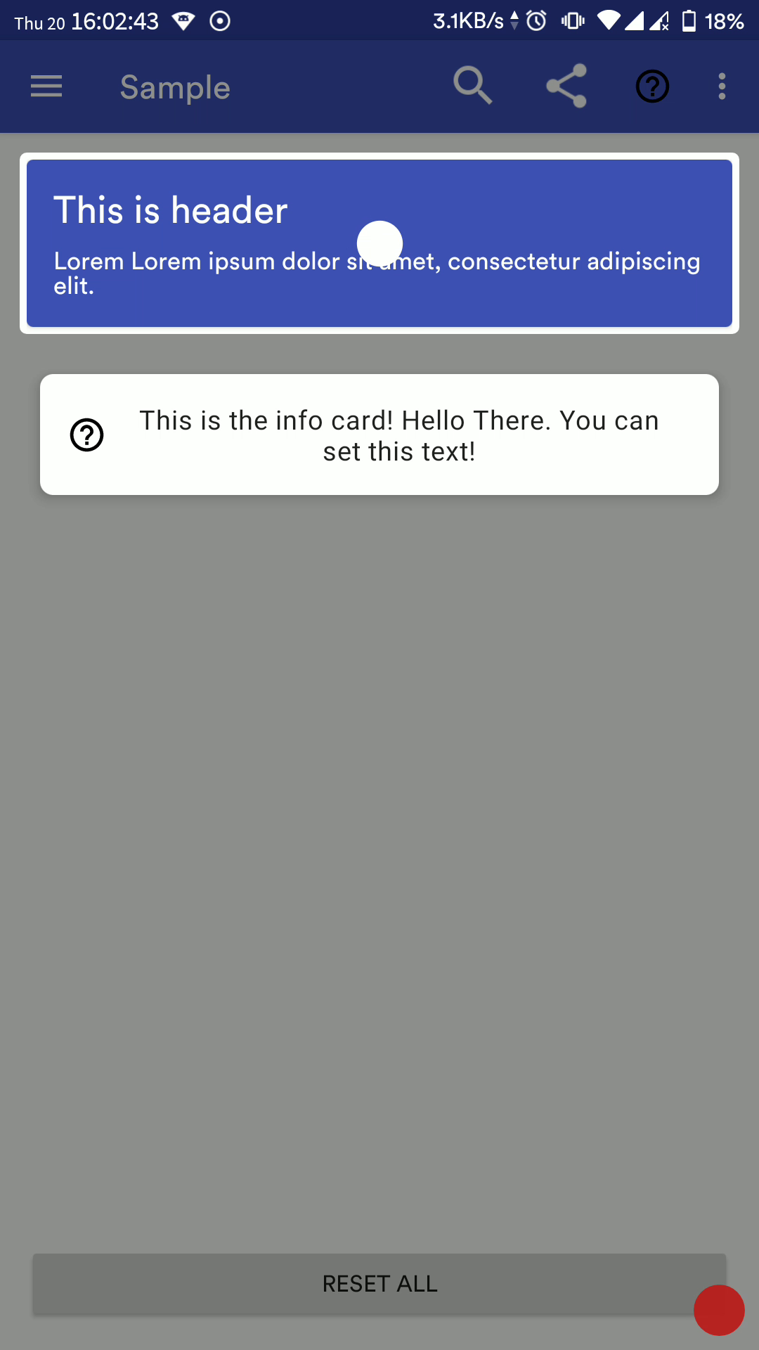
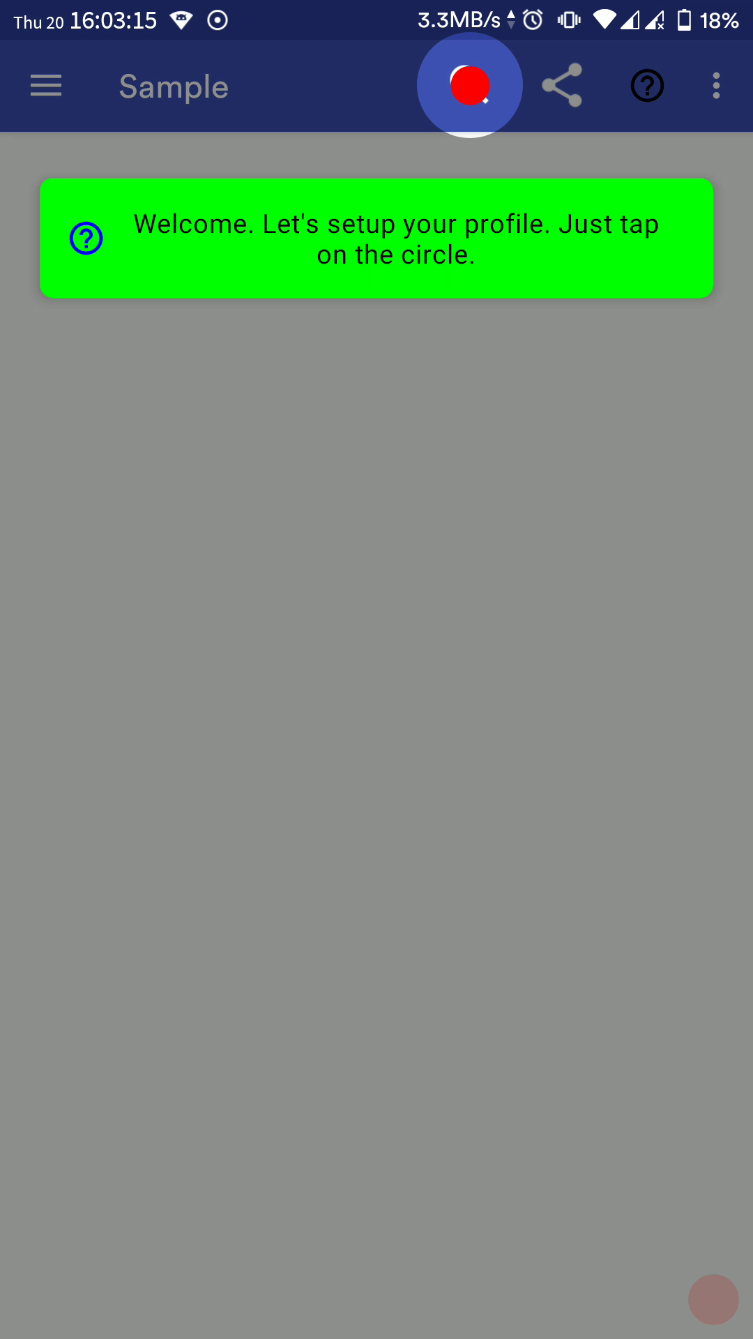
Screenshot

Import
Through bintray
- Add to project-level build.gradle
- Add to module-level build.gradle
Through JitPack
- Add to module-level build.gradle
Single Usage in Activity/Fragment
Properties
| Name | Description | Default Value |
|---|---|---|
| maskColor | The background color | 46% Transparent |
| delayMillis | Delay in ms for MIV (MaterialIntroView) to be shown | 500 |
| isFadeInAnimationEnabled | Enable fade-in animation for MIV | true |
| isFadeOutAnimationEnabled | Enable fade-out animation for MIV | true |
| focusGravity | FocusGravity.CENTER, FocusGravity.LEFT or FocusGravity.RIGHT |
FocusGravity.CENTER |
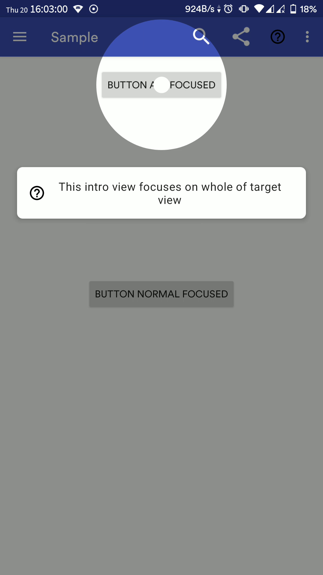
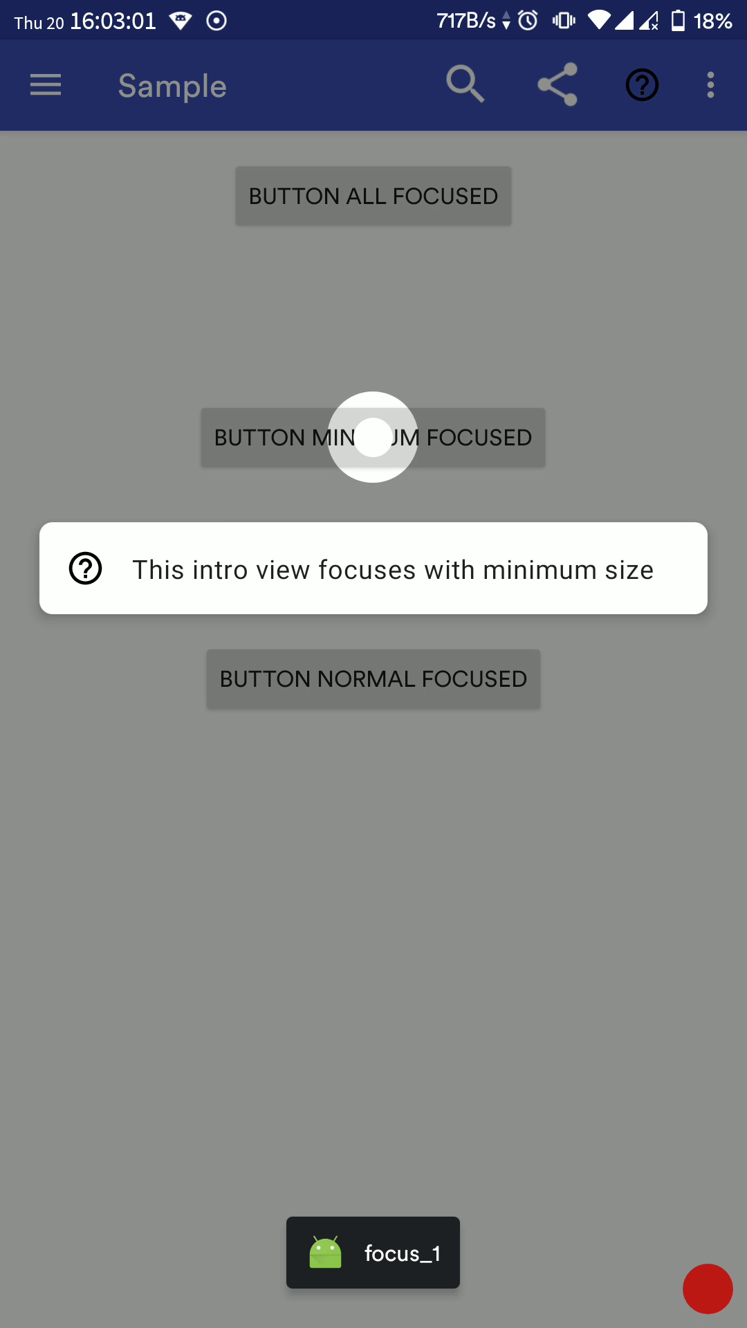
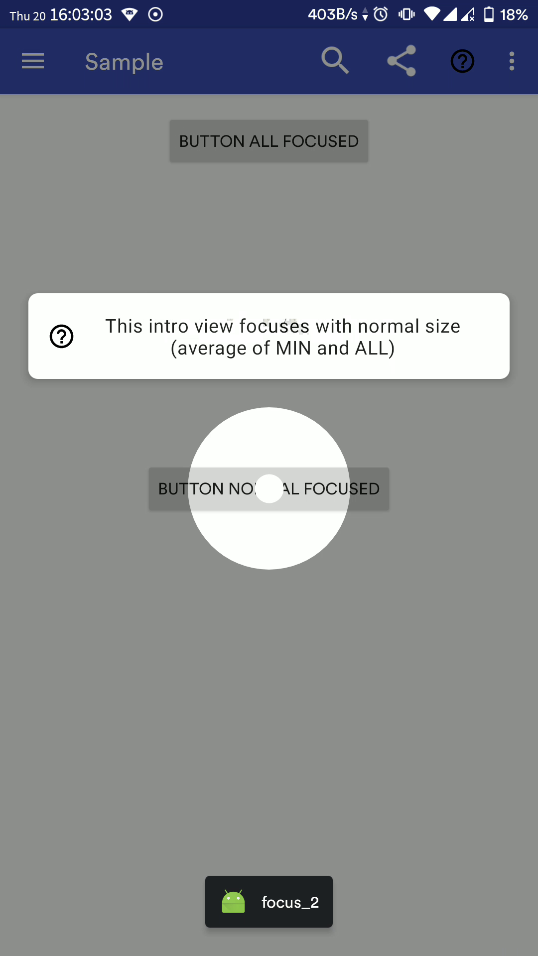
| focusType | Focus.ALL, Focus.MINIMUM or Focus.NORMAL |
Focus.NORMAL |
| padding | Padding (in px) for focusing the target view | 10 |
| dismissOnTouch | Dismiss intro when user touches anywhere | false |
| isInfoEnabled | Whether to show info CardView | true |
| infoText | Text (CharSequence) to be displayed in info CardView | "" |
| infoTextColor | Text Color for info text | textColorPrimary |
| infoTextSize | Text size in sp for info text | 16sp |
| infoTextAlignment | Text alignment for info text | View.TEXT_ALIGNMENT_CENTER |
| infoTextTypeface | Custom typeface for info text | Typeface.DEFAULT |
| infoCardBackgroundColor | Info CardView background color | Inherit from active theme |
| isHelpIconEnabled | Whether to show the help icon in Info CardView | true |
| helpIconColor | Tint help Icon | Black |
| helpIconResource | Custom drawable Resource for help icon | NA |
| helpIconDrawable | Custom drawable for help icon | NA |
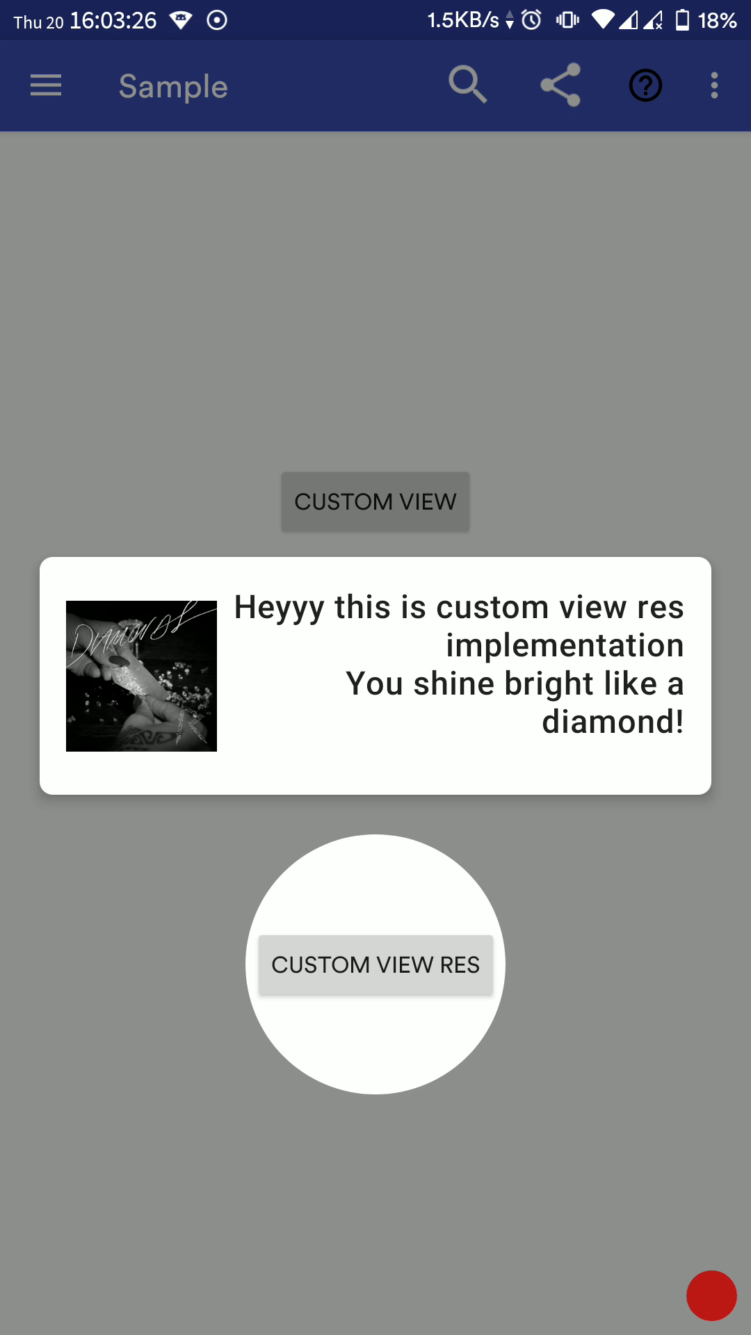
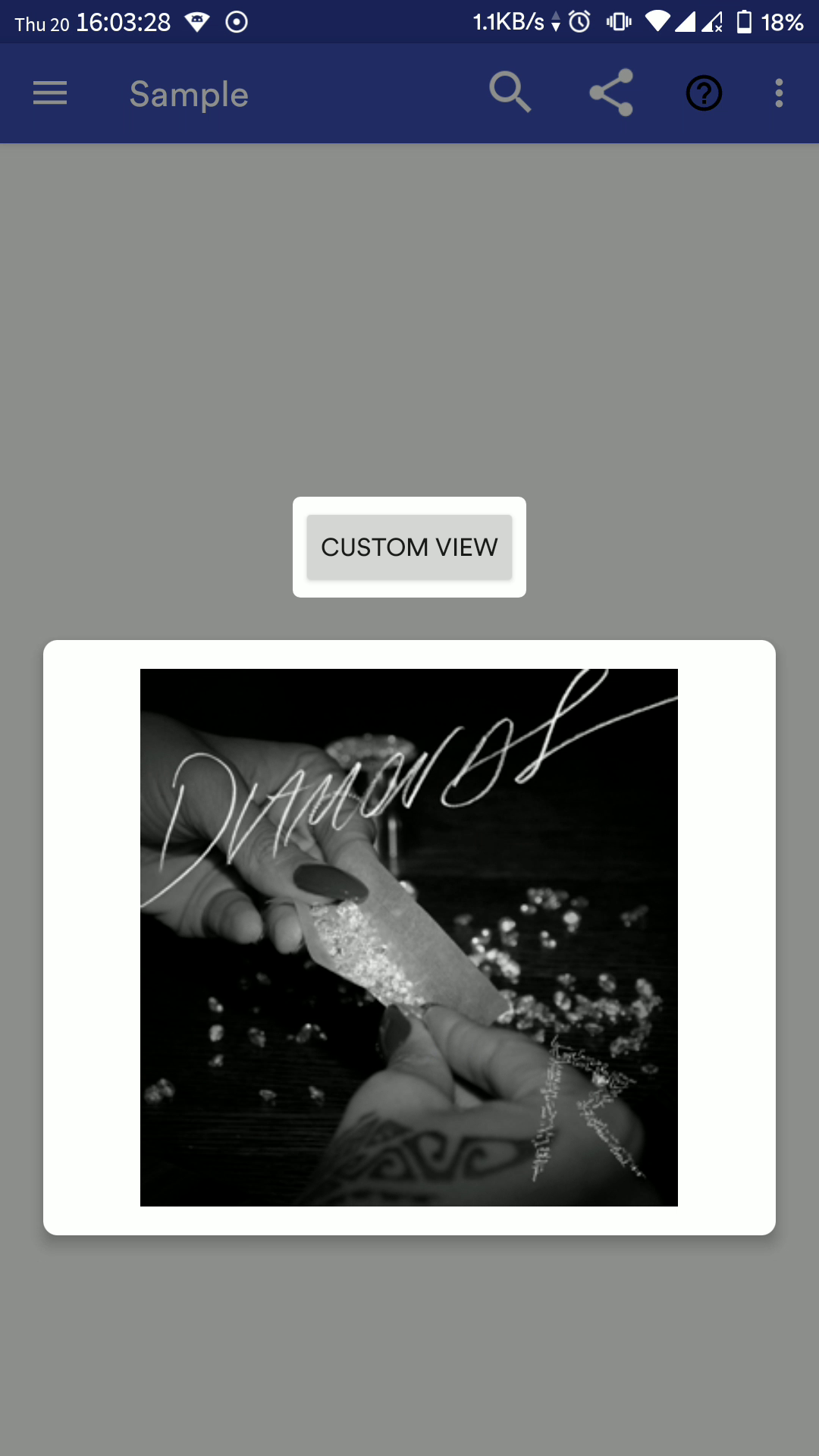
| infoCustomView | Custom view to be displayed inside info CardView | NA |
| infoCustomViewRes | Custom layout resource id to be inflated inside CardView | NA |
| isDotViewEnabled | Whether to show a dot at the centre of focus view | true |
| isDotAnimationEnabled | Whether to zoom-in and zoom-out dot icon periodically | true |
| dotIconColor | Tint Dot Icon | textColorPrimaryInverse |
| viewId | Unique ID of View so that MIV doesn't show again 2nd time onwards (if showOnlyOnce is enabled) |
Automatically picked from view's tag |
| targetView | View to be focused on | NA |
| isPerformClick | Click on the focused view when dismissing | false |
| showOnlyOnce | MIV should be shown only once | true |
| userClickAsDisplayed | MIV should be set as displayed only when user dismisses MIV manually, else MIV will be set as displayed as soon as it is rendered | true |
| shapeType | ShapeType.CIRCLE or ShapeType.RECTANGLE |
ShapeType.CIRCLE |
| customShape | Use custom shape (Usage to be updated) | NA |
| materialIntroListener | Callback when user dismisses a view or it is not shown because it was set as displayed | Current activity/fragment if it implements MaterialIntroListener |
Listener
In your activity/fragment:
Configuration Method
Sequence (Added in v2.1.0)
Using MaterialIntroSequence, you can create a flow for intro view easily in your activity/fragments. Suppose your activity has multiple fragments and each fragment has some or the other view on which you want to show MIV but you want a specific sequence to be followed. In such cases, MaterialIntroSequence is your savior!
The usage is quite simple, call the extension function from your activity/fragment and add MaterialIntroConfiguration objects to it:
Use Custom Shapes
You can use your own highlight shapes if Circle and Rectangle do not work for you. See source for Circle and Rect for implementation example.
TODO update doc
More Screenshots
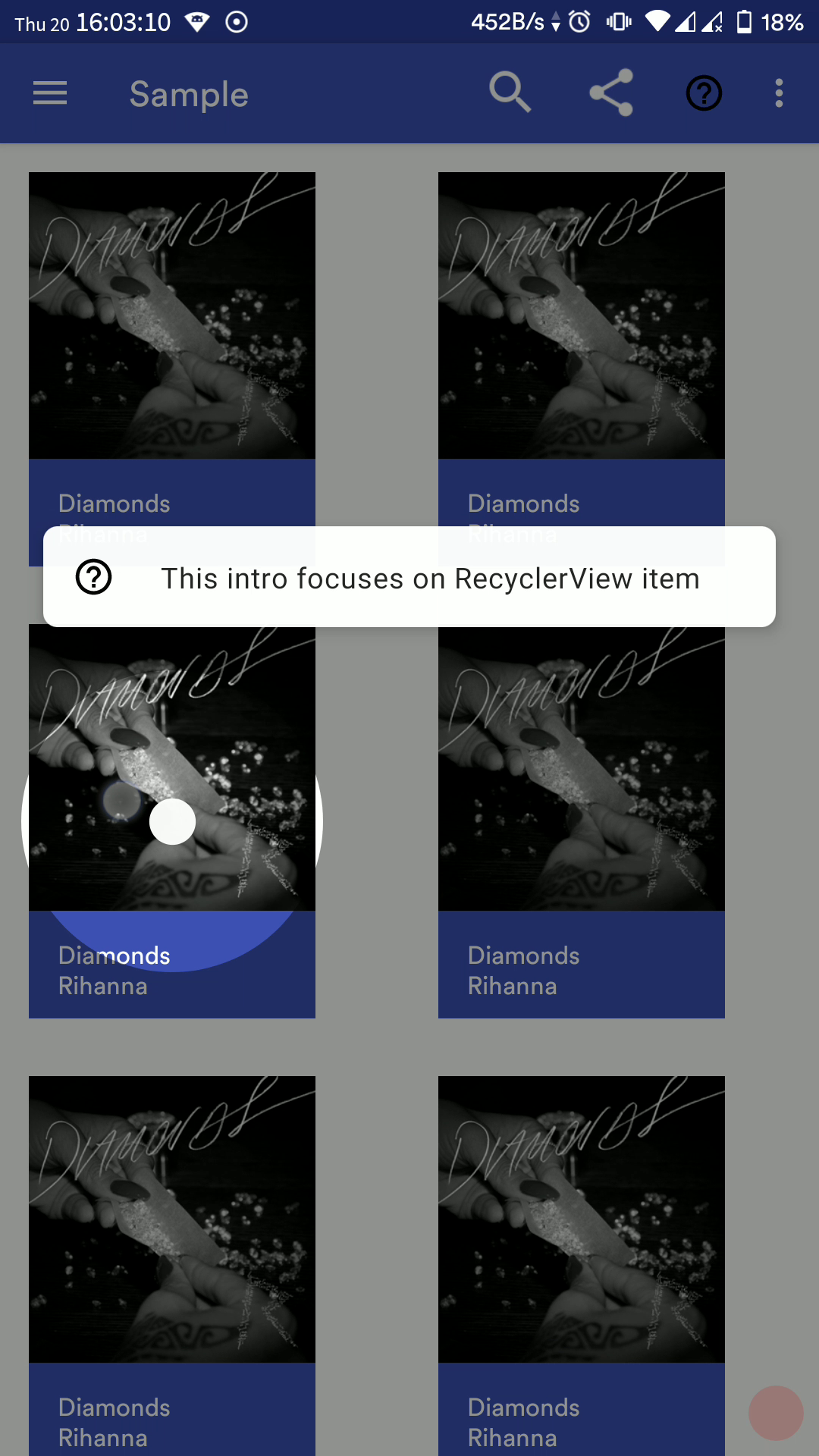
| Default config | Right align gravity | RecyclerView item |
|---|---|---|
 |
 |
 |
| Focus All | Focus Minimum | Focus Normal |
|---|---|---|
 |
 |
 |
| Toolbar Item with sequence and custom colors | Custom Info View using resource layout | Custom Info View at runtime |
|---|---|---|
 |
 |
 |
| Sequence with multiple fragments |
|---|
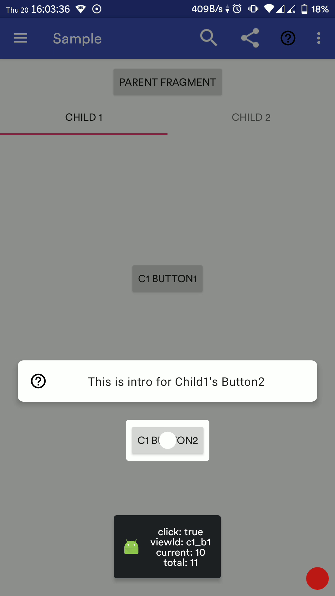 |
Full Demo GIF