Material Segmented Buttons
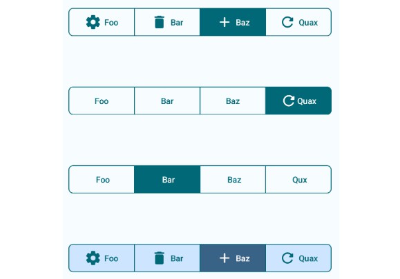
Segmented Buttons inspired by Google’s Material 3 Design Guideline with dynamic color support
Screenshots
Installation
Add this in your project level gradle file
  allprojects {
		repositories {
			...
			maven { url 'https://jitpack.io' }
		}
	}
after that, add this dependency to your app level gradle file
implementation 'com.github.Esarve:MaterialSegmentedButton:release-version'
Current release version:
Usage
This library was designed to be as close as possible to the Material 3 components.
just use the SegmentedButton to use the button in any place. Use a list of SegmentedButtonItem for adding the child items into the button. A demo is provided below:
val itemList = listOf(
    SegmentedButtonItem(
        leadingIcon = {
            // Icon composable goes here
        }

        title = {
            // Text composable goes here
        }

        onClick = {
            // on click for this item goes here
        }
    ),

    SegmentedButtonItem(
            leadingIcon = {
                // Icon composable goes here
            }

            title = {
                // Text composable goes here
            }

            onClick = {
                // on click for this item goes here
            }
        ),

)

SegmentedButton(
    items = itemList,
    modifier = Modifier
        .fillMaxWidth()
        .padding(horizontal = 8.dp, vertical = 32.dp)
)
SegmentedButton with custom corner radius and colors
SegmentedButton{
    item = itemList,
    color = SegmentedButtonDefaults.segmentedButtonColors(
         containerColor = MaterialTheme.colorScheme.tertiaryContainer,
         selectedContainerColor = MaterialTheme.colorScheme.tertiary
         //more arguments availabe here
    ),
    cornerRadius = SegmentedButtonDefaults.segmentedButtonCorners(40) //or you can individually mention each corners here
    showIconForSelectedOnly = true // this keep the icon for selected item visible only
}
check out this gist for more usage https://gist.github.com/Esarve/98f8baaa9b73540800fc208dc013dc60
