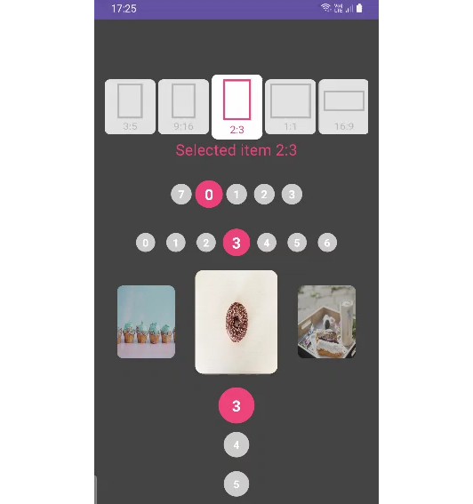
Compose AnimatedList
Animated infinite and finite LazyRow and LazyColumn with scale and color animations on scroll change based on how far they are to selector items
animated_list.mp4
AnimatedCircularList
Declaration
  @Composable
fun <T> AnimatedCircularList(
    modifier: Modifier = Modifier,
    items: List<T>,
    initialFistVisibleIndex: Int = Int.MAX_VALUE / 2,
    lazyListState: LazyListState = rememberLazyListState(initialFistVisibleIndex),
    visibleItemCount: Int = 5,
    activeItemSize: Dp,
    inactiveItemSize: Dp,
    spaceBetweenItems: Dp = 4.dp,
    selectorIndex: Int = visibleItemCount / 2,
    rangeOfSelection: Int = 1,
    activeColor: Color = Color.Cyan,
    inactiveColor: Color = Color.Gray,
    orientation: Orientation = Orientation.Horizontal,
    key: ((index: Int) -> Any)? = null,
    contentType: (index: Int) -> Any? = { null },
    itemContent: @Composable LazyItemScope.(
        animationProgress: AnimationProgress, index: Int, size: Dp
    ) -> Unit
)
Params
- items the data list
- visibleItemCount count of items that are visible at any time
- spaceBetweenItems padding between 2 items
- activeColor color of selected item
- inactiveColor color of items are not selected
- key a factory of stable and unique keys representing the item. Using the same key for multiple items in the list is not allowed. Type of the key should be saveable via Bundle on Android. If null is passed the position in the list will represent the key. When you specify the key the scroll position will be maintained based on the key, which means if you add/remove items before the current visible item the item with the given key will be kept as the first visible one.
- contentType a factory of the content types for the item. The item compositions of the same type could be reused more efficiently. Note that null is a valid type and items of such type will be considered compatible.
- itemContent the content displayed by a single item