Andromeda
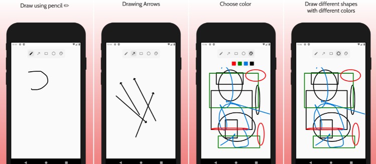
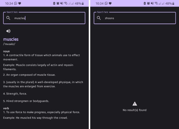
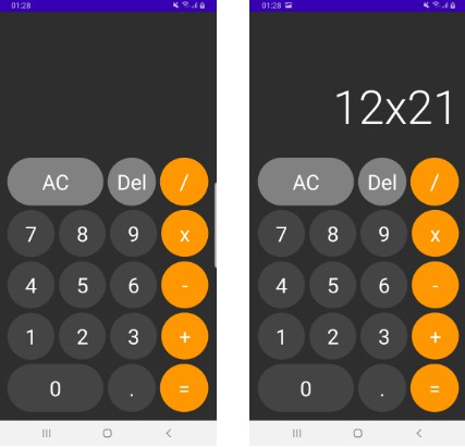
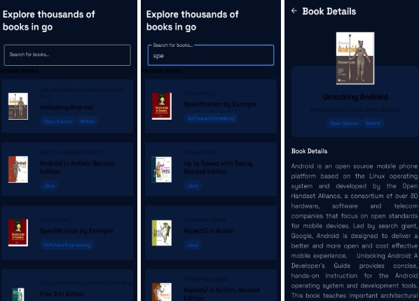
Andromeda is a open-source design language system implemented in Jetpack Compose. Catalog app
About The Project
Andromeda
Welcome ? Andromeda is an open-source Jetpack Compose design system. A collection of guidelines and components which can be used to create amazing compose app user experiences. Foundations introduces you to Andromeda tokens and principles while Components lists out the bolts and nuts that make Andromeda Compose wrapped apps tick.
More details in a blog series: aditlal.dev/Andromeda
Catalog app
Getting Started
In build.gradle of your application module, include this dependency
dependencies {
  implementation("design.andromedacompose:$AndromedaVersion")
}
If you want to use our provided Icons, also add
dependencies {
    implementation("design.andromedacompose-icon:$AndromedaVersion")
}
If you want to use our provided Illustrations, also add
dependencies {
    implementation("design.andromedacompose-illustrations:$AndromedaVersion")
}
Prerequisites
- Android Studio Bumblee
- Java 11
Usage
Theme
AndromedaTheme {
 // Your compose content
}
or
create an extension theme for your app with custom attributes such as colors, font etc
@Composable
fun CatalogTheme(
    isLightTheme: Boolean = true,
    content: @Composable () -> Unit
) {
    AndromedaTheme(
        colors = if (isLightTheme) defaultLightColors() else defaultDarkColors(),
    ) {
        content()
    }
}
Ref : CatalogTheme.kt
Foundation
Colors
fun myCustomAndromedaColors(
    primaryColors: PrimaryColors = customPrimaryLightColors(),
    secondaryColors: SecondaryColors = customSecondaryLightColors(),
    tertiaryColors: TertiaryColors = customTertiaryLightColors(),
    borderColors: BorderColors = customBorderLightColors(),
    iconColors: IconColors = customIconsLightColors(),
    contentColors: ContentColors = customContentLightColors()
): AndromedaColors = AndromedaColors(
    primaryColors = primaryColors,
    secondaryColors = secondaryColors,
    tertiaryColors = tertiaryColors,
    borderColors = borderColors,
    iconColors = iconColors,
    contentColors = contentColors,
    isDark = false
)
Colors can be broken down into :
- Primary colors
- Secondary colors
- Tertiary colors
- Border colors
- Icons colors
- Content colors
and also AndromedaTheme supports dark/light modes – one can override it for a given screen or entire app by passing true in AndromedaColors.isDark
For more details on Colors – check out Documenation here
Shapes
The library provides the following contract to extend on :
interface BasicShapes {
    val small: CornerBasedShape
    val normal: CornerBasedShape
    val large: CornerBasedShape
}

interface AndromedaShapes : BasicShapes {
    val bottomSheet: Shape
    val buttonShape: Shape
    val dialogShape: Shape
}
with some default shapes :
/**
 * Contains default shapes this library provides for components.
 *
 * @param bottomSheet - The shape of components used as bottom sheets.
 * @param buttonShape - The shape of components used as buttons.
 * @param dialogShape - The shape of components used for showing dialog box.
 * */
DefaultShapes(
    override val bottomSheet: Shape,
    override val buttonShape: Shape,
    override val dialogShape: Shape,
    override val small: CornerBasedShape,
    override val normal: CornerBasedShape,
    override val large: CornerBasedShape,
) : AndromedaShapes
One can extend further or generate cusotm shapes on the fly , for more documentation on shapes go here
Typography
AndromedaTheme provides custom typography for common use cases
Typography has default fonts shipped in andromeda artifact – you can also override your own in your app/root module – example of using custom fonts can be found in Catalog app
Typography has following breakdown:
    val titleHeroTextStyle: TextStyle,
    val titleModerateBoldTextStyle: TextStyle,
    val titleModerateDemiTextStyle: TextStyle,
    val titleSmallDemiTextStyle: TextStyle,
    val bodyModerateDefaultTypographyStyle: TextStyle,
    val bodySmallDefaultTypographyStyle: TextStyle,
    val captionModerateBookDefaultTypographyStyle: TextStyle,
    val captionModerateDemiDefaultTypographyStyle: TextStyle
To see them in action , checkout the Catalog app
Components – WIP
Buttons
NavBar
Icon
Divider
Circular Reveal
Text
Surface
BackButton
Releases
- 1.0.0-alpha01
- Initial release with a catalog app showcasing icons, illustrations and other components alongside Foundational toekns of
AndromedaTheme
- Initial release with a catalog app showcasing icons, illustrations and other components alongside Foundational toekns of
Roadmap
- Multi platform support apart from just Android, desktop , iOS , KMM in near future.
See the open issues for a list of proposed features (and known issues).
Contributing
Contributions are what make the open source community such an amazing place to be learn, inspire, and create. Any contributions you make aregreatly appreciated.
- Fork the Project
- Create your Feature Branch (
git checkout -b feature/AmazingFeature) - Commit your Changes (
git commit -m 'Add some AmazingFeature') - Push to the Branch (
git push origin feature/AmazingFeature) - Open a Pull Request
License
Distributed under the MIT License. SeeLICENSEfor more information.
Contact
Adit Lal – @aditlal – https://aditlal.dev


