Compose Actors ?
Inspired from
| JetCaster | JetNews | JetSnack |
|---|

? Architecture
Follows new architecture guide updated on 14 December 2021 from revamped guide to app architecture.
? Layer of this app.
| Network | Repository | ViewModels | Screens | |||
|---|---|---|---|---|---|---|
Data?? ?? |
—> | Source? |
—>Suspend |
Coroutines➰➰ |
—>State |
Composables?? ?? |

? App Overview Compose Blog
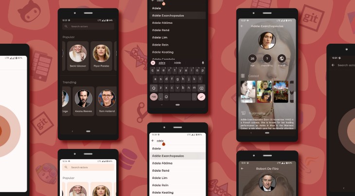
Android app built with Jetpack Compose shows actors information fetched from Tmdb Api.
You may install and try to understand the code better, but make sure you provide your own Tmdb api
key for data to show up in directory /utils/ApiKey.kt.
| Screen | Preview |
|---|---|
| Home Screen (Default destination)
• Shows category list of actors in row of type popular & trending. |
 |
| Search Screen
• Shows list of actors based on user submitted query. |
 |
| Detail Screen
• Shows user selected actor from other screens. |
 |
? Search Animation
// Simple progressive circle looking animation
val animateCircle = remember { Animatable(0f) }.apply {
    AnimateShapeInfinitely(this)
}

@Composable
fun AnimateShapeInfinitely(
    // shape which will be animated infinitely.
    animateShape: Animatable<Float, AnimationVector1D>,
    // final float state to be animated.
    targetValue: Float = 1f,
    // duration took for animating once.
    durationMillis: Int = 1000
) {
    LaunchedEffect(animateShape) {
        animateShape.animateTo(
            targetValue = targetValue,
            animationSpec = infiniteRepeatable(
                animation = tween(durationMillis, LinearEasing),
                repeatMode = RepeatMode.Restart
            )
        )
    }
}
Although I couldn’t fully achieve the desired result as I imagined, I’ve settled for this current
state for now.

Calling the function once will draw a circle, in my example I have drawn it thrice with differnt colors, radius and scales.
DrawCircleOnCanvas(
    scale = scaleInfiniteTransition(targetValue = 2f, durationMillis = 600),
    color = circleColor,
    radiusRatio = 4f
)
I have kept all initial states of 3 circles to 0f to make end result much smoother.
Random or uneven gaps between initial/target/durationMillis will make end animation look more abrupt and aggressively pushing it’s bounds.
@Composable
private fun scaleInfiniteTransition(
    initialValue: Float = 0f,
    targetValue: Float,
    durationMillis: Int,
): Float {
    val infiniteTransition = rememberInfiniteTransition()
    val scale: Float by infiniteTransition.animateFloat(
        initialValue = initialValue,
        targetValue = targetValue,
        animationSpec = infiniteRepeatable(
            animation = tween(durationMillis, easing = LinearEasing),
            repeatMode = RepeatMode.Reverse
        )
    )
    return scale
}
@Composable
fun DrawCircleOnCanvas(
    scale: Float,
    color: Color,
    radiusRatio: Float
) {
    Canvas(
        modifier = Modifier
            .fillMaxSize()
            .graphicsLayer {
                scaleX = scale
                scaleY = scale
            }
    ) {
        val canvasWidth = size.width
        val canvasHeight = size.height
        drawCircle(
            color = color,
            center = Offset(
                x = canvasWidth / 2,
                y = canvasHeight / 2
            ),
            radius = size.minDimension / radiusRatio,
        )
    }
}
? Offline state
| Dark | Light |
|---|---|
 |
 |
Show a Snackbar message with SnackbarHostState.
if (!isOnline) {
    LaunchedEffect(scope) {
        scope.launch {
            scaffoldState.snackbarHostState.showSnackbar(
                message = context.getString(R.string.offline_snackbar_message),
                duration = SnackbarDuration.Indefinite
            )
        }
    }
}
ViewModels
All screens have their own ViewModels for managing the ui state.
class HomeViewModel(
    application: Application,
    private val repository: AppRepository
) : AndroidViewModel(application) {

    // Holds the state for values in HomeViewState
    var uiState by mutableStateOf(HomeViewState())
        private set

    init {
        // Update the values in uiState from all data sources.
        viewModelScope.launch {
            uiState = HomeViewState(isFetchingActors = true)
            val popularActorsList = repository.getPopularActorsData()
            val trendingActorsList = repository.getTrendingActorsData()
            uiState = HomeViewState(
                popularActorList = popularActorsList,
                trendingActorList = trendingActorsList,
                isFetchingActors = false
            )
        }
    }
}
Model for UI state of the screen.
data class HomeViewState(
    var popularActorList: List<Actor> = emptyList(),
    var trendingActorList: List<Actor> = emptyList(),
    val isFetchingActors: Boolean = false,
)
ViewModel used in a screen-level composable.
@Composable
fun HomeScreen(
    viewModel: HomeViewModel
) {
    val uiState = viewModel.uiState
    Box {
        ScreenContent(uiState.popularActorList)
    }
}
Repository
All ViewModels have access to repository which has single instance.
class AppRepository {

    private val networkDataSource by lazy { NetworkDataSource() }

    suspend fun getPopularActorsData(): List<Actor> {
        val listData: List<Actor>
        withContext(Dispatchers.IO) {
            listData = networkDataSource.getPopularActors()
        }
        return listData
    }
}
Instantiated repository will be passed to all ViewModels.
val repository = (application as ComposeActorsApp).repository

NavHost(
    navController = navController,
    startDestination = startDestination
) {
    composable(
        "Destination Route"
    ) {
        HomeScreen(
            viewModel = viewModel(
                factory = HomeViewModel.provideFactory(
                    application, repository
                )
            )
        )
    }
}
? Structure
| ? data | ? navigation | ? repository | ? root |
|---|---|---|---|
| ? NetworkDataSource.kt ? JsonRemoteData.kt ? Urls.kt |
? AppActions.kt ? AppDestinations.kt ? AppNavigation.kt |
? AppRepository.kt | ? MainActivity.kt ? Application.kt |
| ? ui | ? utils | ? model | |
| ? home ? details ? search ? components ? theme |
? InfiniteFlowingThings.kt ? RevealEffect.kt ? Utilities.kt ? DynamicThemeGenerator.kt ? NetworkManager.kt ? NetworkQueryUtils.kt |
? Actor.kt ? ActorDetail.kt ? Movie.kt |
? Packages in ui
| ? home | ? details | ? search | ? components | ? theme |
|---|---|---|---|---|
| ? HomeScreen.kt ? HomeViewModel.kt |
? DetailsScreen.kt ? DetailsViewModel.kt |
? SearchScreen.kt ? SearchViewModel.kt ? AnimatedSearch.kt |
? AppBars.kt ? Components.kt ? NetworkImage.kt ? Progress.kt |
? Color.kt ? Shape.kt ? Theme.kt ? Type.kt |
? Image loading with Coil
Reusable composable used in all screens to load image from an Url.
@Composable
fun LoadNetworkImage(
    imageUrl: String,
    contentDescription: String,
    modifier: Modifier,
    shape: Shape
) {
    Image(
        painter = rememberImagePainter(
            data = imageUrl,
            builder = {
                placeholder(R.drawable.animated_progress)
                error(R.drawable.ic_image_not_available)
            }),
        contentDescription = contentDescription,
        contentScale = ContentScale.Crop,
        modifier = modifier
            .clip(shape)
            .background(color = MaterialTheme.colors.surface)
    )
}
Then we will just call the composable anywhere in app screens.
LoadNetworkImage(
    imageUrl = "https://image_url",
    contentDescription = stringResource(R.string.cd_movie_poster),
    modifier = Modifier.size(100.dp, 150.dp),
    shape = MaterialTheme.shapes.medium,
)
? App Theme
? Material Design 3.
Followed theming and color practices from Material Theme Builder Web Tool.
Learn more here
Color.kt
// Light theme colors
val light_primary = Color(0xFFaa370c)
val light_onPrimary = Color(0xFFffffff)
val light_background = Color(0xFFFFFAF9)
val light_onBackground = Color(0xFF211a18)
val light_surface = Color(0xFFFFE6DB)
val light_onSurface = Color(0xFF211a18)

// Dark theme colors
val dark_primary = Color(0xFFffb59c)
val dark_onPrimary = Color(0xFF5f1600)
val dark_background = Color(0xFF211a18)
val dark_onBackground = Color(0xFFede0dc)
val dark_surface = Color(0xFF302522)
val dark_onSurface = Color(0xFFede0dc)
Theme.kt
val LightColorPalette = lightColors(
    primary = light_primary,
    onPrimary = light_onPrimary,
    background = light_background,
    onBackground = light_onBackground,
    surface = light_surface,
    onSurface = light_onSurface,
)

val DarkColorPalette = darkColors(
    primary = dark_primary,
    onPrimary = dark_onPrimary,
    background = dark_background,
    onBackground = dark_onBackground,
    surface = dark_surface,
    onSurface = dark_onSurface
)
⚪⚫ Light/Dark theme screenshots
| Home | Search | Detail |
|---|---|---|
  |
  |
  |
? Blog
 |
|---|
| Reveal effect animations in compose jetpack android |
| Read article |
 |
|---|
| Compose and build android app with new architecture principles |
| Read article |
 |
|---|
| Custom shape animations pulsating circles on canvas in compose android |
| Read article |
 |
|---|
| Search with TextField in list Compose Android Jetpack |
| Read article |

? Motivation and Context
Jetpack Compose is Android’s modern toolkit for building native UI. It enables you to quickly
bring your app to life with less code, powerful tools, and intuitive Kotlin APIs.
Understanding to implement own Theme Shape Typography Color has became bit easier by
referring to lot of official jetpack compose samples which are available in GitHub.
Best of all we got to do this in Kotlin way. Excited and long way to go from here.
? Credits
? JetCaster
Check the official JetCaster example from Android Team, I have used their code to generate Swatch with Palette Api in my Detail screen.
? Tmdb Api
Images and all information in app belongs to and taken from Tmdb Api.
I do not own any of it and only made use of it for this app demonstration purpose.
Obtain your own Tmdb Api Key
from here
License
Copyright 2021 Rajasekhar K E

Licensed under the Apache License, Version 2.0 (the "License");
you may not use this file except in compliance with the License.
You may obtain a copy of the License at

    https://www.apache.org/licenses/LICENSE-2.0

Unless required by applicable law or agreed to in writing, software
distributed under the License is distributed on an "AS IS" BASIS,
WITHOUT WARRANTIES OR CONDITIONS OF ANY KIND, either express or implied.
See the License for the specific language governing permissions and
limitations under the License.