MaterialDayPicker
Inspired by the day picker in the builtin Android clock app.
| Normal Usage | Localized Usage | Dark Mode Usage |
|---|---|---|
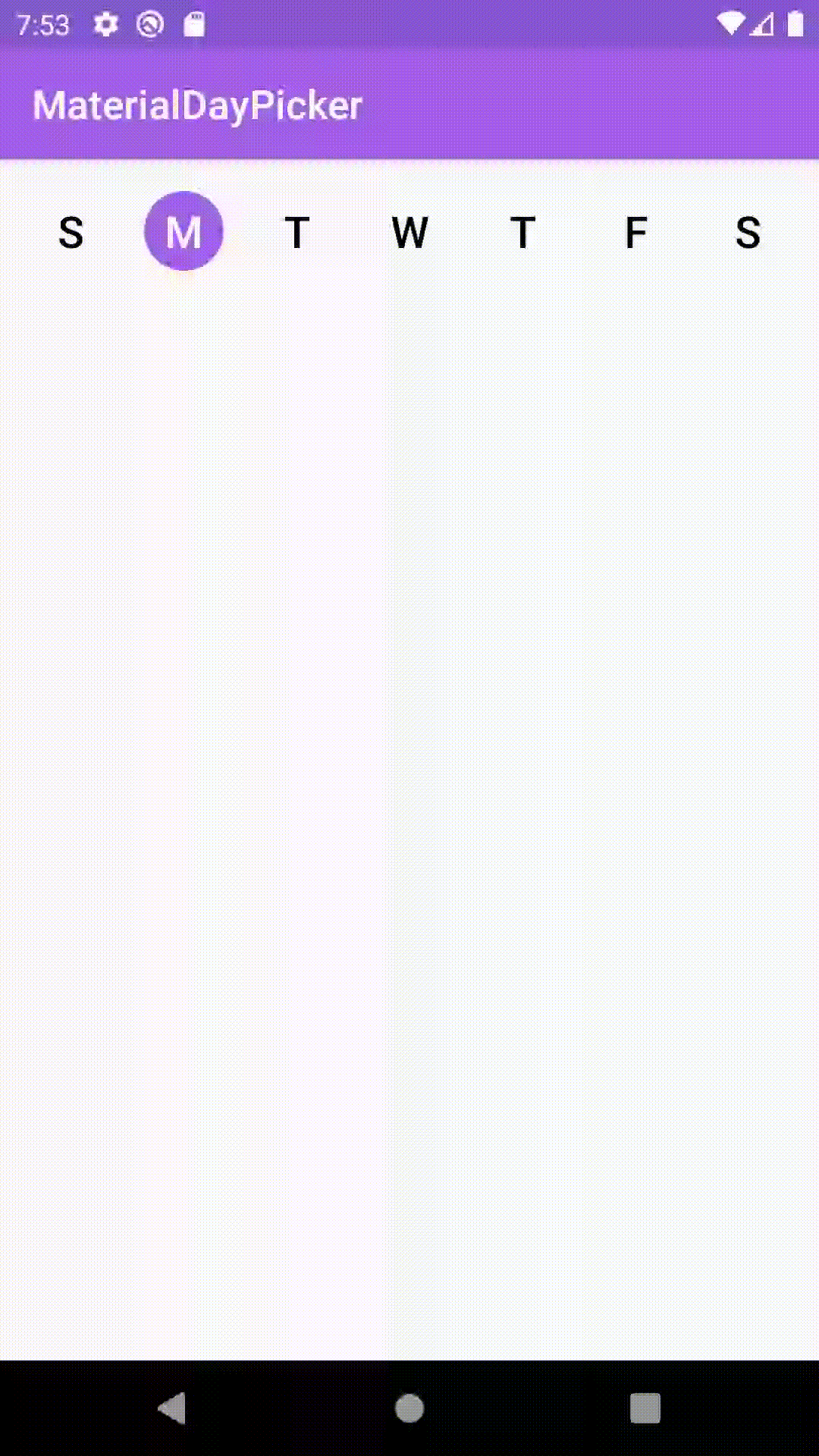 |
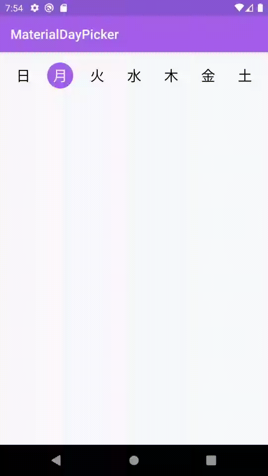 |
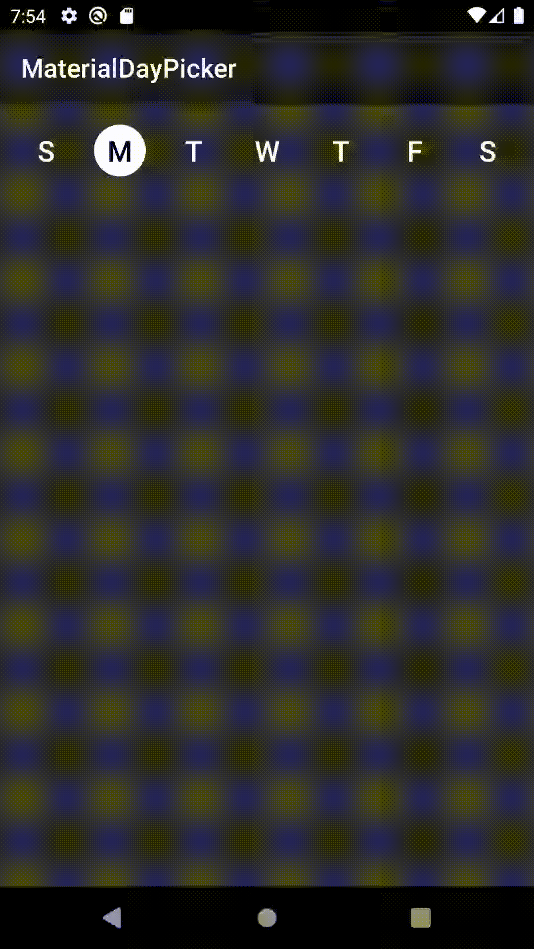 |
Features
- ? Customizable theming
- ✅ Easy to use API/hooks
- ? Fully localized
- ? Supports dark mode
What's New: Version 0.7.3 - Better Configuration + Bug fixes
- Upgraded MaterialDayPicker to target API 30 and upgraded its AndroidX dependencies
Changes from 0.7.2
Bug fixes
- Fixes a bug when using android gradle plugin
3.6.1that would cause building to fail due to not being able to find theselectionModeattribute.
Changes from 0.7.1
Bug fixes
- Fixes an issue where calling
setSelectedDayswould cause selected days to flash off and on.
Changes from 0.7.0
Configuration Improvements
- You can now enable/disable days from being selected using enableDay/disableDay methods. See more below.
- You can now set the selection mode via xml by using the
app:selectionModeattribute.
Download the latest version by adding the following to your project's build.gradle file:
Using MaterialDayPicker in your App
You can just drop the view into your existing xml:
You can get the currently selected days by using:
You can set the selected days by doing:
If you want to only allow one day to be selected at a time you can do:
This can also be set via xml using the selectionMode attribute:
You can enable/disable days using the following methods. Note if you disable a day when it's selected it cannot be deselected:
If you want to listen to whenever the day selection is changed you can use:
If you need to know when a specific day is selected/deselected you can use:
Customizing MaterialDayPicker for your App
You can override these colors to change how MaterialDayPicker looks. You can also update these values in your night color resources directory to update how MaterialDayPicker looks in dark mode:
If you don't want to use the device's current locale you can override it by doing: