Easy-List-Compose 

Introduction
This is an Android Library that’s implemented in compose to help you to build a List with some features.

Setup
Step1: settings.gradle
   repositories {
        ...
        maven { url 'https://jitpack.io' }
    }
Step2: add the dependency
 dependencies {
     ...
 	  implementation 'com.github.MshariAlsayari:Easy-List-Compose:3.0.0'
 }
Examples
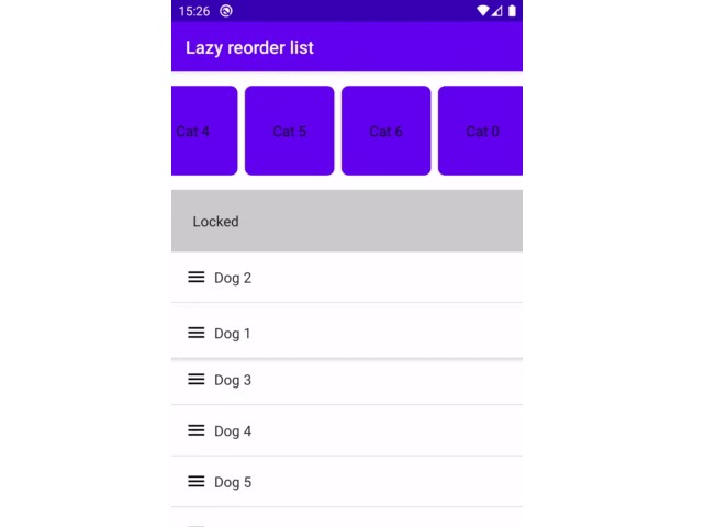
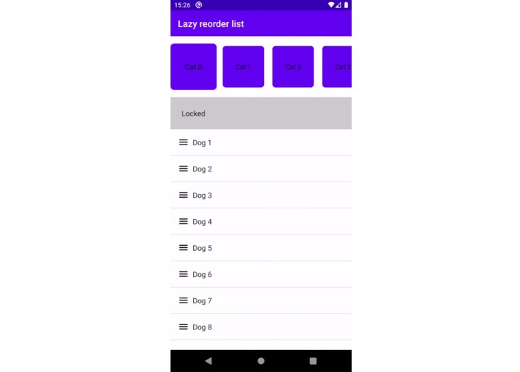
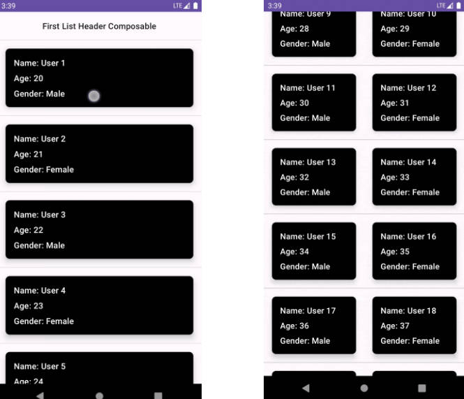
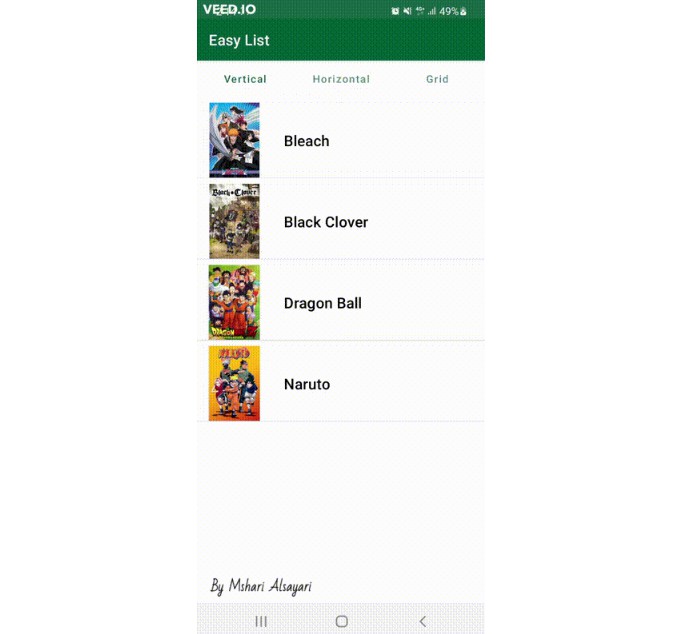
There are three types of a List Vertical, Horizontal and Grid.
In the vertical list you can make items swappable by adding list of Action onStart or onEnd
/***
 * text - a composable text.
 * icon -  a composable icon c.
 * onClicked - calback to handle onClick.
 * actionSize - action size default is 56.
 */

data class Action<T>(
    val text: (@Composable () -> Unit)? = null,
    val icon: (@Composable () -> Unit)? = null,
    val onClicked: ((position: Int, item: T) -> Unit)? = null,
    val actionSize: Dp = ACTION_ICON_SIZE.dp
)
)
Vertical
/***
 * modifier - the modifier to apply to this layout.
 * list -  list of data.
 * views - the data view holder.
 * onItemClicked - callback when the swappable item's been clicked
 * onItemCollapsed - callback when the swappable item's been collapsed
 * onItemExpanded - callback when the swappable item's been expanded
 * dividerView - (optional) divider between items.
 * emptyView - (optional) emptyview if the list is empty.
 * startActions - list of actions if it is empty no swipe (3 items at most).
 * endActions - list of actions if it is empty no swipe (3 items at most).
 * startActionBackgroundColor - background color of the list of the start actions.
 * endActionBackgroundColor - background color of the list of the end actions.
 * actionBackgroundRadiusCorner - radius corner for both start background and end background actions.
 * actionBackgroundHeight - height of the actions background.
 * isRefreshing - show progress of the swipeRefreshLayout.
 * onRefresh - (optional) callback when the swipeRefreshLayout swapped if null the list will wrapped without the swipeRefreshLayout .
 * paddingBetweenItems - padding between items default is 8f.
 * paddingVertical - padding on top and bottom of the whole list default is 0.
 * paddingHorizontal - padding on left and right of the whole list default is 0.
 * scrollTo - scroll to item default is 0.
 */

@ExperimentalMaterialApi
@Composable
fun <T> VerticalEasyList(
    modifier: Modifier = Modifier,
    list: List<T>,
    views: @Composable LazyItemScope.(item: T) -> Unit,
    onItemClicked: (item: T, position: Int) -> Unit,
    onItemCollapsed: ((item: T, position: Int) -> Unit)? = null,
    onItemExpanded: ((item: T, position: Int, type: ActionRowType) -> Unit)? = null,
    dividerView: (@Composable () -> Unit)? = null,
    emptyView: (@Composable () -> Unit)? = null,
    startActions: List<Action<T>> = listOf(),
    endActions: List<Action<T>> = listOf(),
    startActionBackgroundColor: Color = Color.Transparent,
    endActionBackgroundColor: Color = Color.Transparent,
    actionBackgroundRadiusCorner: Float = 0f,
    actionBackgroundHeight: Float = ACTION_HEIGHT,
    isRefreshing: Boolean = false,
    onRefresh: (() -> Unit)? = null,
    paddingBetweenItems: Float = PADDING_BETWEEN_ITEMS,
    paddingVertical: Float = PADDING_VERTICAL,
    paddingHorizontal: Float = PADDING_HORIZONTAL,
    scrollTo: Int = 0,
)
Horizontal
/***
 * modifier - the modifier to apply to this layout.
 * list -  list of data.
 * views - the data view holder.
 * dividerView - (optional) divider between items.
 * emptyView - (optional) emptyview if the list is empty.
 * paddingBetweenItems - padding between items default is 8f.
 * paddingVertical - padding on top and bottom of the whole list default is 0.
 * paddingHorizontal - padding on left and right of the whole list default is 0.
 * scrollTo - scroll to item default is 0.
 */
@Composable
fun <T> HorizontalEasyList(
    modifier: Modifier = Modifier,
    list: List<T>,
    views: @Composable LazyItemScope.(item: T) -> Unit,
    emptyView: (@Composable () -> Unit)? = null,
    dividerView: (@Composable () -> Unit)? = null,
    paddingBetweenItems: Float = PADDING_BETWEEN_ITEMS,
    paddingVertical: Float = PADDING_VERTICAL,
    paddingHorizontal: Float = PADDING_HORIZONTAL,
    scrollTo: Int = 0,
)
Grid
/***
 * modifier - the modifier to apply to this layout.
 * list -  list of data.
 * views - the data view holder.
 * dividerView - (optional) divider between items.
 * emptyView - (optional) emptyview if the list is empty.
 * actionBackgroundHeight - height of the actions background.
 * isRefreshing - show progress of the swipeRefreshLayout.
 * onRefresh - (optional) callback when the swipeRefreshLayout swapped if null the list will wrapped without the swipeRefreshLayout .
 * paddingBetweenItems - padding between items default is 8f.
 * paddingVertical - padding on top and bottom of the whole list default is 0.
 * paddingHorizontal - padding on left and right of the whole list default is 0.
 * scrollTo - scroll to item default is 0.
 * columnCount - number of columns default is 2
 */
@ExperimentalFoundationApi
@Composable
fun <T> GridEasyList(
    modifier: Modifier = Modifier,
    list: List<T>,
    views: @Composable (LazyItemScope.(item: T) -> Unit),
    emptyView: @Composable (() -> Unit)? = null,
    paddingBetweenItems: Float = PADDING_BETWEEN_ITEMS,
    paddingVertical: Float = PADDING_VERTICAL,
    paddingHorizontal: Float = PADDING_HORIZONTAL,
    columnCount: Int = COLUMN_COUNT,
    isRefreshing: Boolean = false,
    onRefresh: (() -> Unit)? = null,
    scrollTo: Int = 0,
)