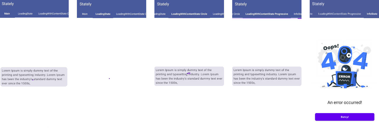
EmptyStateLibrary
An Android Library to show different states.
Features
- [x] MinSdk 14
- [x] Support both PNG and SVG as icon
- [x] Could use different custom fonts for title, description and button
- [x] Support both PNG and SVG as icon
- [x] Easy to use
Add Library
- Add the JitPack repository to your build file
- Add the dependency
Add EmptyState view
All xml attributes
| Key | Value | Description |
|---|---|---|
| emps_iconSize | SMALL, NORMALL, BIG | size of icon |
| emps_icon | icon resource id | could be png or vector drawable |
| emps_title | String | emptyState title, will be gone if not set |
| emps_titleFontPath | String | title font's path |
| emps_titleSize | Dimension | title text size, dp or sp |
| emps_titleColor | Color | title text color, Hex ot color reference |
| emps_description | String | emptyState description, will be gone if not set |
| emps_descriptionFontPath | String | title font's path |
| emps_descriptionSize | Dimension | title text size, dp or sp |
| emps_descriptionColor | Color | title text color, Hex or color reference |
| emps_showButton | Boolean | show / hide button |
| emps_buttonText | String | button's text |
| emps_buttonFontPath | String | button text font's path |
| emps_buttonTextSize | Dimension | button text size, dp or sp |
| emps_buttonTextColor | Color | button text color, Hex ot color reference |
| emps_buttonBackgroundColor | Color | button background color, Hex ot color reference |
| emps_buttonCorner | Dimension | button corner size in dp |
All of these attributes have setters and could be set from code
Show / Hide with animation
You could show or hide emptyState view with animation:


