DialogPlus
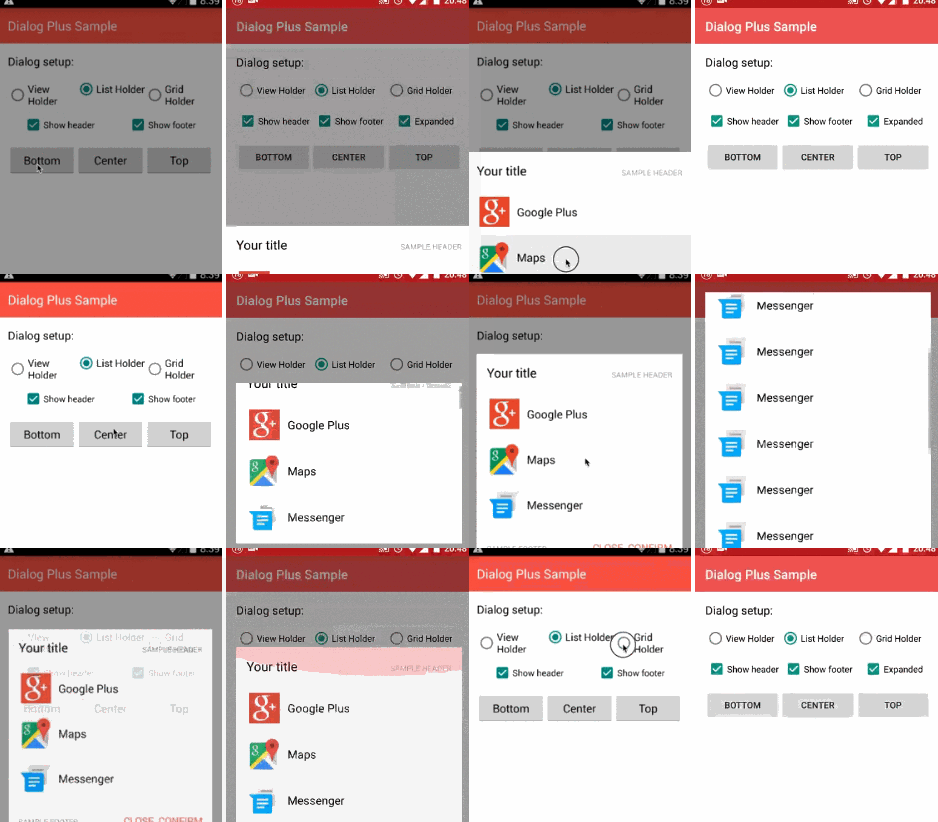
DialogPlus provides android L dialog animation
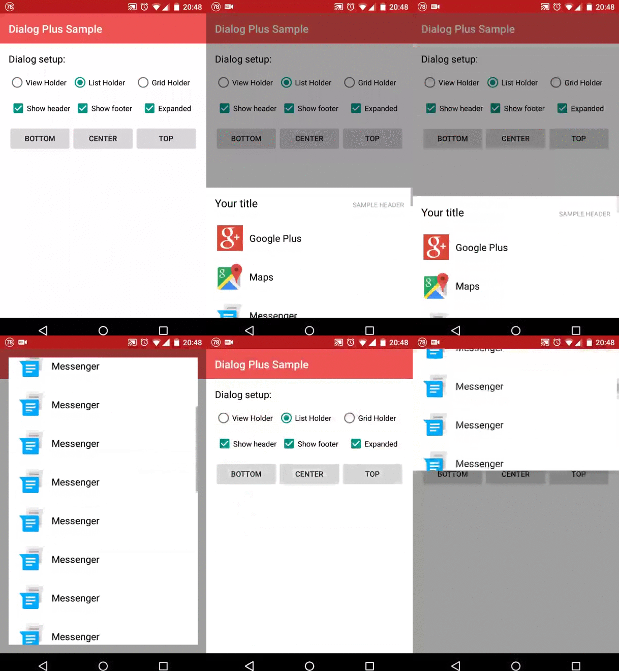
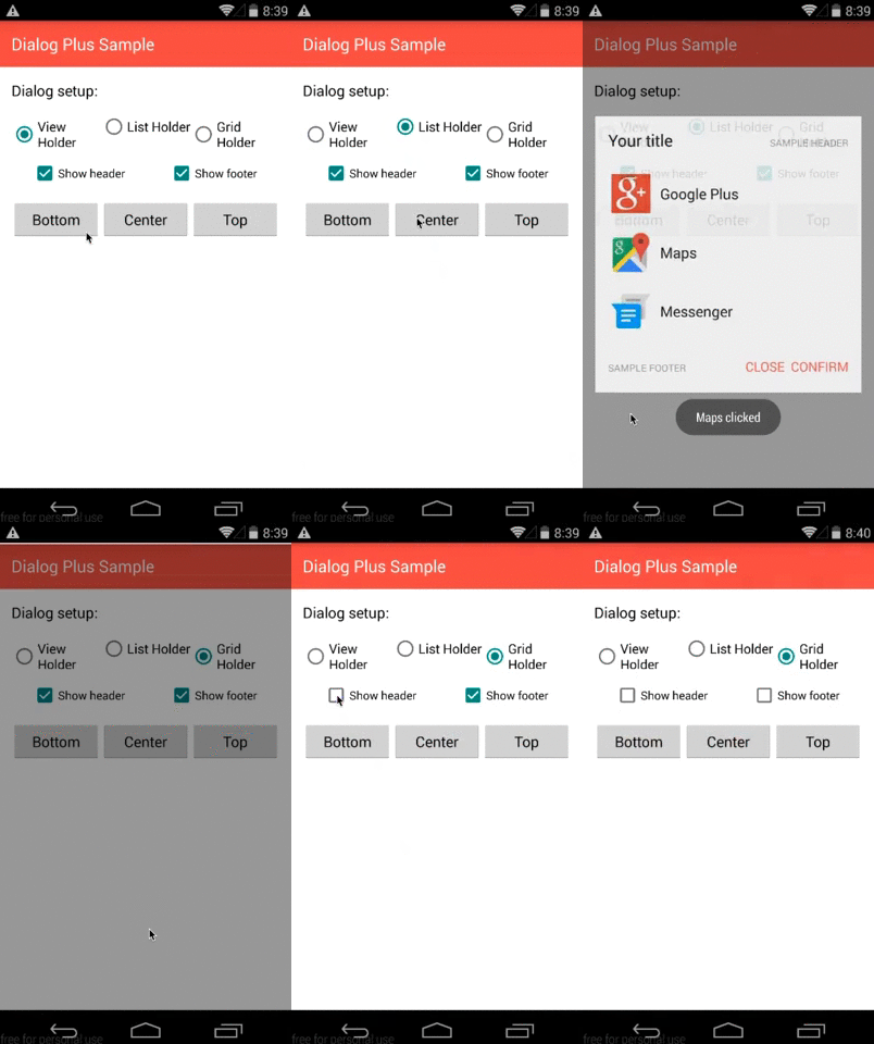
DialogPlus provides 3 position:
- Top : Dialog will appear at top with animation
- Center : Dialog will appear in the center with animation
- Bottom : Dialog will appear at the bottom of the screen with animation
DialogPlus provides 3 content types:
- ListHolder : Items will be shown in a listview
- GridHolder : Items will be shown in a gridview
- ViewHolder : Your customized view will be shown in the content
Gradle
Usage
Use the builder to create the dialog.
Basic usage
More options
Enable expand animation same as Android L share dialog
Set expand animation default height
Select different holder.
- Use ListView as content holder, note that this is default content type.
- Use ViewHolder as content holder if you want to use a custom view for your dialog. Pass resource id
or pass view itself
- Use GridHolder if you want to use GridView for the dialog. You must set column number.
- Get the holder view, ListView, GridView or your custom view
- Set dialog position. BOTTOM (default), TOP or CENTER. You can also combine other Gravity options.
- Define if the dialog is cancelable and should be closed when back pressed or out of dialog is clicked
- Set Adapter, this adapter will be used to fill the content for ListHolder and GridHolder. This is required if the content holder is ListHolder or GridHolder. It is not required if the content holder is ViewHolder.
- Set an item click listener when list or grid holder is chosen. In that way you can have callbacks when one of your items is clicked
- Set a global click listener to you dialog in order to handle all the possible click events. You can then identify the view by using its id and handle the correct behaviour. Only views which has id will trigger this event.
- Add margins to your dialog. They are set to 0 except when gravity is center. In that case basic margins are applied
- Set padding to the holder
- Set the footer view using the id of the layout resource
or use view
- Get the footer view
- Set the header view using the id of the layout resource
or use view
- Get the header view
- Set animation resources
- Set width and height for the content
- Dismiss Listener, triggered when the dialog is dismissed
- Cancel Listener, triggered when the dialog is cancelled by back button or clicking outside
- BackPress Listener, triggered when the back button is pressed
- Change content container background, as default white
- Change overlay container background, as default it's semi-transparent black
