Why Not! Image Carousel!
An easy, super simple and customizable image carousel view for Android.
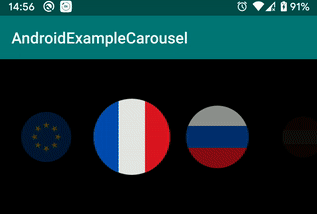
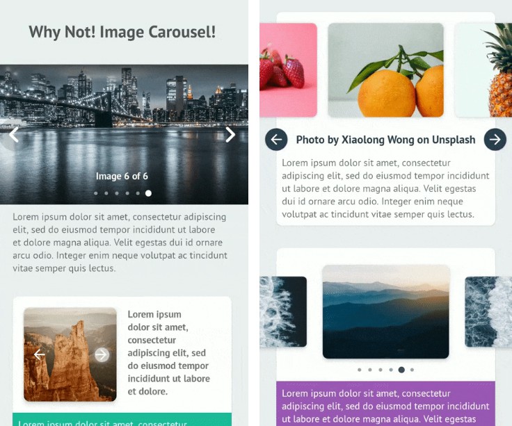
Preview
| Screenshot | Preview |
|---|---|
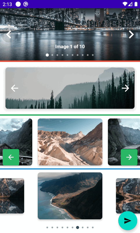 |
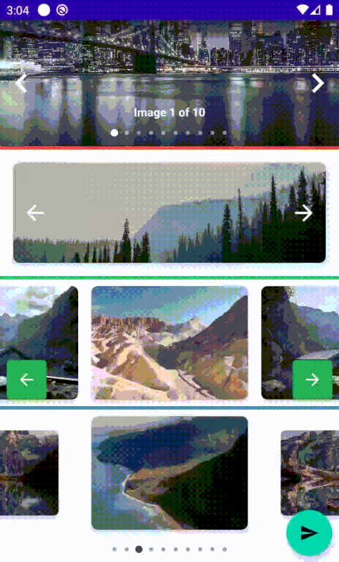 |
Usage
Dependency
Step 1. Add the JitPack repository to your build file
Add it to your root build.gradle at the end of repositories:
Step 2. Add the dependency
Note 0. Minimum SDK for this library is API 21 (Android 5.0 Lollipop).
Note 1. Your application have to use AndroidX to use this library.
Note 2. Your have to use *.MaterialComponents.* in you styles.
Finally
Add the view org.imaginativeworld.whynotimagecarousel.ImageCarousel in your layout:
<org.imaginativeworld.whynotimagecarousel.ImageCarousel
    android:id="@+id/carousel"
    android:layout_width="match_parent"
    android:layout_height="match_parent" />
Use the CarouselItem class for data item. Initialize the ImageCarousel with data using addData() function:
That's all you need to use the library! :)
Detail examples can be found here.
ImageCarousel XML attributes
All the custom XML attributes for ImageCarousel view with default values are given below. All attributes are optional.
<org.imaginativeworld.whynotimagecarousel.ImageCarousel
    android:id="@+id/carousel"
    android:layout_width="match_parent"
    android:layout_height="match_parent"

    app:showTopShadow="true"
    app:topShadowAlpha="0.6"
    app:showBottomShadow="true"
    app:bottomShadowAlpha="0.6"
    app:showCaption="true"
    app:showIndicator="true"
    app:showNavigationButtons="true"
    app:imageScaleType="fitCenter"
    app:carouselBackground="#333333"
    app:imagePlaceholder="@drawable/ic_picture"
    app:itemLayout="@layout/item_carousel"
    app:imageViewId="@id/img"
    app:previousButtonLayout="@layout/previous_button_layout"
    app:previousButtonId="@id/btn_previous"
    app:previousButtonMargin="4dp"
    app:nextButtonLayout="@layout/next_button_layout"
    app:nextButtonId="@id/btn_next"
    app:nextButtonMargin="4dp"
    app:carouselType="BLOCK"
    app:scaleOnScroll="false"
    app:scalingFactor="0.15"
    app:autoWidthFixing="true"
    app:autoPlay="false"
    app:autoPlayDelay="3000" />
ImageCarousel functions
You can also set all the attributes programmatically. All the functions and their usages given below:
Carousel Type
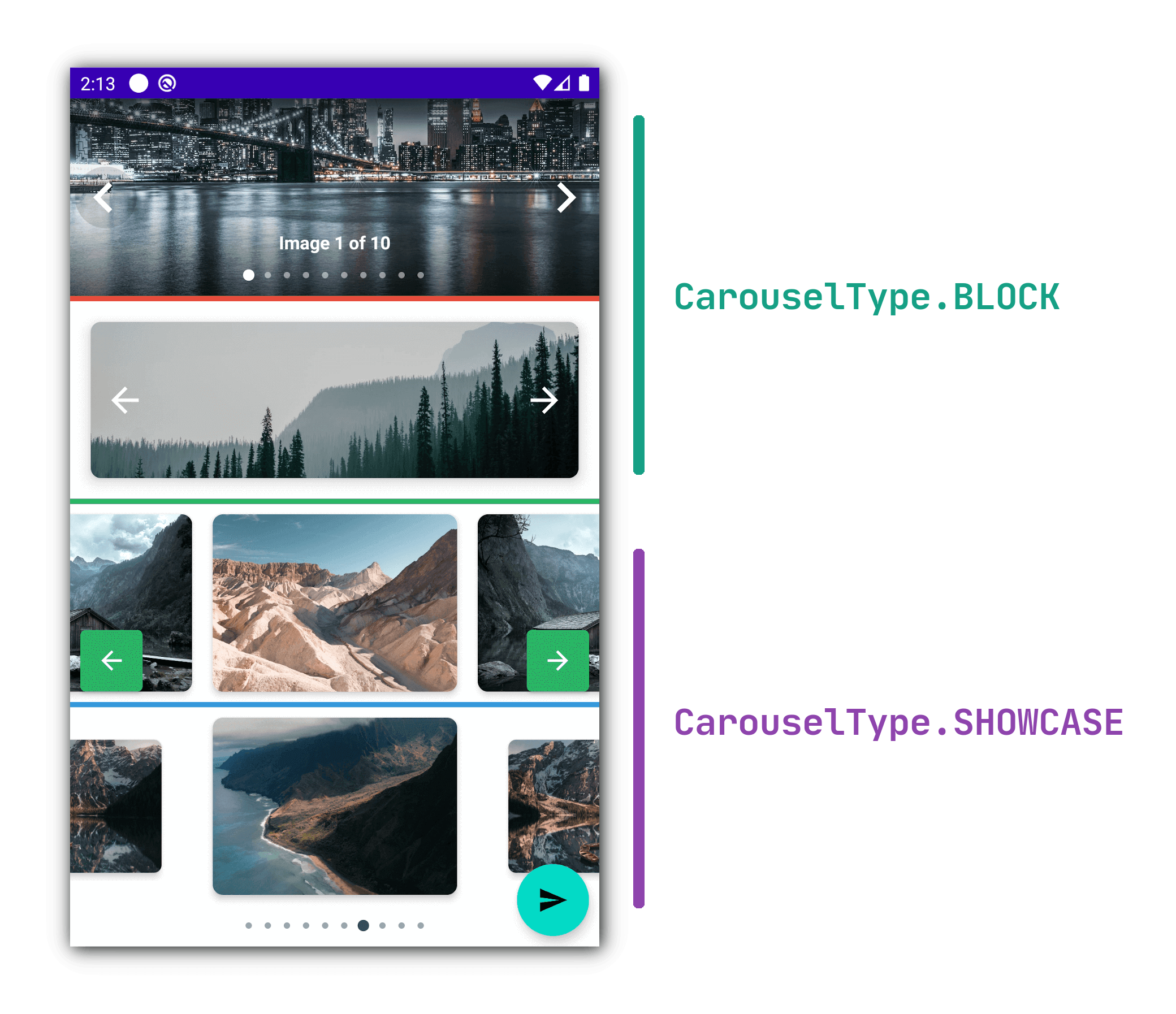
ImageCarousel has following types:
1. CarouselType.BLOCK
If you need one item view at a time, then use this carousel type.
2. CarouselType.SHOWCASE
If you need multiple item view at a time, use this carousel type.
You can also use the scaleOnScroll and scalingFactor attributes with this carousel type.
Credits
This library is using the CircleIndicator library for the indicator.
Inspired by CarouselView library.
Changelog
1.0.0
The initial release of the library.