circle-progress-ad-android

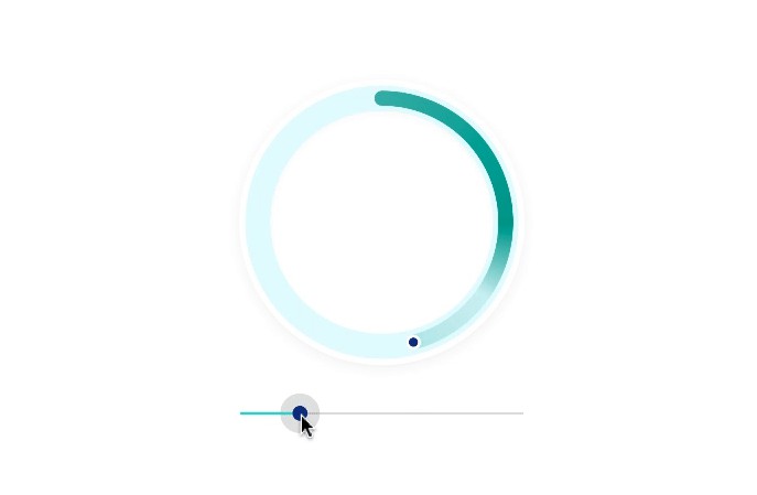
A small Android library allowing you to have a smooth and customizable circular ProgressBar like whatsapp and Tez app, it can be use while uploding or downloading file.

I decided to do this because I was really tired to find progressbar like whatsapp and gradient color progressbar and also you can contribute more color style, or new idea to me.

I took reference or take some code from CircleProgress and change it as i need. also add code for set vector image as background and gradient colors.

circle-progress-ad-android

Integration

Add it in your root build.gradle at the end of repositories:

allprojects {
		repositories {
			...
			maven { url 'https://jitpack.io' }
		}
	}

Add the dependency:

implementation 'com.github.Adilhusen:circle-progress-ad-android-:1.0'

Usage

You can either simply use the AdCircleProgress widge from this library on a regular ProgressBar.

Using Widget

Simply replace your ProgressBar with AdCircleProgress, and remember to apply corresponding style and attribute for correct behavior.

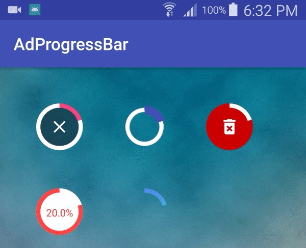
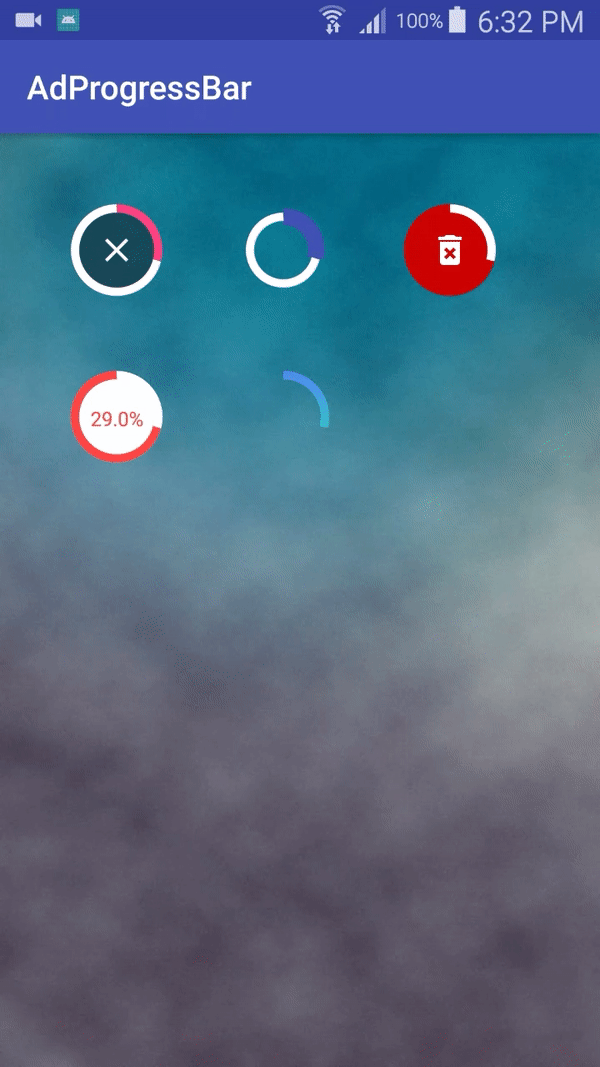
For example, to create a first AdCircleProgress like whatsapp:

AdProgressBarFirst

<com.app.adprogressbarlib.AdCircleProgress
        android:id="@+id/pgb_progress"
        android:layout_width="60dp"
        android:layout_height="60dp"
        android:backgroundTintMode="add"
        app:adpgb_finished_color="@color/colorAccent"
        app:adpgb_unfinished_color="@android:color/white"
        custom:adpgb_finished_stroke_width="5dp"
        custom:adpgb_inner_drawable="@drawable/ic_close_icon"
        custom:adpgb_show_text="false"
        custom:adpgb_unfinished_stroke_width="5dp" />

Second AdCircleProgress in which you can change adpgb_finished_stroke_width like below code:

AdProgressBarSecond

<com.app.adprogressbarlib.AdCircleProgress
        android:id="@+id/pgb_progress2"
        android:layout_width="60dp"
        android:layout_height="60dp"
        android:backgroundTintMode="add"
        app:adpgb_finished_color="@color/colorPrimary"
        app:adpgb_background_color="@android:color/transparent"
        app:adpgb_unfinished_color="@android:color/white"
        custom:adpgb_finished_stroke_width="10dp"
        custom:adpgb_show_text="false"
        custom:adpgb_unfinished_stroke_width="5dp" />

Third AdCircleProgress in which you can change custom:adpgb_inner_drawable means you can change image or vector image in inner circle like below code:

AdProgressBarThird

<com.app.adprogressbarlib.AdCircleProgress
     android:id="@+id/pgb_progress3"
     android:layout_width="60dp"
     android:layout_height="60dp"
     app:adpgb_background_color="@android:color/holo_red_dark"
     android:backgroundTintMode="add"
     app:adpgb_finished_color="@android:color/white"
     app:adpgb_unfinished_color="@android:color/holo_red_dark"
     custom:adpgb_finished_stroke_width="5dp"
     custom:adpgb_inner_drawable="@drawable/ic_delete_icon"
     custom:adpgb_show_text="false"
     custom:adpgb_unfinished_stroke_width="5dp" />

Fourth AdCircleProgress in which you can change custom:adpgb_show_text="true" means if you want to show progress in percentage like below code:

AdProgressBarFourth

<com.app.adprogressbarlib.AdCircleProgress
     android:id="@+id/pgb_progress4"
     android:layout_width="60dp"
     android:layout_height="60dp"
     app:adpgb_background_color="@android:color/background_light"
     android:backgroundTintMode="add"
     app:adpgb_finished_color="@android:color/white"
     app:adpgb_unfinished_color="@android:color/holo_red_light"
     custom:adpgb_finished_stroke_width="5dp"
     app:adpgb_text_size="12dp"
     custom:adpgb_show_text="true"
     app:adpgb_text_color="@android:color/holo_red_light"
     custom:adpgb_unfinished_stroke_width="5dp" />

Fifth AdCircleProgress in which you can add gradient color for progressbar app:adpgb_gradient_color_one="@color/colorOne" app:adpgb_gradient_color_two="@color/colorTwo"like below code:

AdProgressBarFifth

<com.app.adprogressbarlib.AdCircleProgress
     android:id="@+id/pgb_progress5"
     android:layout_width="60dp"
     android:layout_height="60dp"
     app:adpgb_background_color="@android:color/transparent"
     android:backgroundTintMode="add"
     app:adpgb_finished_color="@android:color/white"
     app:adpgb_gradient_color_one="@color/colorOne"
     app:adpgb_gradient_color_two="@color/colorTwo"
     app:adpgb_unfinished_color="@android:color/transparent"
     custom:adpgb_finished_stroke_width="5dp"
     app:adpgb_progress="90"
     app:adpgb_text_size="12dp"
     custom:adpgb_show_text="false"
     custom:adpgb_unfinished_stroke_width="5dp" />

Do not forget to add xmlns:custom custom attr in your root layout :

<RelativeLayout xmlns:android="http://schemas.android.com/apk/res/android"
   xmlns:app="http://schemas.android.com/apk/res-auto"
   xmlns:custom="http://schemas.android.com/apk/res-auto"
   xmlns:tools="http://schemas.android.com/tools"
   android:layout_width="match_parent"
   android:layout_height="match_parent"
   android:background="@drawable/backg"
   android:padding="20dp"
   tools:context=".MainActivity">

</RelativeLayout>

GitHub