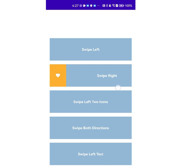
Swipeable-Card
A simple utility Compose to add customizable buttons when swiping the card in an easy way.
Import:
This library is available as a gradle dependency via JitPack.io. Just add the following code:
- Add Jitpack.io to your root build.gradle:
allprojects {
     repositories {
     	...
     	maven { url "https://jitpack.io" }
     }
}
Note: if you faced an issue with the first step check this out
- Add dependency:
implementation 'com.github.Amrjyniat:Swipeable-Card:1.0.0'
Features
- Customize the background, text color and icon of the button.
- Add unlimited buttons to the card by passing a list of
SwipeableAction. - Work with both LTR and RTL layout directions.
- You don’t need to edit your card to make it swipeable, just add your card compose to the
SwipeableCard.
How to use:
SwipeableCard(
	actions = listOf(
	  Action(R.drawable.ic_share, Orange, "Share", Color.White, 85.dp){},
	),
	isRevealed = revealIds.contains(task.taskId),
	paddingValues = PaddingValues(16.dp),
	animationDuration = 500,
	onExpand = {},
	onCollapse = {}
) {
	Card()
}
You have three customizable areas in SwipeableCard composable fun:
-
Your original card.
-
The buttons that will show when swiping the card, pass a list of
Actionwhich has multiple attributes:iconRes: Drawable resource icon.color: Background of the button.text: Text of the button.textColor: Text color of the button.withInDp: Specify button width in DB, otherwise will wrap the content.onAction: Lambda triggered when button clicked.
-
Attributes:
isRevealed: Boolean value that Reveals the card to show the buttons when being true.paddingValues: Set card padding.animationDuration: Specify the Reveal speed by passing duration in milliseconds.onExpand: Lambda triggered when revealing the card.onCollpase: Lambda triggered when collapsing the card.
Sample:
You can check out the sample app in the project to take a closer look of how to use it in real work.
References:
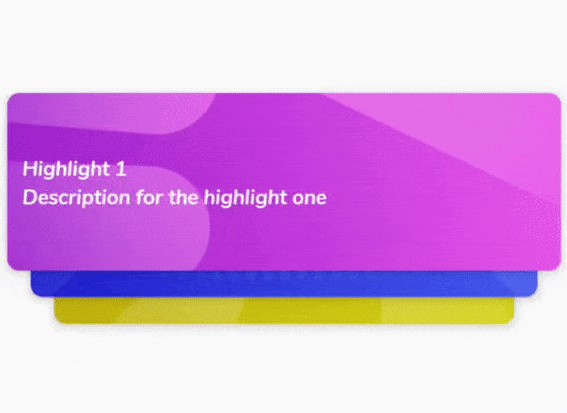
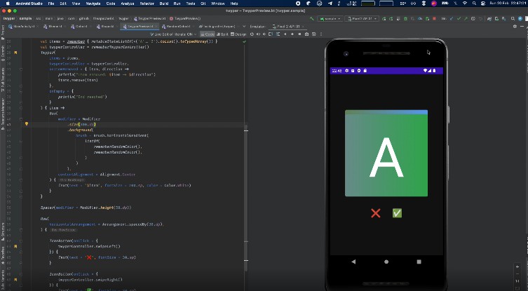
This library inspired from here, Thanks Skyyo!


