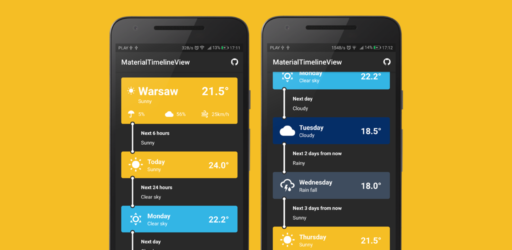
Slide To Act
A simple Slide to Unlock Material widget for Android, written in Kotlin ?.
Getting Started ?
Slide To Act is distributed through JCenter. To use it you need to add the following Gradle dependency to your android app gradle file (NOT the root file).
If you're using the Android Gradle plugin version 3:
If you're using an Older version of the Android Gradle plugin:
Or you can download the .AAR artifact directly from Bintray.
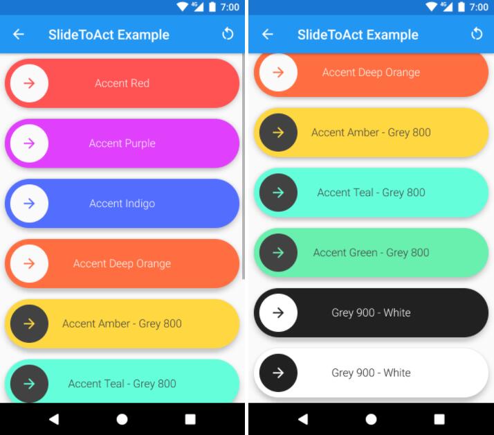
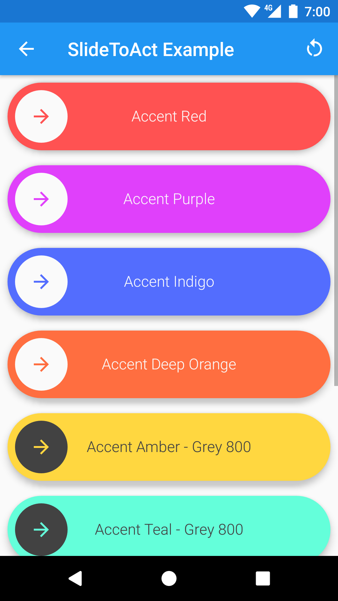
Example ?
After setting up the Gradle dependency, you can use SlideToActView widgets inside your XML Layout files
And bind them inside your Java/Kotlin code:
Features ?
- 100% Vectorial, no .png or other assets provided.
- Fancy animations! ?
- API >= 14 compatible (since v0.2.0)
- Easy to integrate (just a gradle compile line).
- Integrated with your app theme ?.
- Works out of the box, no customization needed.
- Written in Kotlin (but you don't need Kotlin to use it)!
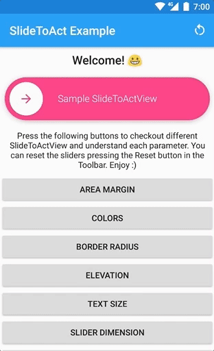
- UX Friendly ?, button will bump to complete if it's over the 80% of the slider (see the following gif).

Attributes
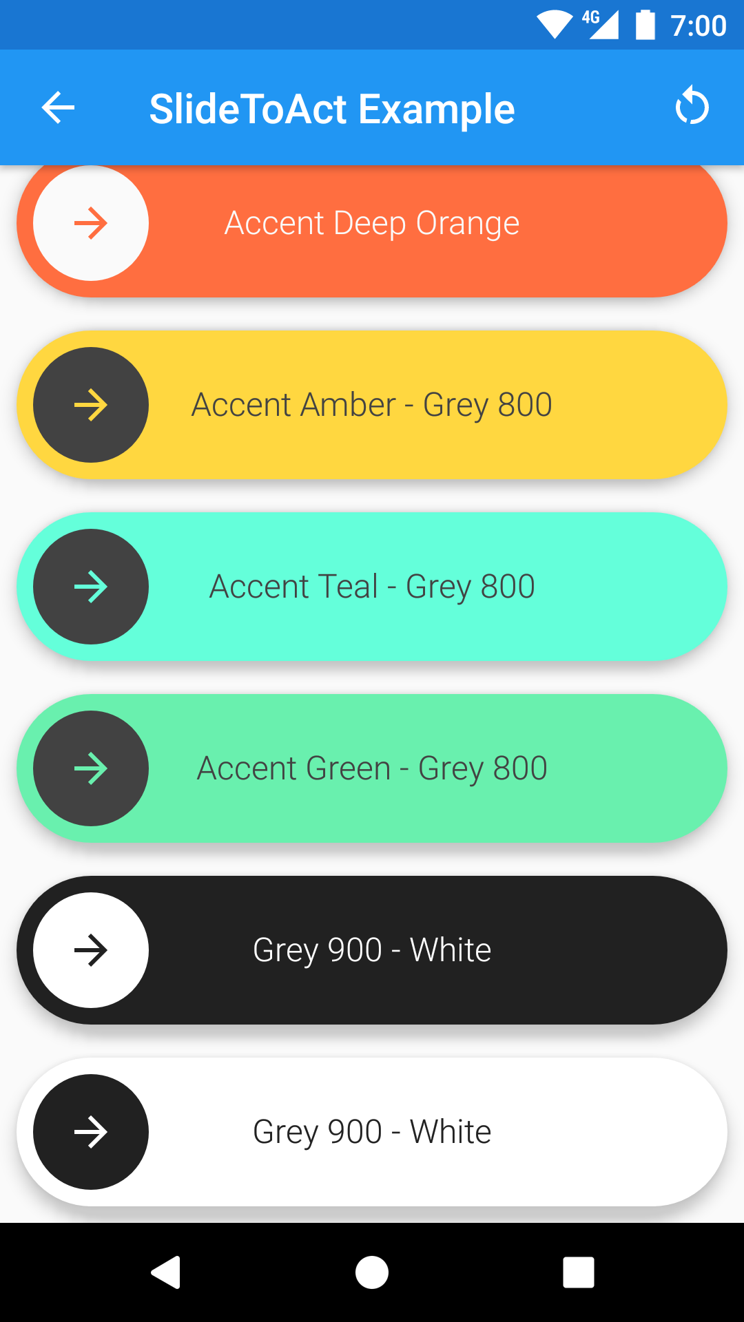
By the default, every SlideToActView widget fits to your app using the colorAccent and the colorBackground parameters from your theme. You can customize your SlideToActView using the following custom attributes.
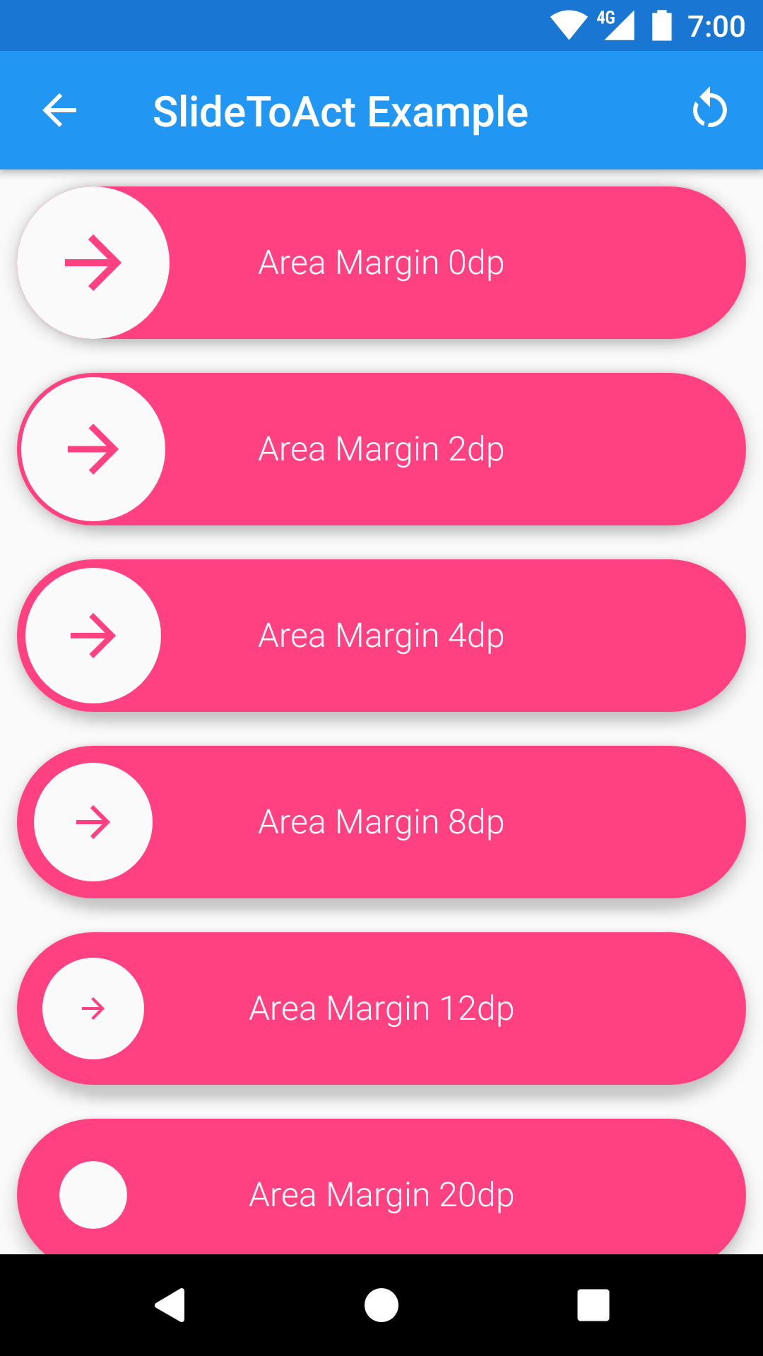
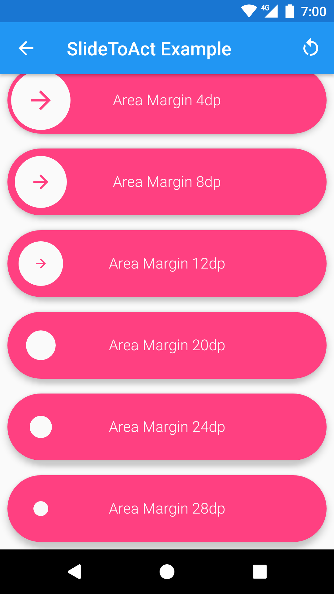
area_margin
Use the area_marging attribute to control the margin of the inner circular button from the outside area. If not set, this attribute defaults to 8dp.
inner_color & outer_color
Use the outer_color attribute to control the color of the external area and the color of the arrow icon. If not set, this attribute defaults to colorAccent from your theme.
Use the inner_color attribute to control the color of the inner circular button, the color of the tick icon and the color of the text. If not set, this attribute defaults to colorBackground from your theme.
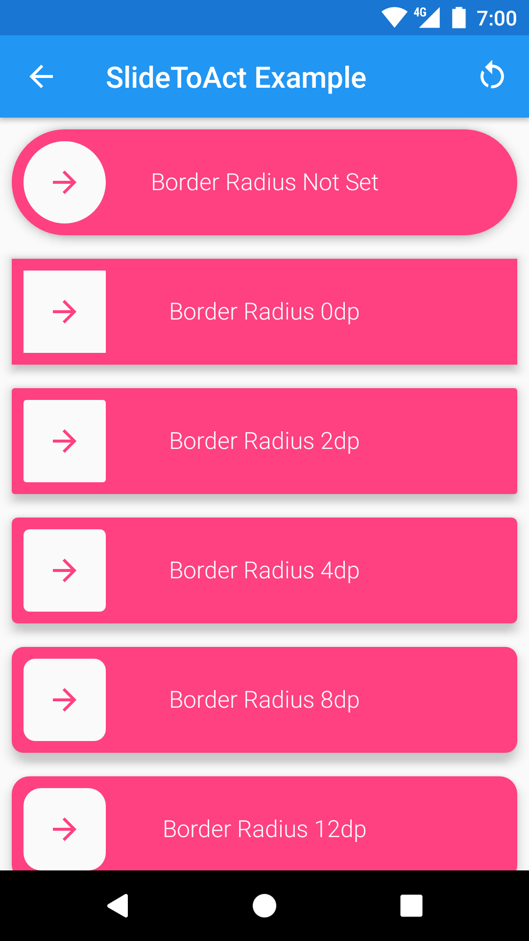
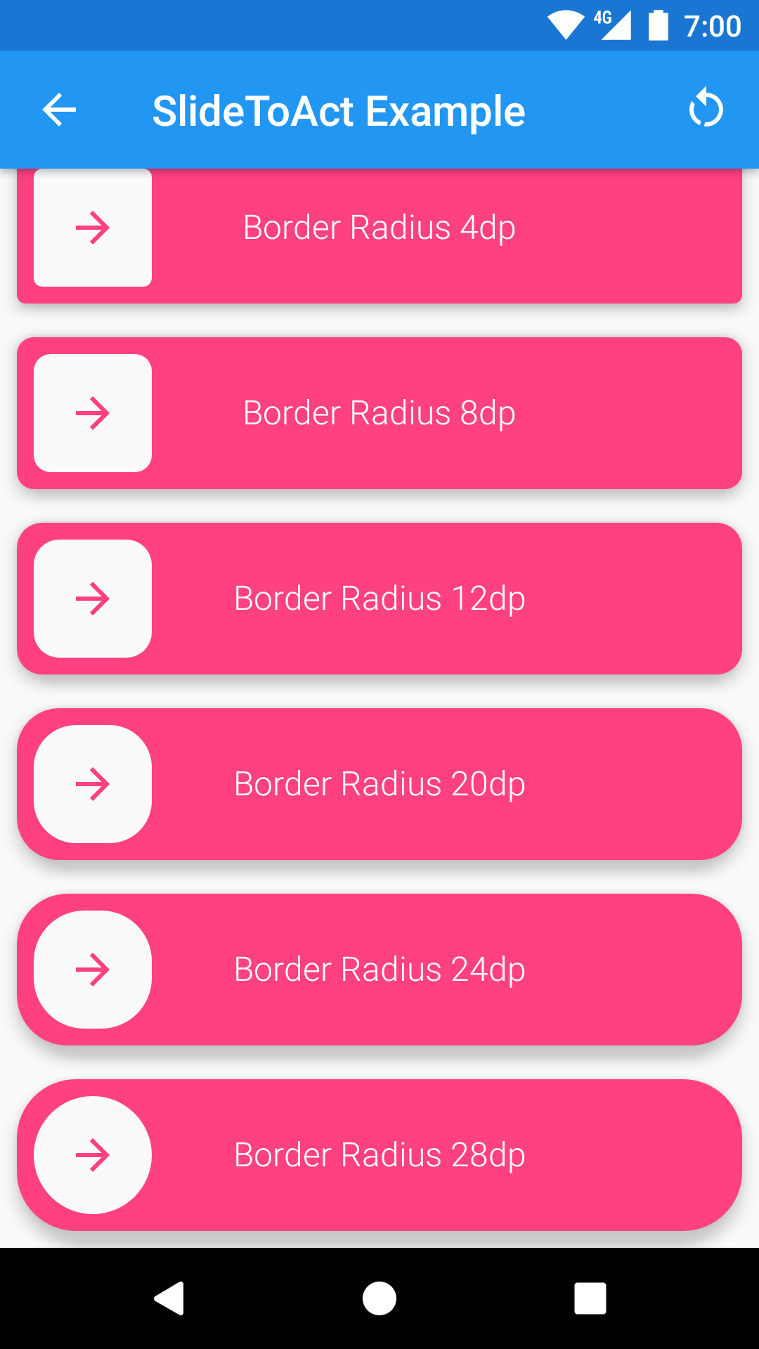
border_radius
Use the border_radius attribute to control the radius of the inner circular button and of the external area. A border_radius set to 0dp will result in a square slider. If not set, this attribute will render your slider as a circle (default behavior).
text, text_size, text_style
Use the text attribute to control the text of your slider. If not set, this attribute defaults to SlideToActView.
Use the text_size attribute to control the size of the text of your slider. A text_size set to 0sp will result in hiding the text. If not set, this attribute defaults to 16sp.
Use the text_style attribute to control the style of your text. Accepted values are normal, bold and italic.

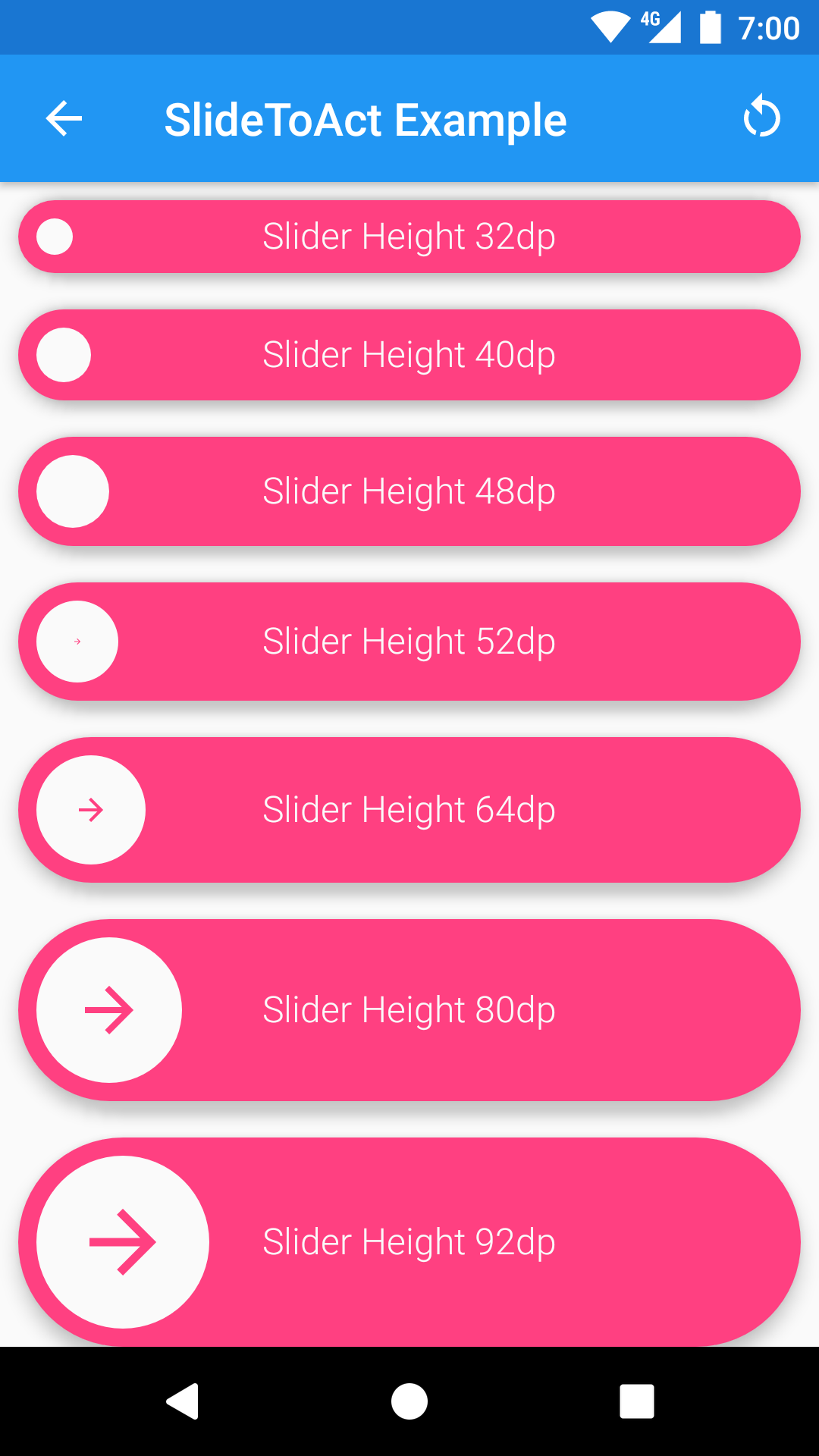
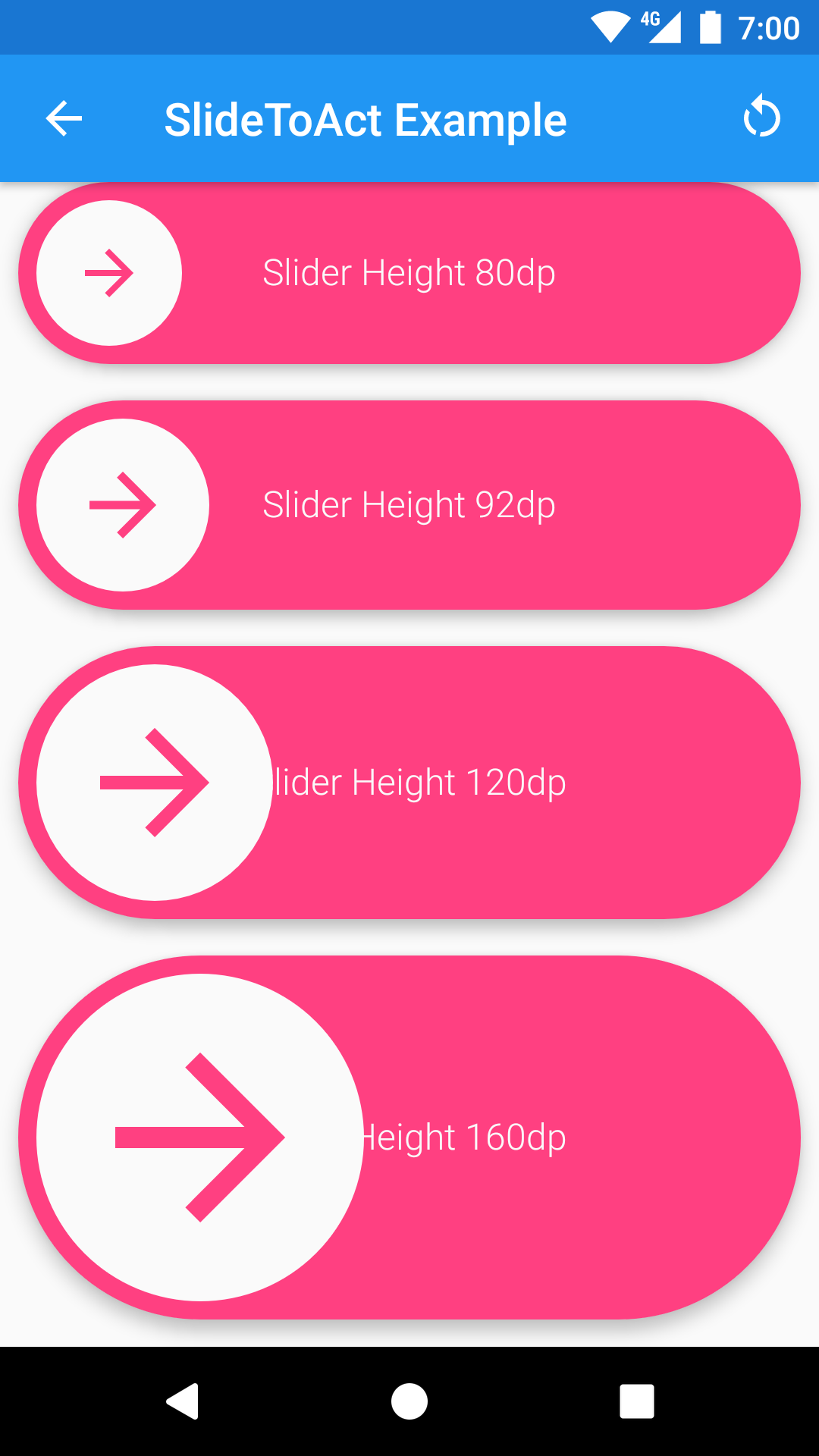
slider_height
Use the slider_height attribute to control the desired height of the widget. If not set, the widget will try to render with 72dp of height.
slider_locked
Use the slider_locked attribute to lock the slider (this is a boolean attribute). When a slider is locked, will always bump the button to the beginning (default is false).
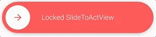
You can also toggle this attribute programmatically with the provided setter.
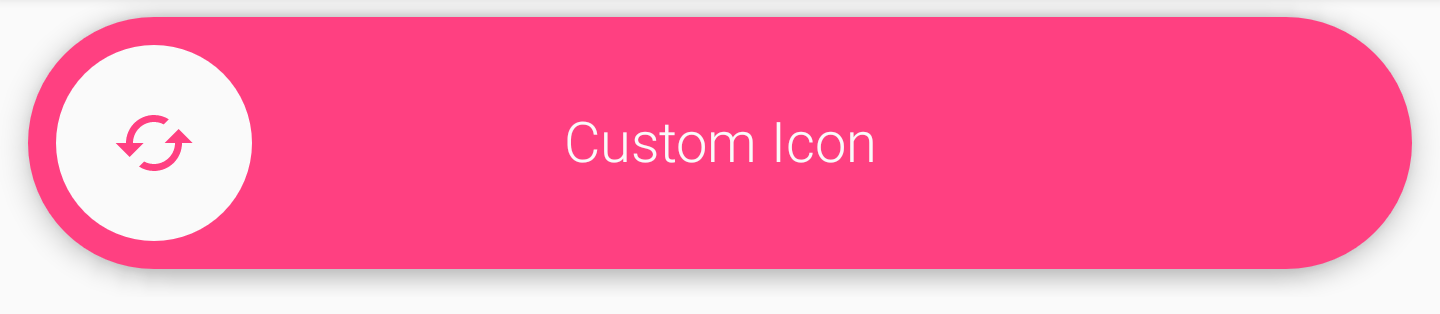
slider_icon
You can set a custom icon by setting the slider_iconattribute to a drawable resource.
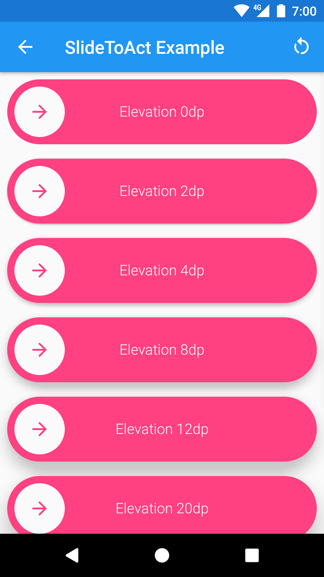
android:elevation
Use the android:elevation attribute to set the elevation of the widget. The widgets will take care of providing the proper ViewOutlineProvider during the whole animation (a.k.a. The shadow will be drawn properly).

Event callbacks
You can use the OnSlideCompleteListener and the OnSlideResetListener to simply interact with the widget. If you need to perform operations during animations, you can provide an OnSlideToActAnimationEventListener. With the latter, you will be notified of every animation start/stop.
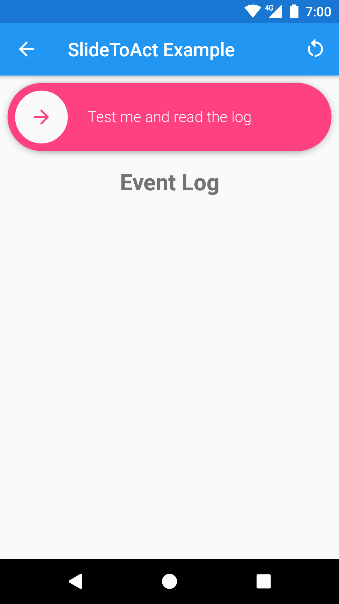
You can try the Event Callbacks in the Demo app to better understand where every callback is called.
Demo ?
Wonna see the widget in action? Just give a try to the Example App, it's inside the example folder.
Otherwise, you can just download the APK from a CircleCI build, and try it on a real device/emulator.
Building/Testing ⚙️
CircleCI 
This projects is built with Circle CI. The CI environment takes care of building the library .AAR, the example app and to run the Espresso tests. Artifacts are exposed at the end of every build (both the .AAR and the .APK of the example app).
TravisCI 
TravisCI builds are also running but they are considered Legacy. I'm probably going to dismiss it soon or later.
Building locally
Before building, make sure you have the following updated components from the Android SDK:
- tools
- platform-tools
- build-tools-25.0.3
- android-25
- extra-android-support
- extra-android-m2repository
- extra-google-m2repository
Then just clone the repo locally and build the .AAR with the following command:
The assembled .AAR will be inside the slidetoact/build/outputs/aar folder.
Testing
Once you're able to build successfully, you can run Espresso tests locally with the following command.
Make sure your tests are all green ✅ locally before submitting PRs.